KISAN SARATHI
Getting India's agricultural research
out of
labs and into farmers' hands.
Designing the end-to-end advisory platform that connects ICAR scientists, subject experts, and KVK field workers into one shared workflow.
MY ROLE
UX Lead
responsibilities
Research, IA, Interaction Design, Visual Design
TIMELINE
Feb 2024 - Oct 2024
CLIENT
Kisan Sarathi / ICAR
A breakthrough means nothing until it reaches the people who can act on it.
LONG STORY SHORT
India has world-class agricultural research. Most farmers never see it.
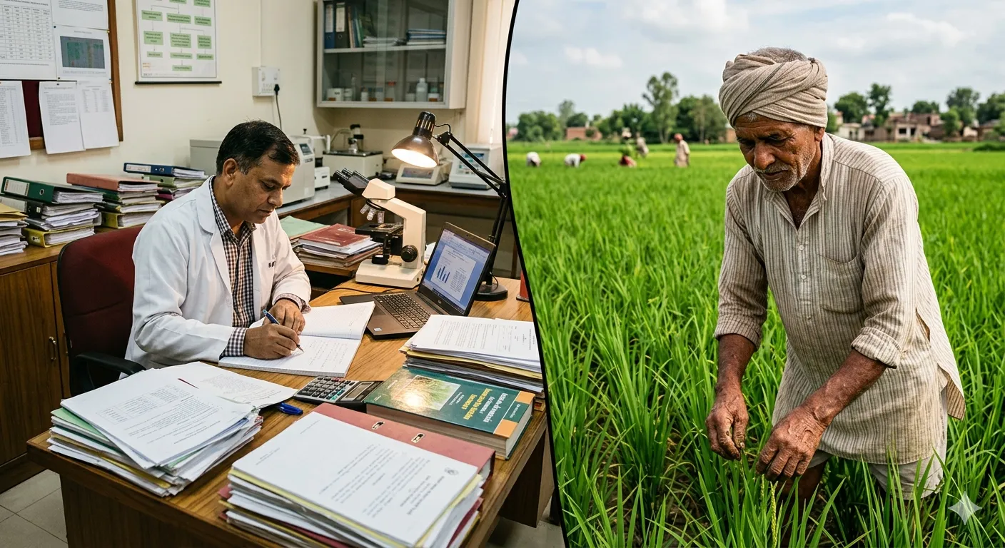
ICAR, India's national agricultural research body, runs one of the largest agri-science networks in the world: institutes, universities, and over 700 Krishi Vigyan Kendras (KVKs) spread across every state. The research is there. The problem is getting it out of the lab and into the field, in the right language, at the right time, for the right crop.
I was brought in as UX lead from UX4G to design AAMS, the Agriculture Advisory Management System. A platform connecting three very different users: scientists who create advisories, subject experts who approve them, and KVK field workers who localise and push them out to farmers. My job was to make that chain actually work, without any of them having to think too hard about the others.


the problem
The old system was email, paper, and crossed fingers.
Before AAMS, there was no system. Advisories moved through chains of people via email threads and printed documents. By the time advice reached a farmer, it could be weeks old, in the wrong language, or contradicting something another institute had already sent out.
I spent time with a senior ICAR researcher who walked me through how things actually worked day to day. Five problems came up that shaped everything that came after.
1. Research lived in inboxes and filing cabinets
Scientists wrote up findings and sent them by email or printed them out. No central place to store, search, or build on existing advisories. Every season, work got duplicated from scratch.
2. Translations happened slowly, or not at all
India's farmers speak dozens of languages. Researchers largely write in English. Getting an advisory translated into Telugu or Marathi meant finding the right person, explaining the context, and waiting. A lot of advice never got translated at all.
3. Nobody knew if farmers were actually getting the advice
Once an advisory was sent out, it disappeared. No delivery logs, no read signals, no way to know if it reached anyone. Scientists were writing into a void.
4. Scientists had no idea if their research was being used
No feedback loop at all. Was the advice useful? Were farmers following it? Did it improve anything? No one knew. Years of research with no way to prove its own impact.
5. Contradictory advisories were going out at the same time
With no central coordination, different institutes sometimes published conflicting guidance on the same crop or pest. A farmer receiving two advisories telling them to do opposite things had no way to know which to trust.
2.1
The gap which needs to close
Image
understanding the users
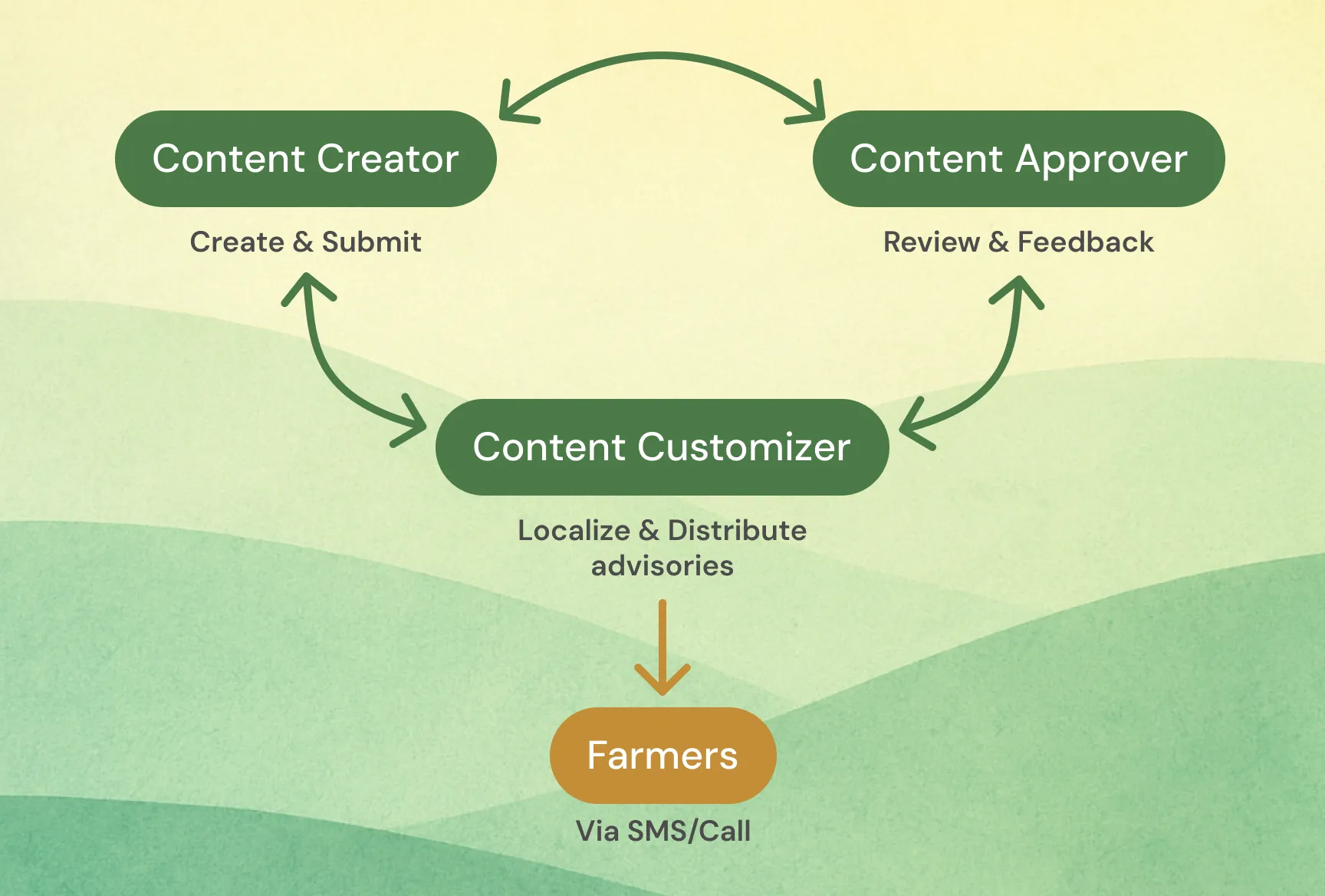
Three very different people, one shared chain
The most important insight for this project came early: AAMS was not one product for one user. It was three interconnected tools for three completely different people, whose work only made sense in relation to each other. Getting this right meant understanding each persona on their own terms first, then designing the handoffs between them.
1. Content Creator: the scientist or researcher
Based at ICAR institutes, SAUs, or KVKs. Writes advisories from their research and regional expertise. More comfortable with domain knowledge than digital tools. Needs a creation flow structured enough to capture the right metadata (crop, region, season, dosages) without feeling like a bureaucratic form.
2. Content Approver: the subject expert or nodal officer
Reviews and signs off on advisories before they go out. Responsible for accuracy, compliance, and catching anything that conflicts with existing guidance. Needs clear visibility into the queue and a way to give structured, traceable feedback rather than freeform emails.
3. Content Customizer: the KVK field expert
Closest to the farmer. Takes approved advisories and adapts them: translating into regional languages, adjusting dosages for local conditions, adding context specific to their geography. Needs to work fast, stay close to the original without breaking it, and see how farmers respond to what they publish.
3.1
The chain connecting the platform's beneficiaries
Image
research & insights
One honest conversation was worth more than a survey.
I did not have a research budget or a research team. What I had was a senior ICAR scientist who was willing to talk honestly about what was broken. That conversation gave me more direction than any desk research would have. All five problems in the previous section came from that one conversation.
Three things shaped the design most directly.
1. The metadata problem
Scientists would write a perfectly good advisory and leave out half the information needed to make it useful: which region, which season, which growth stage. Not because they did not know, just because there was nowhere obvious to put it. The old system had no structured fields for any of this. The result was advisories that could not be searched, filtered, or targeted. They just existed as documents.
This told me the creation flow had to capture metadata upfront, progressively, as part of writing, not as an afterthought at the end.
2. The credibility problem
Scientists cared a lot about attribution. If they wrote something, they wanted their name on it, their institute on it, and a clear trail showing it had been reviewed before going out. Advisories in the old system circulated without clear authorship and sometimes got modified in ways the original author never knew about.
Version control and audit trails were not nice-to-haves. They were essential to getting scientists to trust the platform enough to use it.
3. The feedback vacuum
The researcher had been writing advisories for years with almost no idea whether any of them made a difference. They were not even asking for detailed analytics. Just some signal that the work was reaching people.
That is what made the farmer feedback and analytics features feel urgent rather than supplementary.
design process
Three tools that had to feel like one.
The central design challenge was not any individual feature. It was coherence across three very different user contexts. A scientist's choices at creation time shaped what an approver saw, which shaped what a KVK expert could localise. If any link in that chain felt wrong, the whole system fell apart.
1. Guided creation, not a blank form
The biggest risk for the creator flow was that scientists would skip metadata fields and publish under-specified advisories that could not be properly targeted or found. A blank form was not going to solve this.
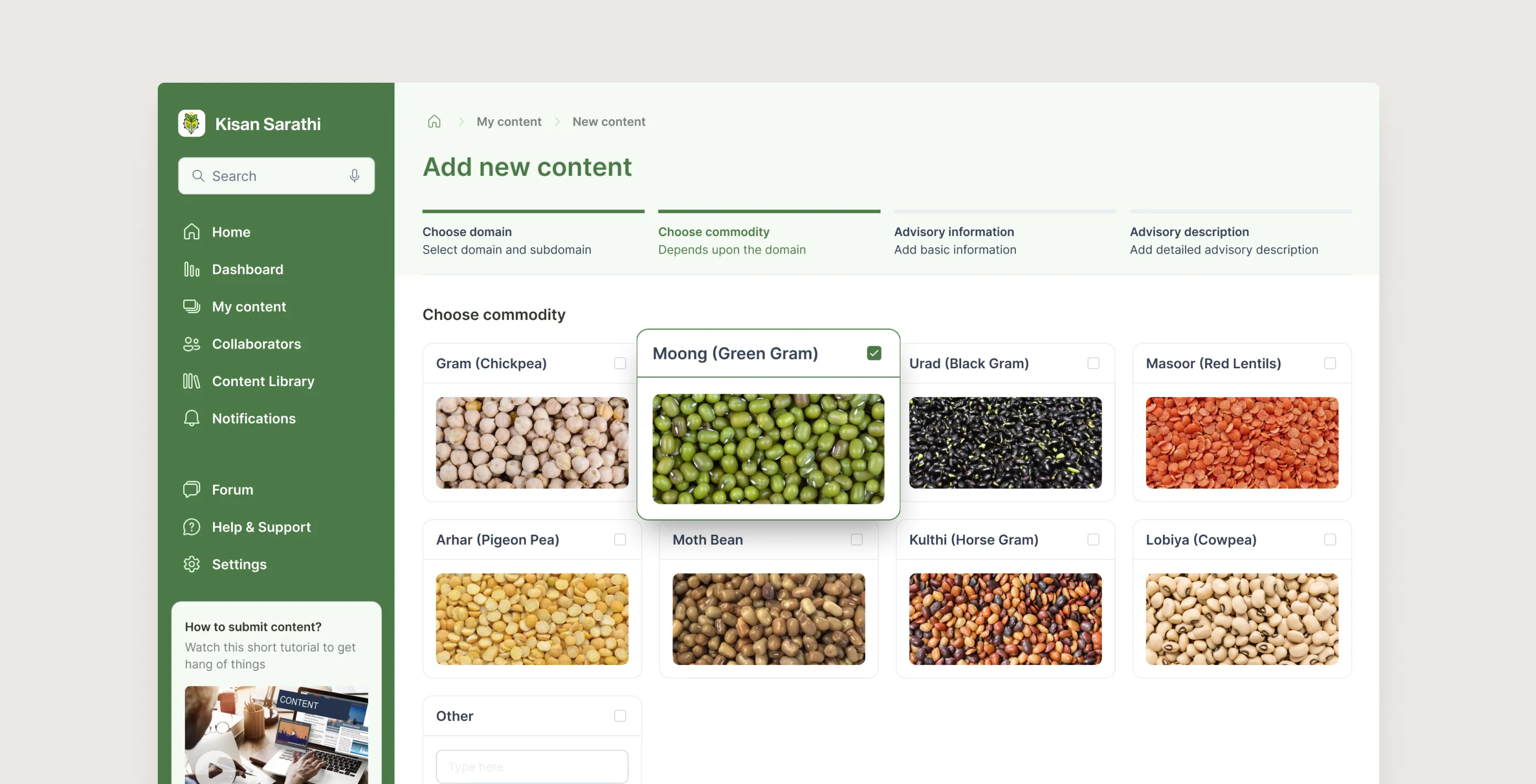
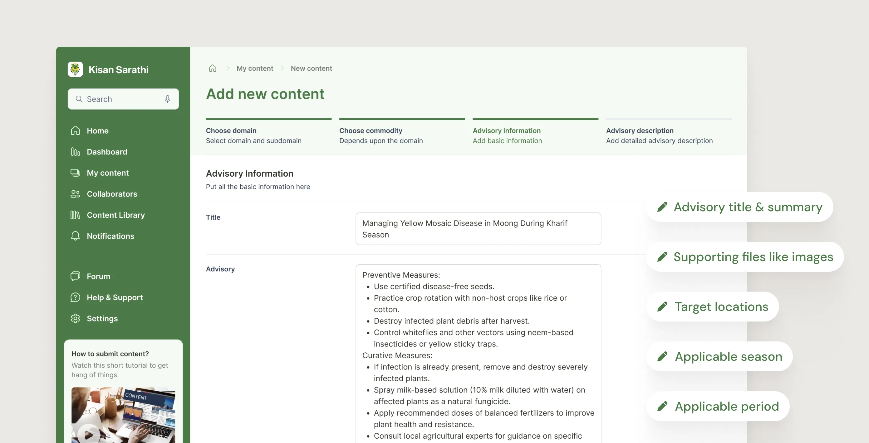
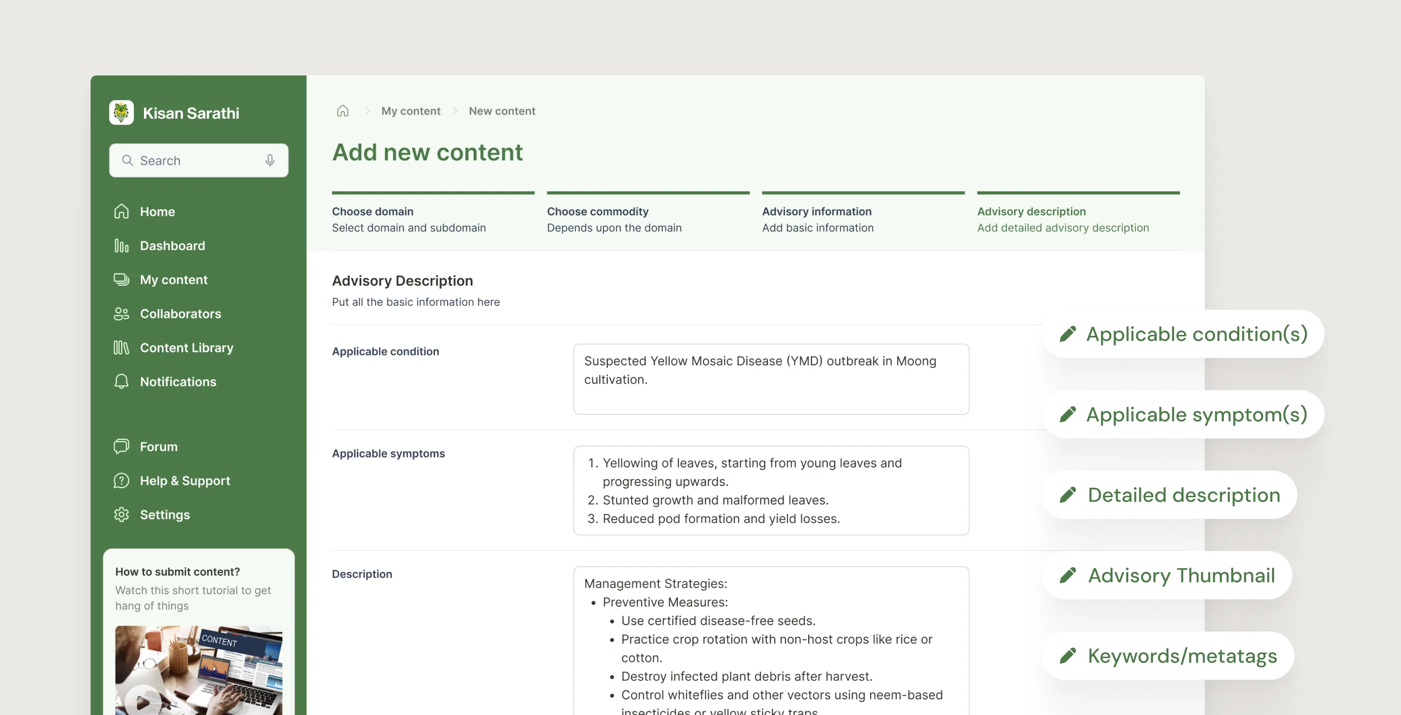
I designed the creation flow as a four-step wizard: domain first, then commodity, then the factual scaffold (region, season, period), then the advisory content itself. Each step unlocked the next. The structure made it hard to leave things out without noticing, and kept each screen clean because only the relevant fields were visible at that stage.
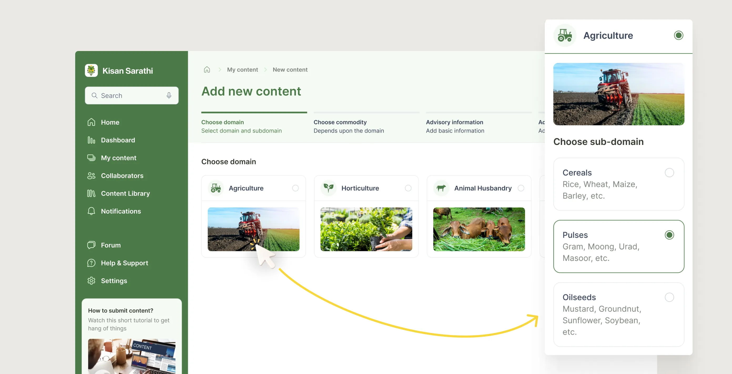
5.1.1
Content creation flow - Choose domain
Image
5.1.2
Content creation flow - Choose commodity
Image
5.1.3
Content creation flow - Advisory information
Image
5.1.4
Content creation flow - Advisory description
Image
5.1.1
Content creation flow - Choose domain
Image
5.1.2
Content creation flow - Choose commodity
Image
5.1.3
Content creation flow - Advisory information
Image
5.1.4
Content creation flow - Advisory description
Image
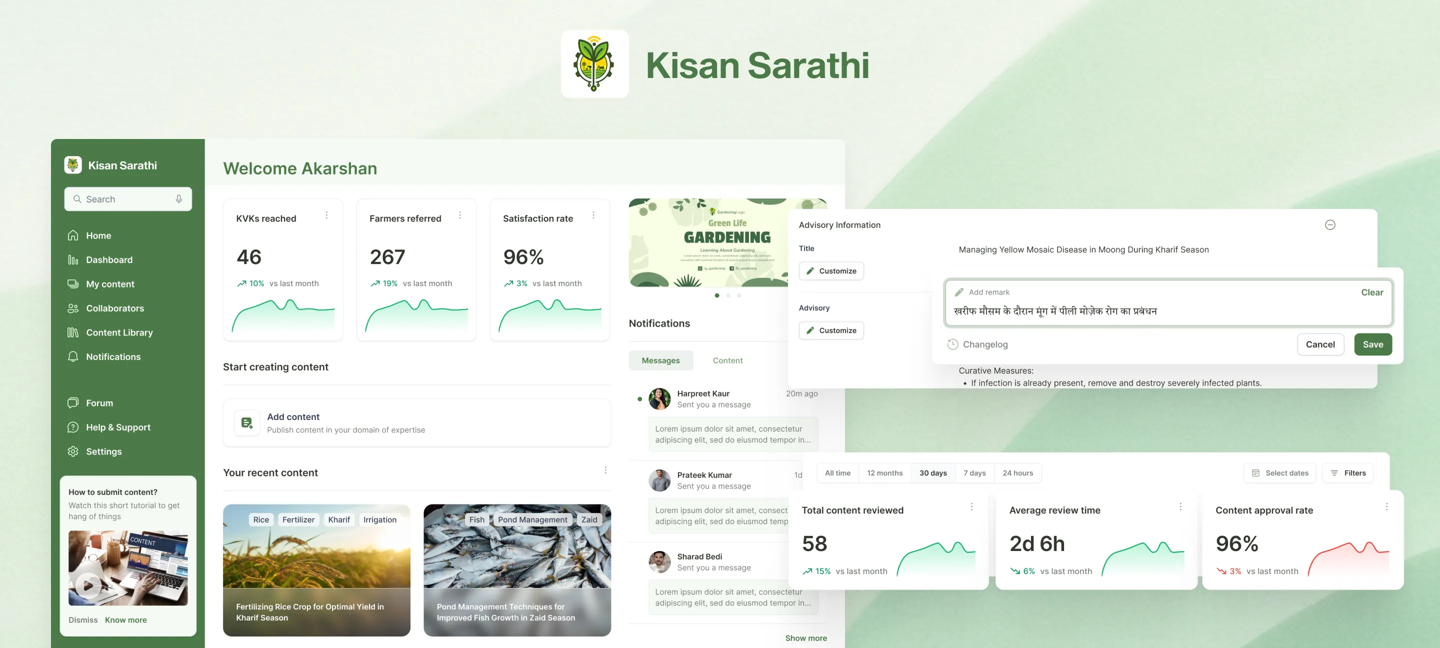
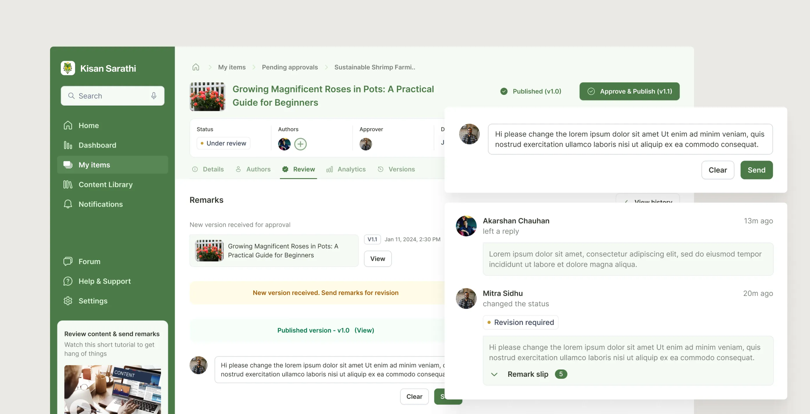
2. Approval as a conversation, not a gate
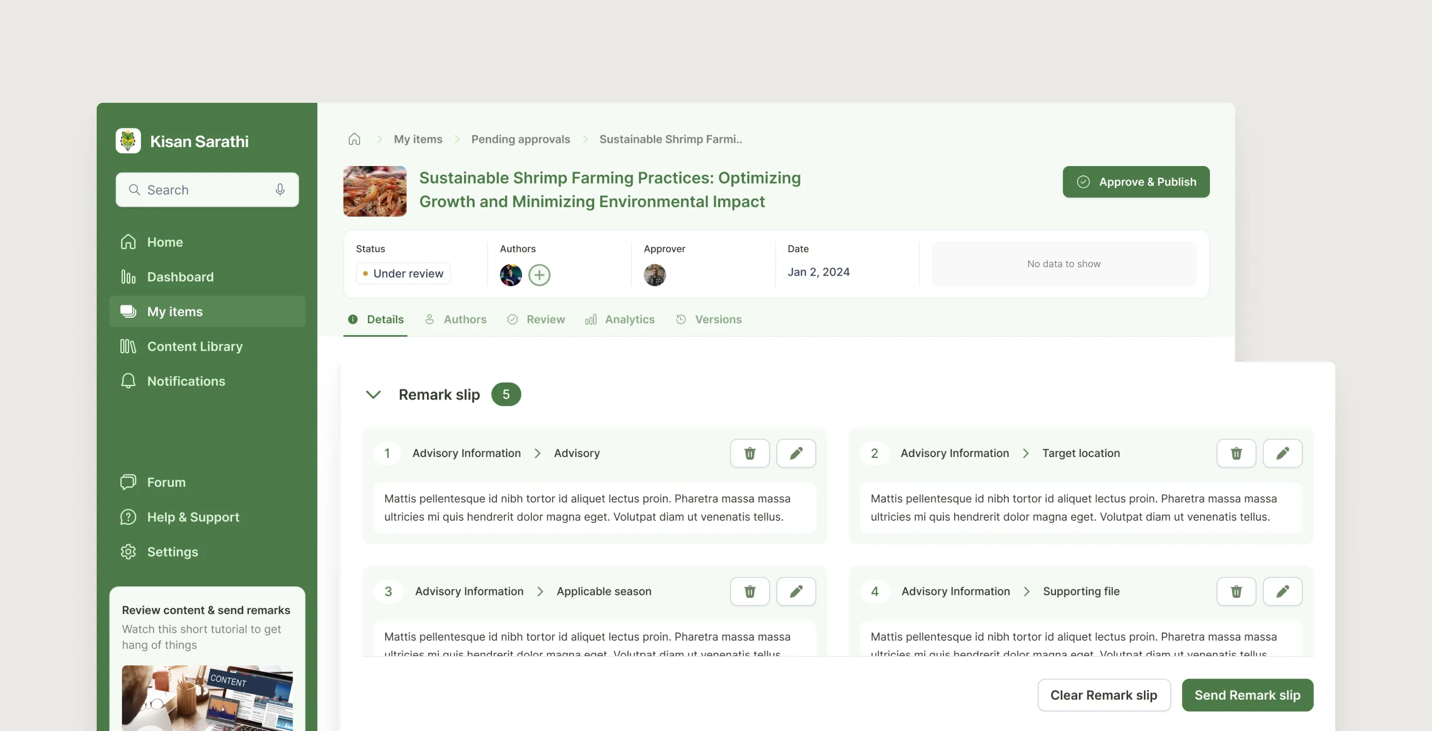
Approval workflows in most platforms feel like a binary: approve or reject, with a text box for comments. That is not how subject experts actually think about feedback. They want to point at a specific claim, explain the issue, and see the creator respond in context.
I designed the review interface around remark slips: the approver clicks on any field and adds a note, which docks at the bottom of the page into a running slip. When sent, it flips the status and notifies the creator. The creator can reply inline before revising. Every exchange gets locked permanently once the advisory is published, creating an audit trail that serves both accountability and future training.
5.2.1
Approver - Review, Remarks & Approve
Loop
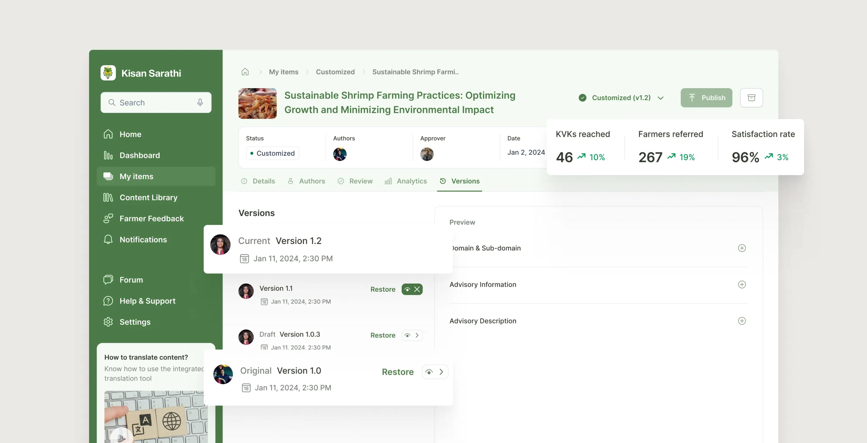
3. Localise without breaking the original
The customizer's job is to adapt an approved advisory for their specific geography. The risk was that heavy editing could corrupt the original research intent, or that different KVKs would diverge so much that conflicting advice went out again through a different route.
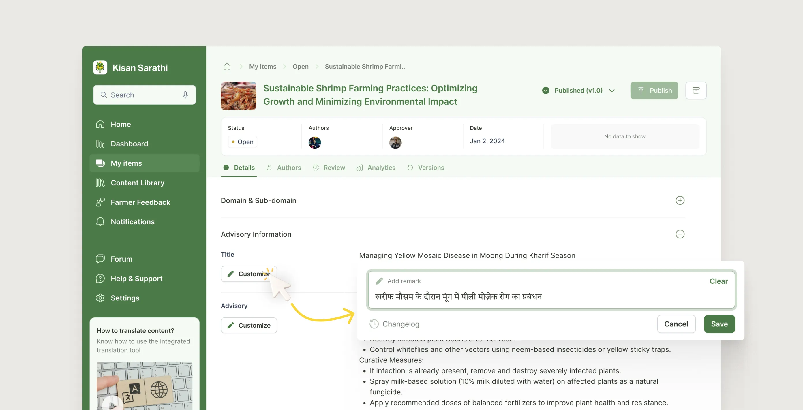
Every field in the customizer view is editable in place, with changes logged instantly in a changelog. Publishing a customised version creates a separate variant. It does not overwrite the original. Approvers can see all variants downstream. Version history lets a customizer restore any earlier state with one click.
5.3.1
Customizer - Cuztomizing by translating to their local language
Image
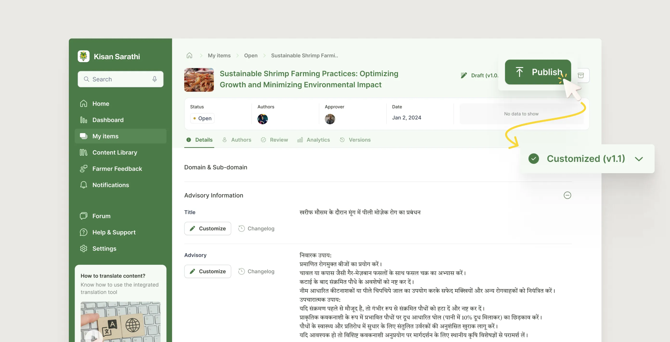
5.3.2
Customizer - Publishes new customized version
Image
5.3.1
Customizer - Cuztomizing by translating to their local language
Image
5.3.2
Customizer - Publishes new customized version
Image
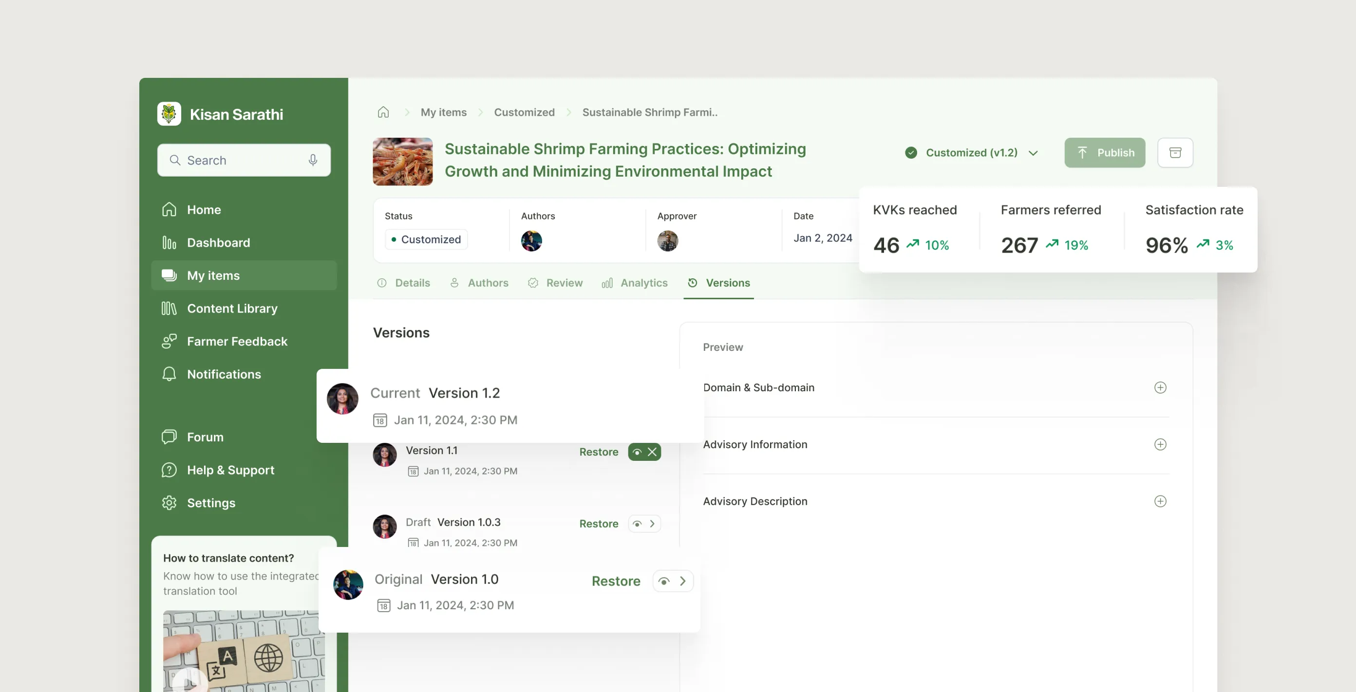
5.3.3
Updated version post publishing customized content
Image
final designs
What each user actually gets
1. For the scientist: a workspace they can trust
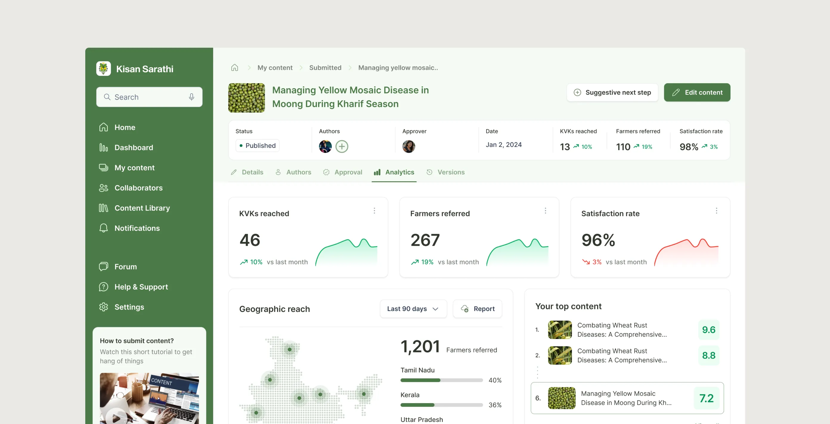
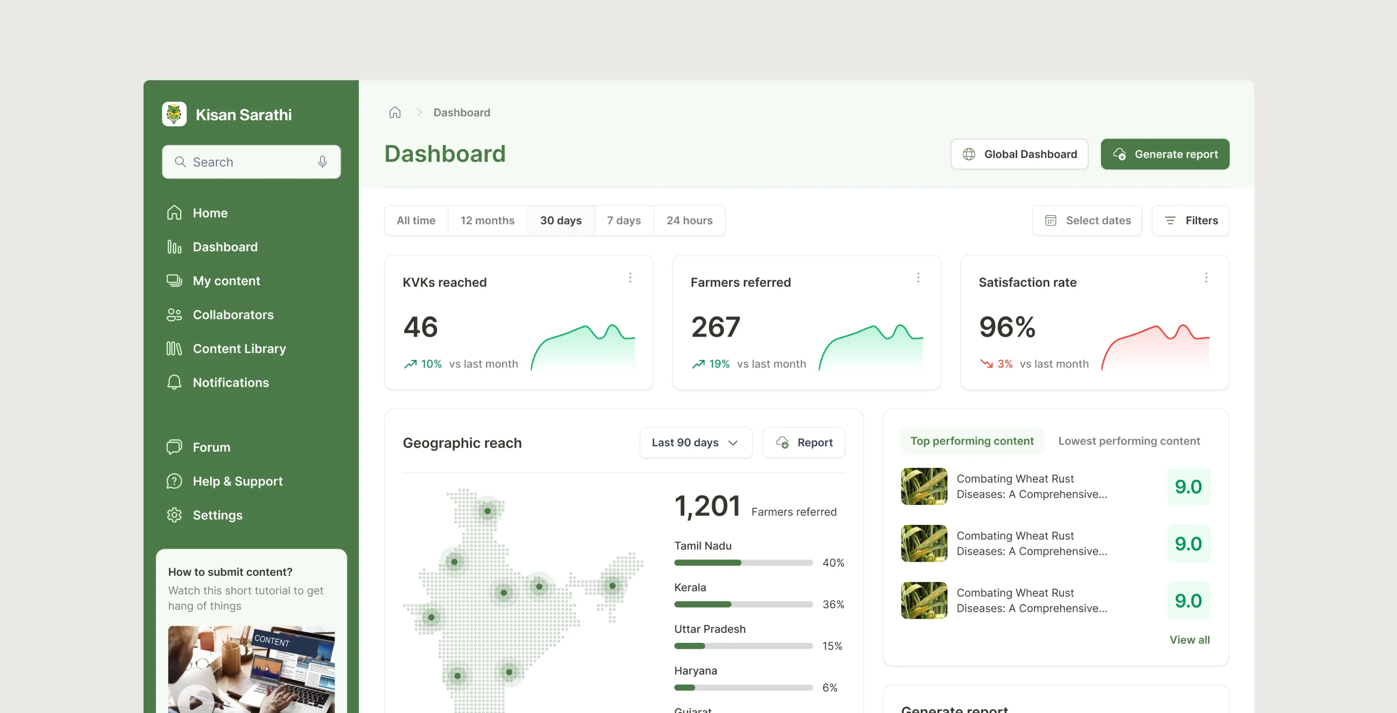
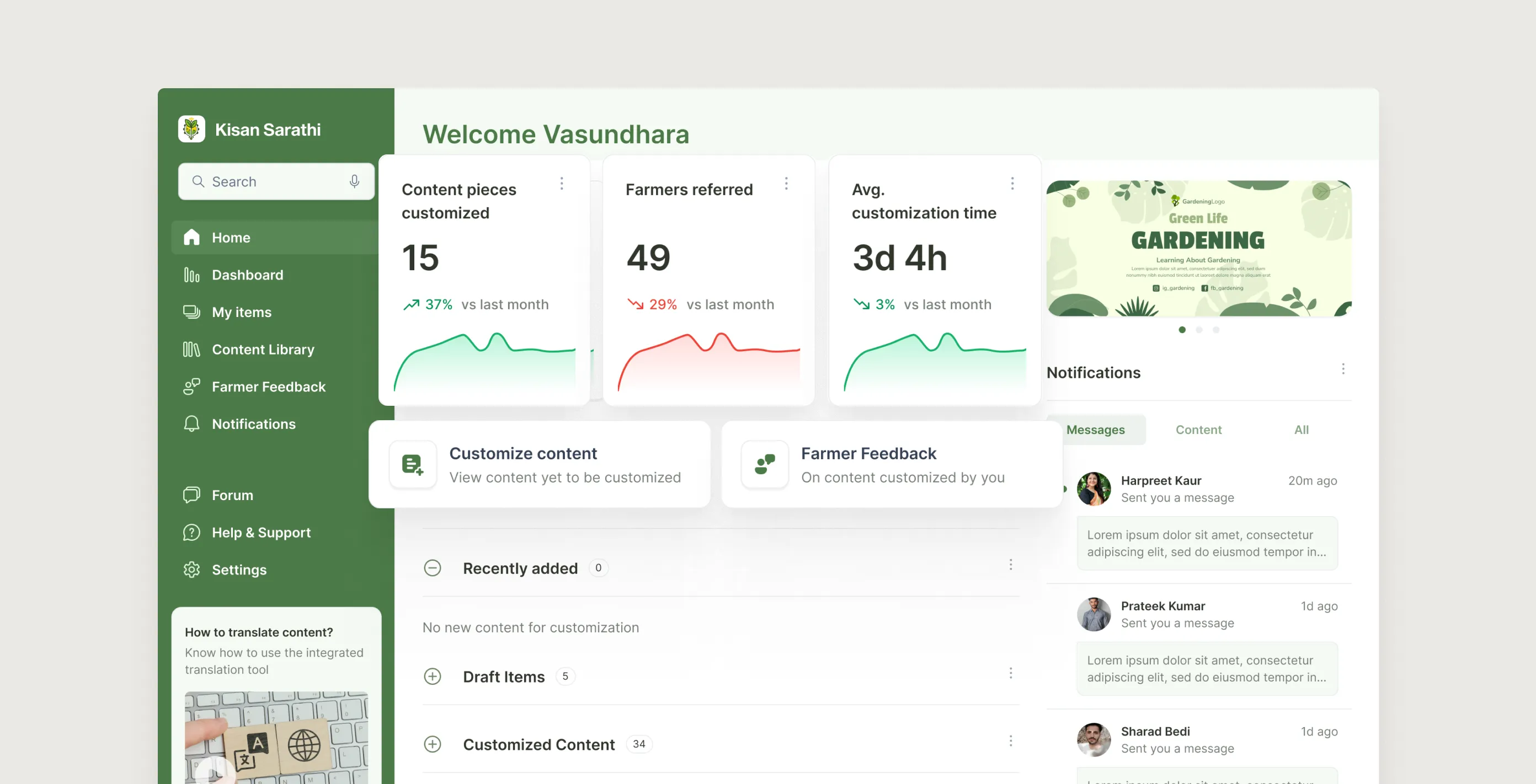
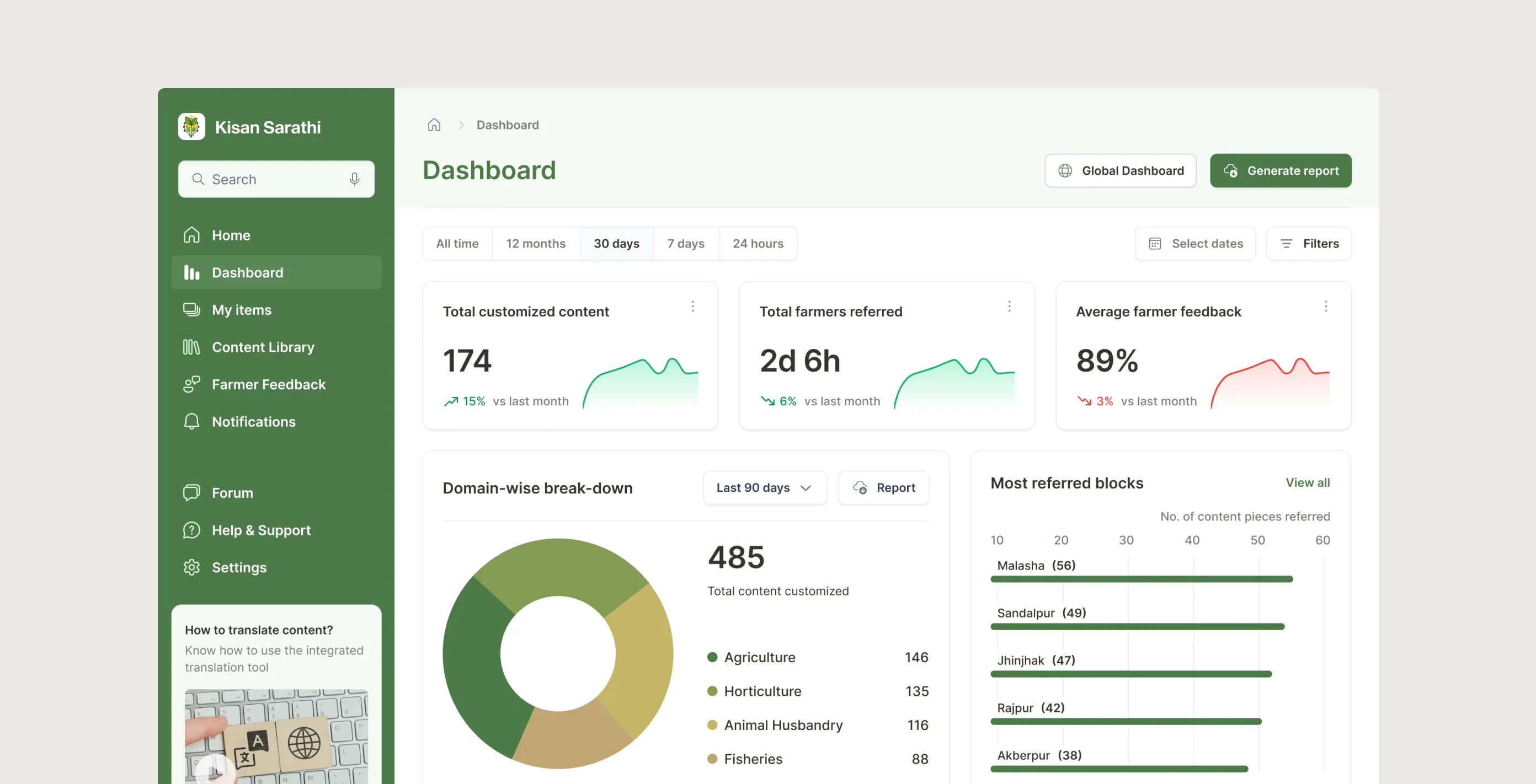
A four-step guided creation flow. Drafts saved automatically. Co-authors added before submission. My Content gives a single organised view of every advisory across five tabs, with voice search, filters, and batch actions. Analytics per advisory shows KVKs reached, farmer referrals, and satisfaction rate. A portfolio-level dashboard aggregates everything with date-range toggles and PDF/CSV export.
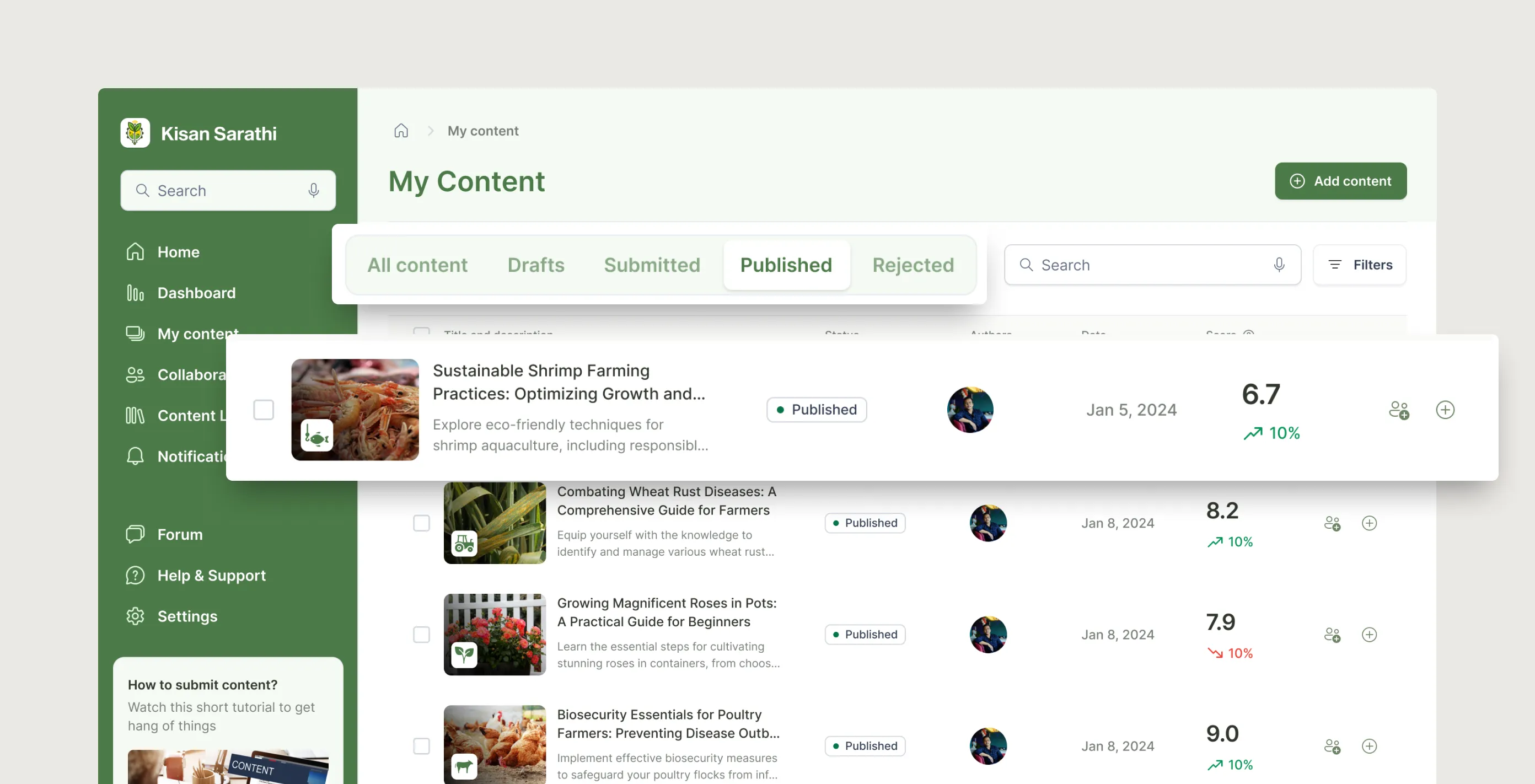
6.1.1
My Content page
Image
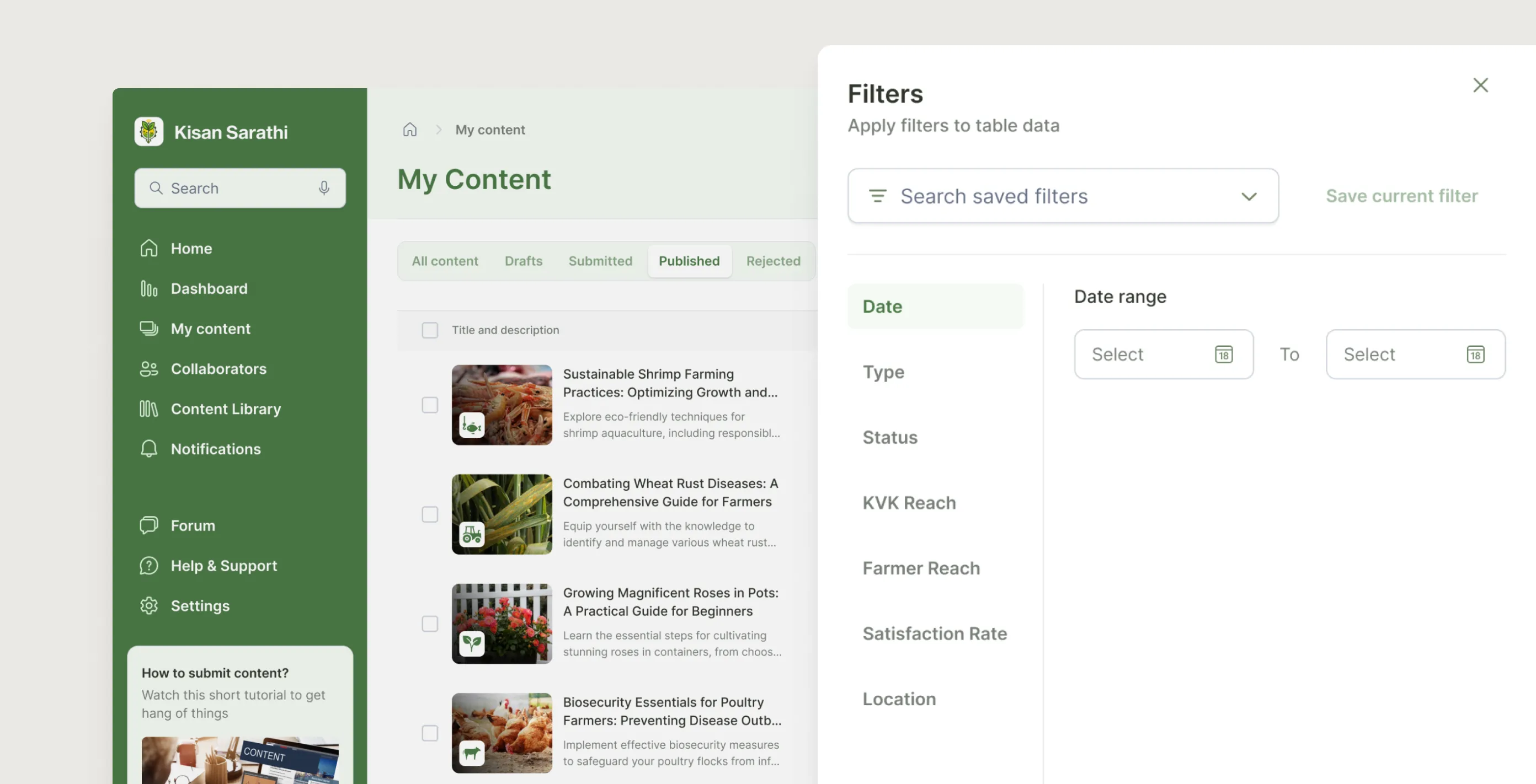
6.1.2
Comprehensive set of filters to filter out the list
Image
6.1.3
Analytics - Content level
Image
6.1.4
Analytics - Dashboard level
Image
6.1.3
Analytics - Content level
Image
6.1.4
Analytics - Dashboard level
Image
2. For the approver: full visibility, structured feedback
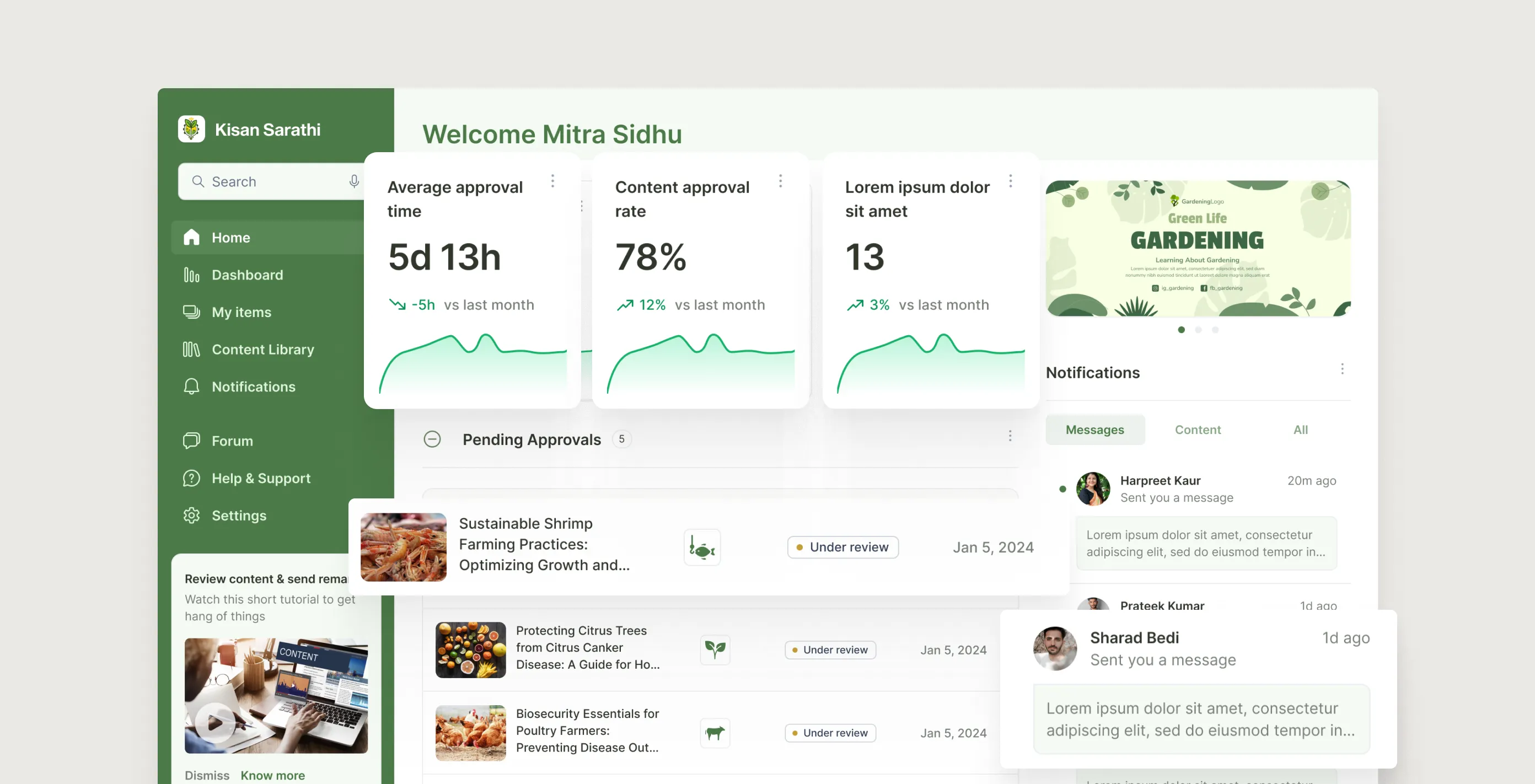
The home screen surfaces pending items, in-progress reviews, and recently closed approvals in one place, nothing disappears into email. A My Items board with four tabs makes the queue scannable. Remarks dock into a structured slip rather than floating as comments. Version history lets the approver compare any resubmission against the current live copy and restore an older version if needed.
6.2.1
Approver's home
Image
6.2.2
Approver consolidating and leaving remarks
Image
6.2.3
Remarks and reply(s) thread
Image
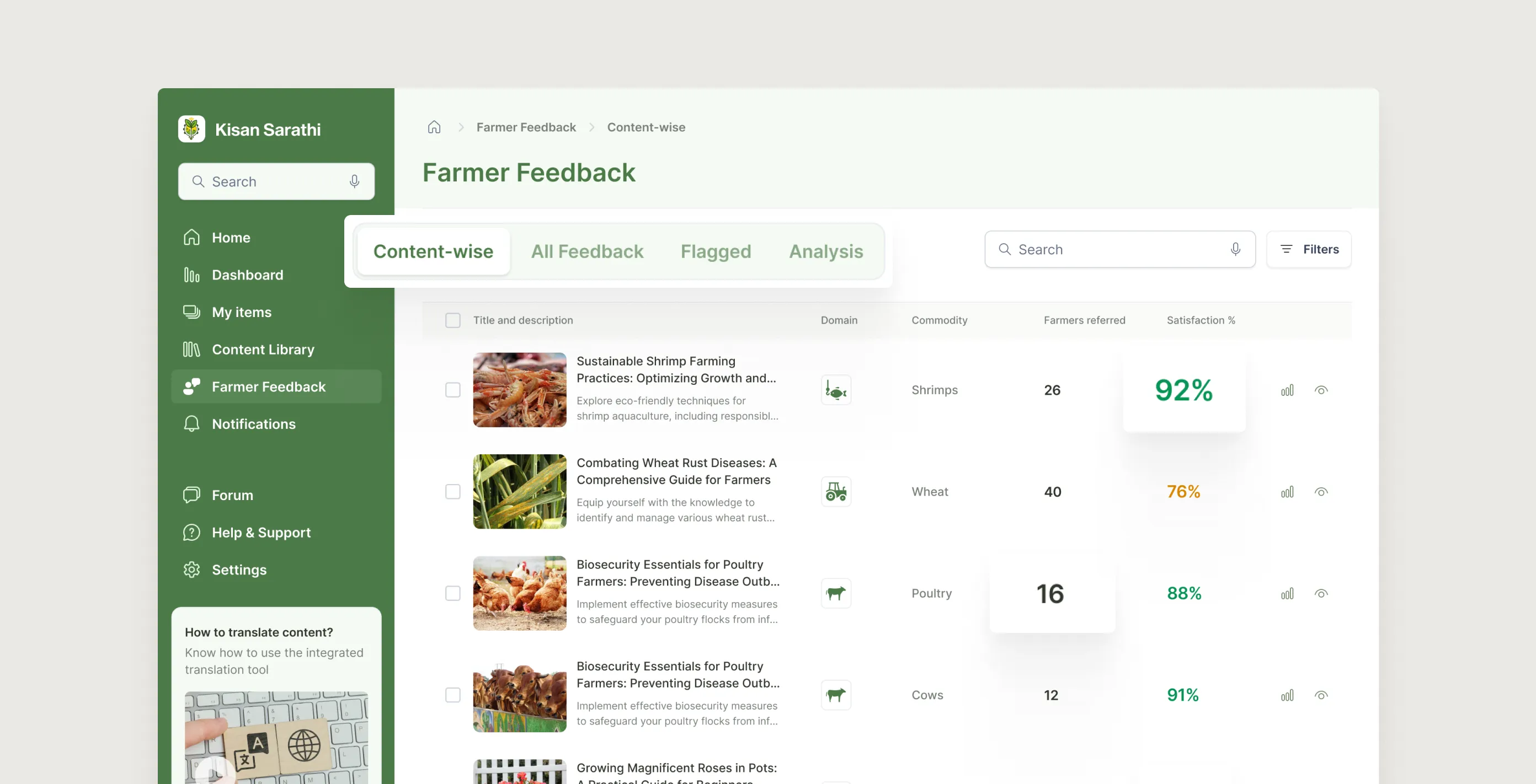
3. For the KVK expert: localise fast, stay grounded
A personal home screen with total items customised, farmers reached, and average turnaround. Content organised into five buckets from New through Archived. The editing view lets them translate, adjust dosages, and add local context in place. Publishing creates a variant without touching the original. Farmer feedback arrives in four views: content-wise, all feedback, flagged, and analysis.
6.3.1
Customizer's home
Image
6.3.2
Customized Content - Versions & Feedback
Image
Since the customizers or the KVK experts are the ones providing the advisories to the end users, the farmers, it is essential to provide them a dedicated space for collecting and viewing farmers' feedback along with analytics. The farmers' feedback page has four views- Content-wise, All Feedback, Flagged, Analysis. They tie real farmer responses to each customised item. Up-votes highlight what resonates; down-votes flag confusing advice; the Flagged tab isolates anything requiring urgent correction before the next advisory push.
6.3.3
Customized Content - Versions & Feedback
Image
6.3.4
Analytics for customizer
Image
4. Connecting everyone: the forum
A discussion board where all three user types can share data, request peer reviews, and coordinate joint advisories. Threads follow the same domain taxonomy as advisories, so conversations stay tied to the content they relate to. Institutional knowledge that used to live in email now lives in the platform.
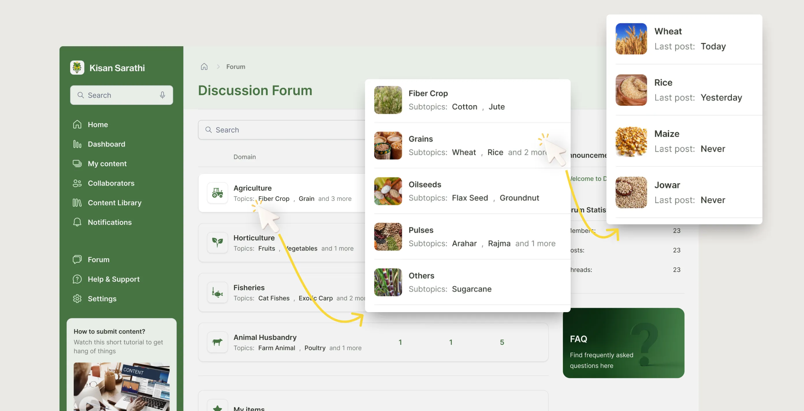
6.4.1
Discussion forum
Image
6.4.2
Forum - Viewing threads
Loop
6.4.3
Forum - Posting new thread
Loop
6.4.2
Forum - Viewing threads
Loop
6.4.3
Forum - Posting new thread
Loop
constraints & trade-offs
What made this harder than it looked.
1. One researcher's view is not a user study
My primary research source was a single ICAR scientist. They were candid and experienced and gave me more useful direction than a survey of fifty people might have. But one perspective has real limits. Scientists at KVKs work differently to those at central institutes. I made design decisions based on the best information I had, knowing the gaps were there.
If I could go back, I would have pushed harder to speak to at least one KVK field worker and one approver directly, even just informally for an hour each.
2. The development team arrived six months after the designs were done
I had been creating dev-ready files based on my assumptions without talking with any developer because there weren't any for this platform at that time. AAMS was a new initiative within NeGD and the development plan had not been prepared in parallel, so an external team was brought in later. By the time they reached out with questions, I could not dedicate meaningful time to the project again.
A design handoff is not just a file transfer. It is a relationship. If the other side does not exist yet, you are handing off into a void.
3. I handed off designs, not a launched product
The project ended at design handoff. I do not know whether AAMS shipped, how many users adopted it, or whether the problems I designed solutions for were actually solved. That uncertainty is uncomfortable to sit with.
It is a reminder that design quality and design impact are not the same thing. The work can be good and still not reach the people it was meant for.
reflection
What I took away.
1. Designing for a chain is harder than designing for a user.
Most of my work before this focused on one user type at a time. AAMS forced me to think differently. Every decision I made for the creator had consequences for the approver. Every choice for the approver had consequences for the customizer. I had to hold three mental models at once and make sure the handoffs between them felt seamless.
That kind of systems thinking is not something you learn from a brief. You learn it by getting it wrong a few times and then working out why.
2. One good conversation beats a prolonged desk research
I did not have a research budget. What I had was an ICAR scientist willing to talk honestly about what was broken. That one conversation gave me more direction than any amount of desk research. All five problems that shaped this case study came from that single interview.
I think a lot about research theatre: surveys sent to large groups, workshops with stakeholders who tell you what they think you want to hear. Sometimes the most useful thing is to find one person who really knows the problem and ask them to walk you through a normal day.