UX4G DESIGN SYSTEM 3.0
A design system
that is
Built to scale. Built to last.
A complete overhaul of UX4G Design System. Moving from a Bootstrap-dependent UI kit to a genuinely scalable, token-based design system built for the complexity of Indian government platforms.
MY ROLE
Lead Designer
TIMELINE
Phase I: Dec 2025 - Ongoing
scope
Foundations + 35 core components + code
CLIENT
UX4G Internal Product
context
UX4G Design System. Why does it exist?
UX4G (User Experience for Government) is India's national design initiative under the Ministry of Electronics and Information Technology (MeitY). Its purpose is to bring consistency, accessibility, and usability standards to government digital products: the portals, apps, and platforms serving over a billion people.
At the core of UX4G is its design system: a shared library of foundations, components, and guidelines that government teams can use to build faster, more consistently, and without reinventing decisions that have already been made.
The design system has gone through multiple versions. 1.0 was essentially Bootstrap with a government coat of paint. 2.0 was a more deliberate effort, with a Figma library and more considered visual direction. 3.0 is what this case study is about.


the history
1.0, 2.0, and the gap between ambition and depth.
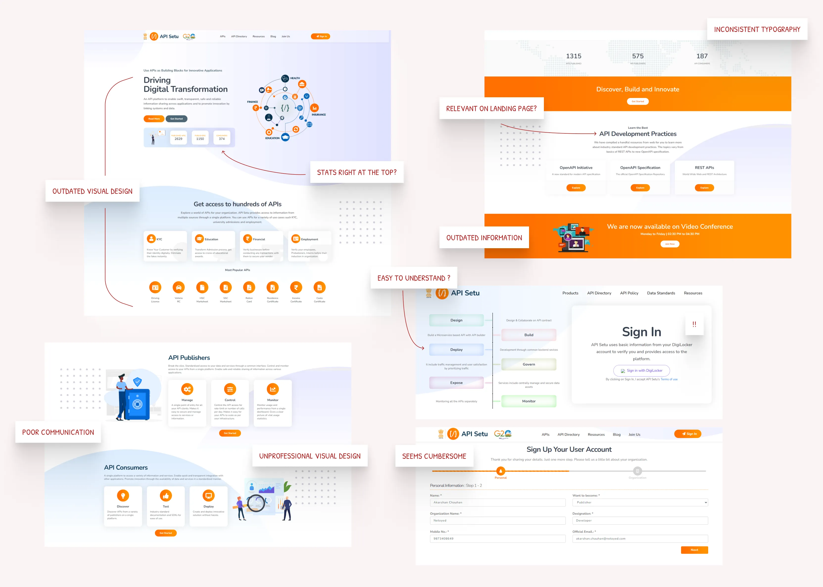
It's important to be fair about 2.0. In the context of Indian government digital products, it was a genuine step forward. A Figma component library, a more cohesive visual language, a publicly available resource that teams could reference. For an ecosystem where most government platforms had no design coherence at all, that mattered.
But 2.0 had limits that became harder to ignore the more you worked with it.
1. The Figma library was heavily Material Design-inspired
Any designer familiar with Material UI would recognise the components immediately. They weren't adapted for the specific context of Indian government platforms, which have different information densities, different user demographics, and different trust and credibility requirements.
2. The code was Bootstrap, and had been since 1.0
Using the UX4G design system essentially meant using Bootstrap. That made it easy to implement for developers who already knew Bootstrap, but it also meant the system had no identity of its own in the codebase. There were no proper design tokens, no custom theming architecture, no real separation between the design system and the framework it was built on.
3. Component coverage was shallow
The components that existed were basic. The range of states, variants, and use cases covered was limited. Across 100+ government platforms, teams were constantly customising, detaching, and improvising because the system didn't go deep enough to cover what they actually needed.
4. It was not scalable across India's platform diversity
Government platforms in India vary enormously: in complexity, in the populations they serve, in the languages they operate in, in the frameworks their development teams use. A design system meant to serve all of them needs to be flexible, well-tokenised, and deeply documented. 2.0 was none of those things.
the turning point
A global moment that put us in the spotlight.
In August 2025, the US appointed the co-founder of Airbnb as its first Chief Design Officer, tasked with overhauling 26,000 federal websites. The story travelled fast. In design communities across India, it sparked a natural comparison: the US is making this a headline priority, what does India have?
The answer was UX4G Design System. And for the first time, it was getting read by people who were looking critically at it rather than just celebrating its existence. A Substack article titled 'a design system for 1.4 billion people?' asked directly why government platforms still felt broken if comprehensive design guidelines already existed. On LinkedIn, designers started comparing the UX4G design system to GOV.UK design system and USWDS, which was a useful but uncomfortable benchmark.
The traction was real. The attention was welcome. But it also made the shortcomings visible in a way they hadn't been before. Inside the team, we knew usage of 2.0 had been mostly in conversation and presentations, not in actual implementation. That gap between visibility and adoption was the signal we needed to take seriously.
3.1
Zoom meetings with stakeholders
Image
3.2
Products benchmarked
Image
3.3
Comprehensive UX audit of the existing product
Image
Beyond fixing problems, my aim was to elevate API Setu to meet modern expectations and reinforce its role as a credible government platform.
process
Starting from experience
3.0 began with a decision to stop patching what existed and start from scratch, grounded in what we actually knew.
Between our team, we had designed or consulted on over 100 government platforms since UX4G's early days. That meant we had seen, firsthand, where the old system held up and where it fell apart. We had collected years of instances where teams detached components, invented their own patterns, or simply abandoned the design system because it didn't cover their use case.
That accumulated experience was our primary input. Real project files from real platforms.
The component workflow
For every component we designed, we followed the same sequence. First, we pulled examples of that component from actual projects across our portfolio and put them on a shared page. This gave us a picture of how the component was actually being used in the wild: what states people needed, what variations had been improvised, what patterns kept repeating.
From that, we identified the patterns worth standardising. We defined the variants and properties in Figma, then documented the component fully in our internal documentation site. Before moving to development, the team reviewed the documentation page to catch anything missing. Only after sign-off did it go to the developers.
The team was in the room for every major decision
This wasn't a solo project. At every significant decision point, including something as specific as the default primary and secondary brand colours for the design system, the whole team was consulted. Everyone had worked on government platforms. Everyone had opinions, frustrations, and preferences that were worth hearing. Getting that input before locking a decision was slower, but it meant the decisions stuck.
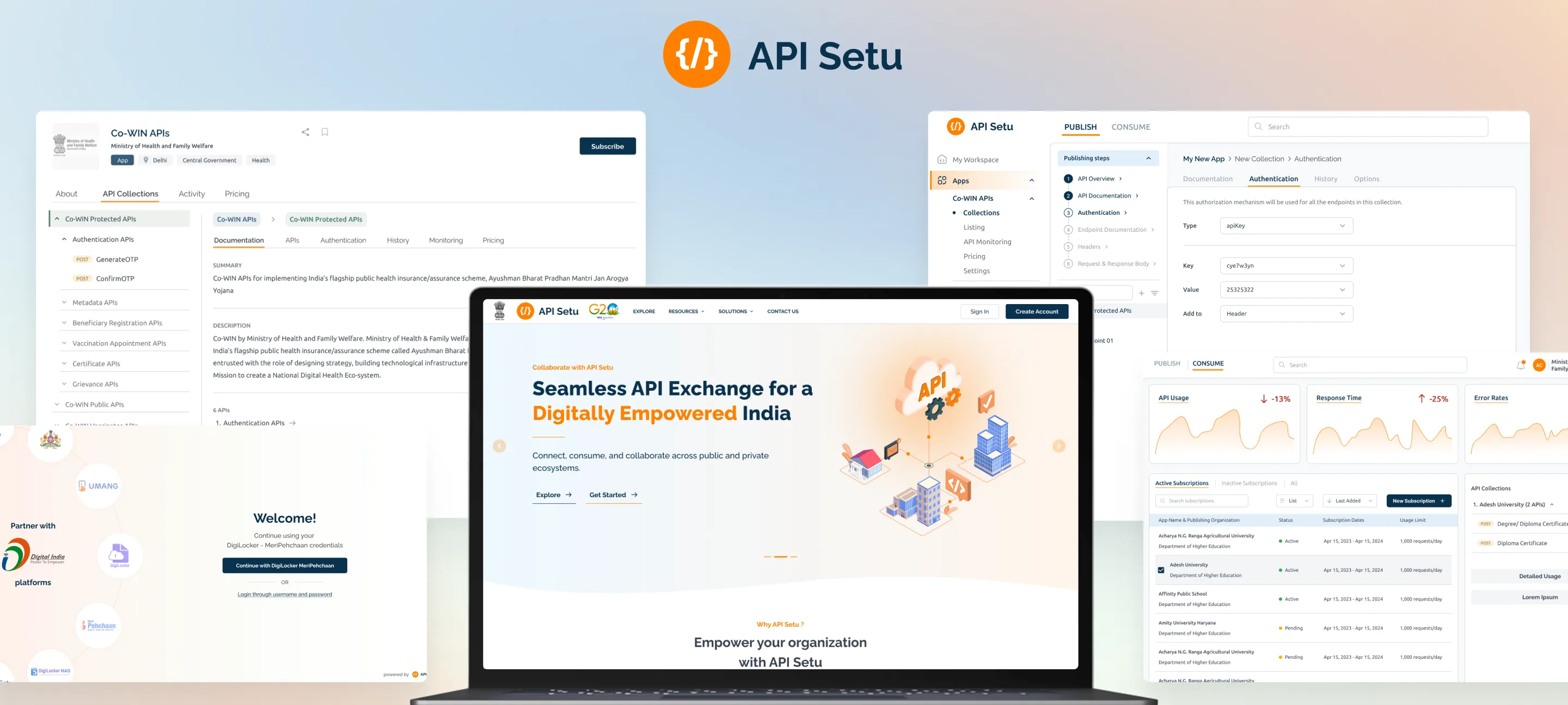
1. What should a government API platform look like?
The old homepage was too casual. The obvious fix was to go corporate and clean. But that felt wrong too. API Setu needed to feel like somewhere worth being, not just somewhere official. It needed to attract developers who had platforms like Postman as their reference points.
4.1.1
Existing website analysis
Images
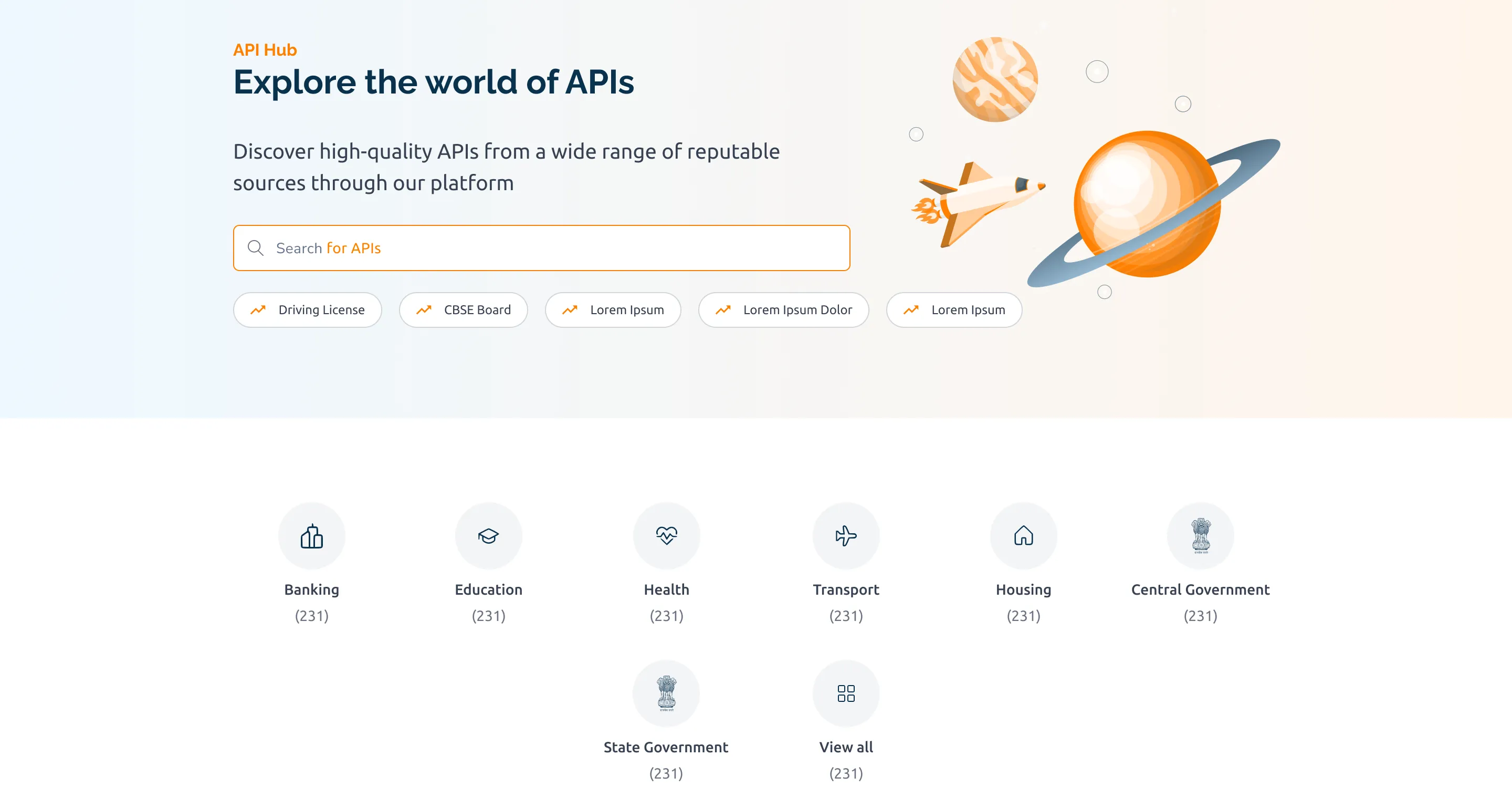
I explored a few directions before landing on a space exploration theme. APIs as navigating a digital universe. It sounds abstract but it worked. It gave the platform ambition and personality while staying within government design guidelines.
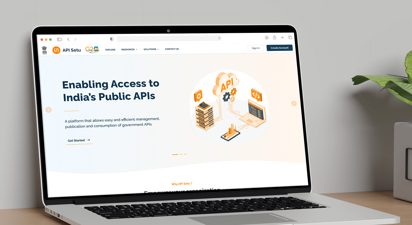
4.1.2
Redesigned hero section on the landing page
Image
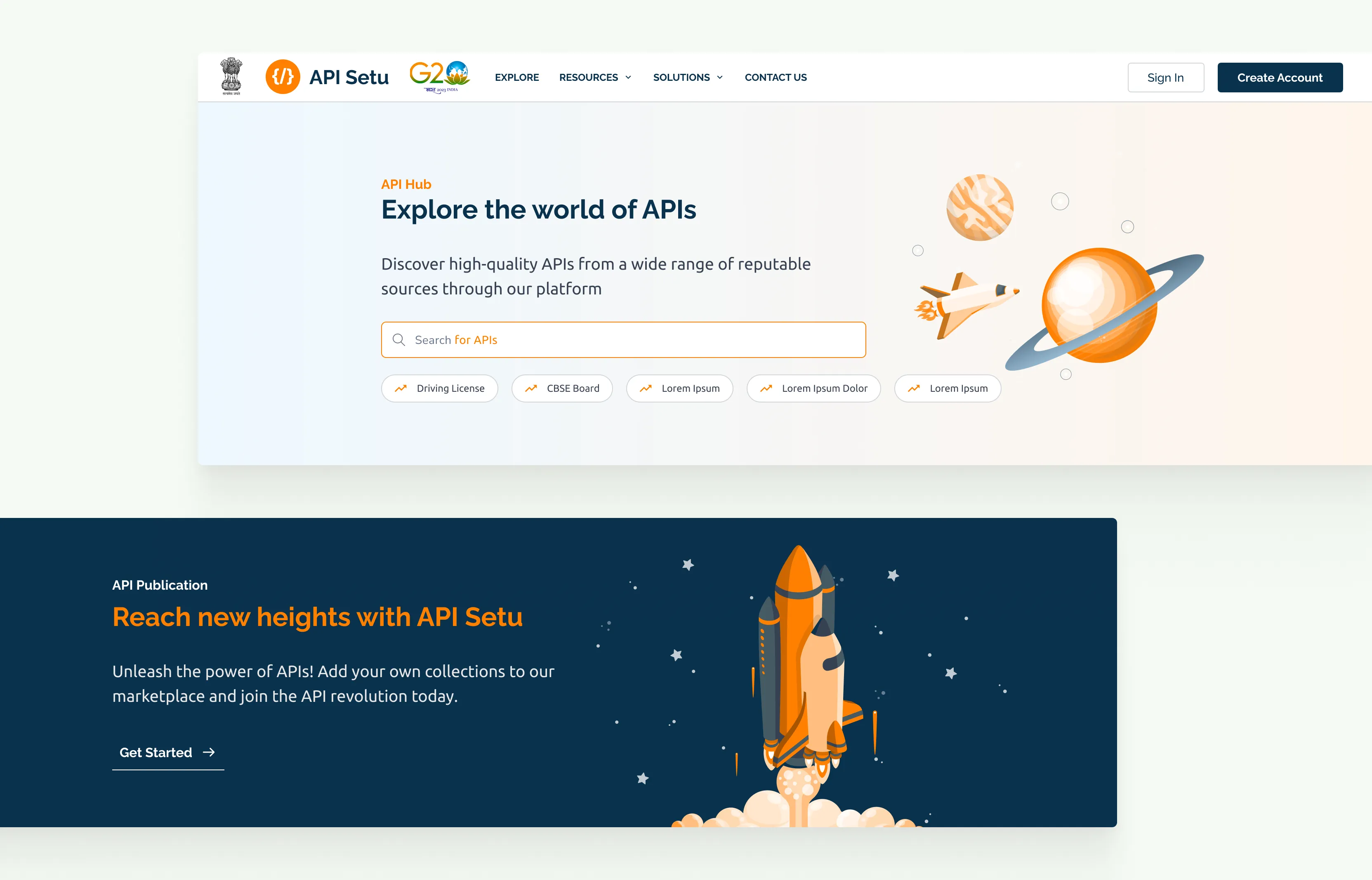
4.1.3
Space exploration theme
Images
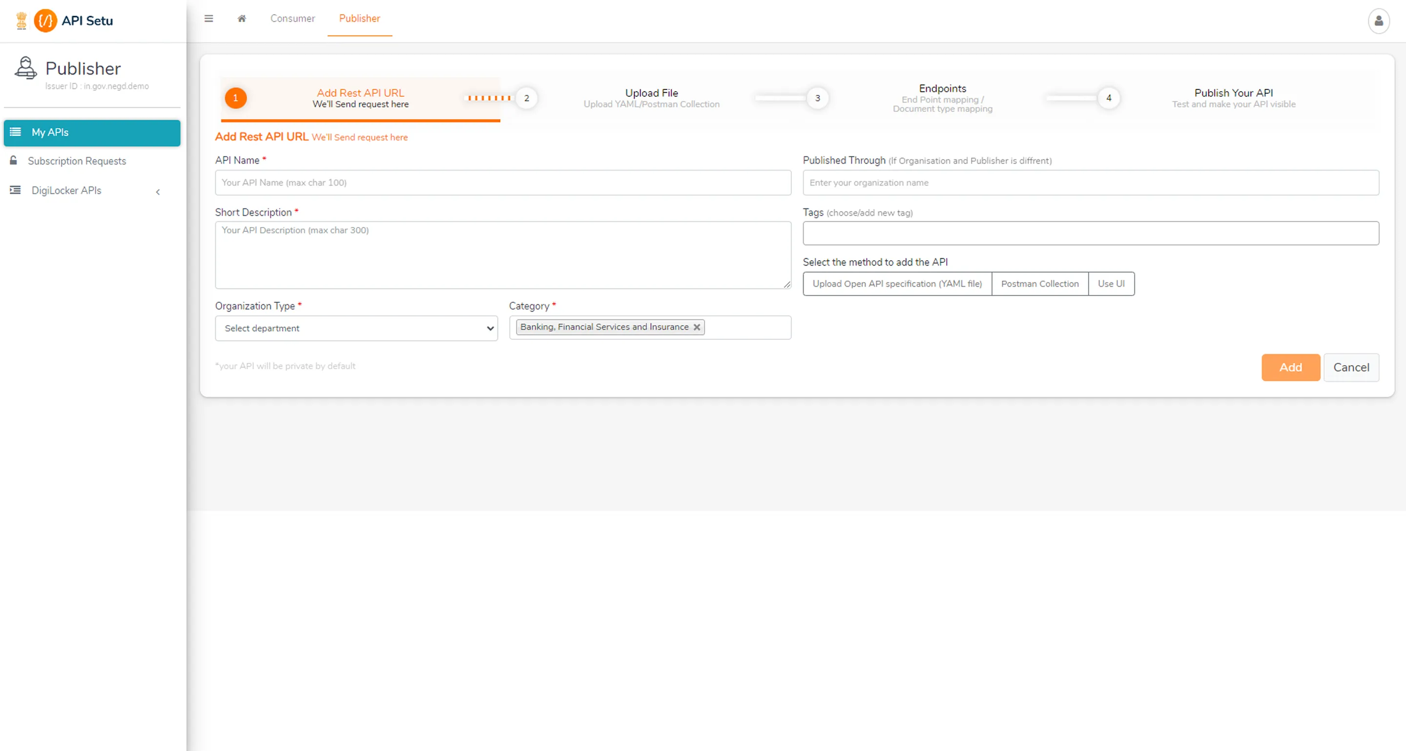
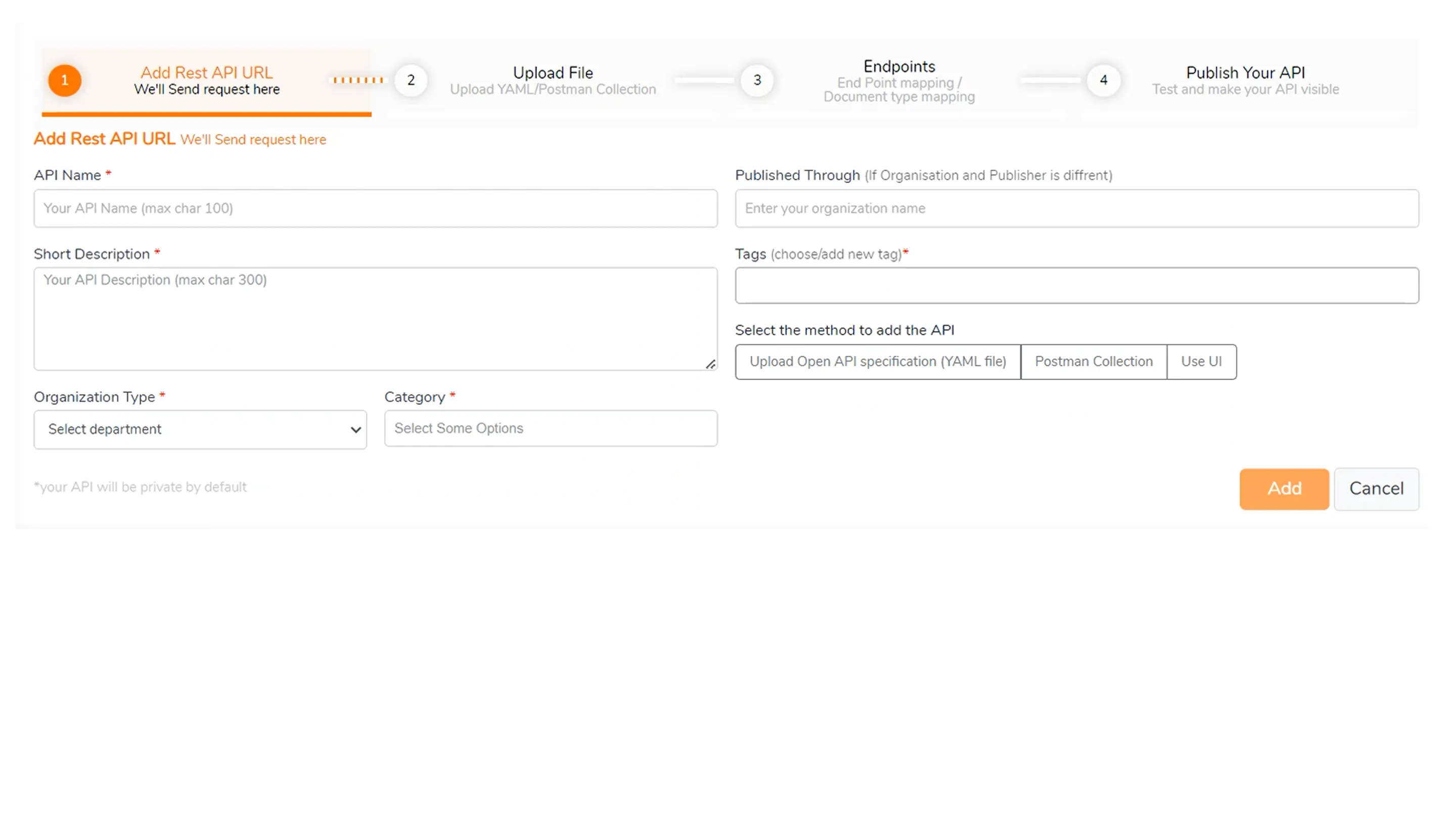
2. Rethinking the API publishing flow
The old publishing flow had one mode: forward. Step 1, step 2, step 3, no going back. The moment I reframed the question from 'how do we fix the steps' to 'how do we make this feel like a workspace', everything changed.
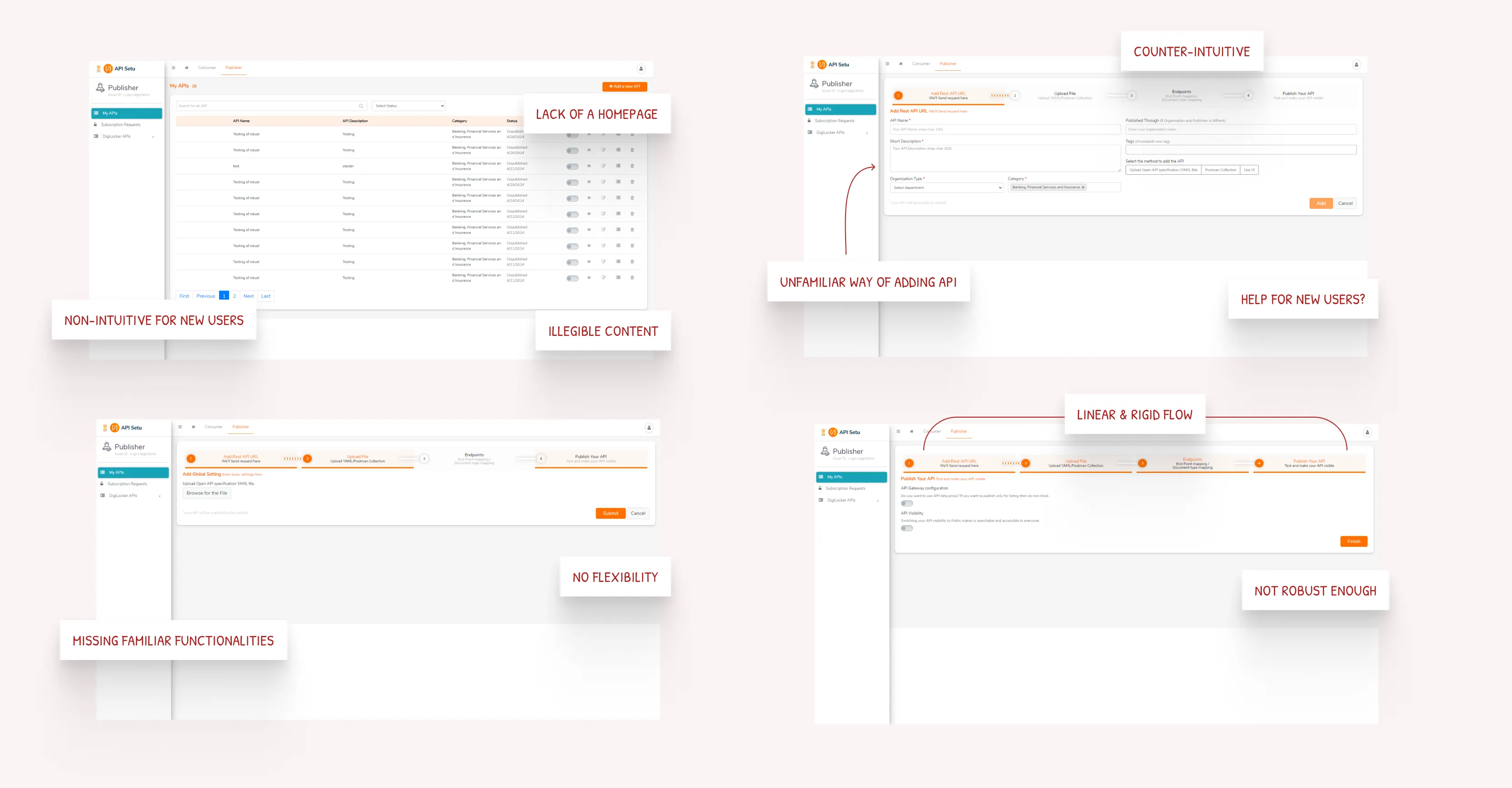
4.2.1
Existing API Publisher's flow analysis
Images
The question wasn't "how do we fix these steps in the publishing flow", it was "how do we give developers the feeling of a workspace rather than a form."
That reframe changed everything: collapsible nav, a persistent preview pane, inline docs, jump-to-any-step freedom. Developers could move the way they actually think, not the way a form tells them to.
4.2.2
Publishing flow exploration
Images
4.2.3
API publishing - before & after
Slider
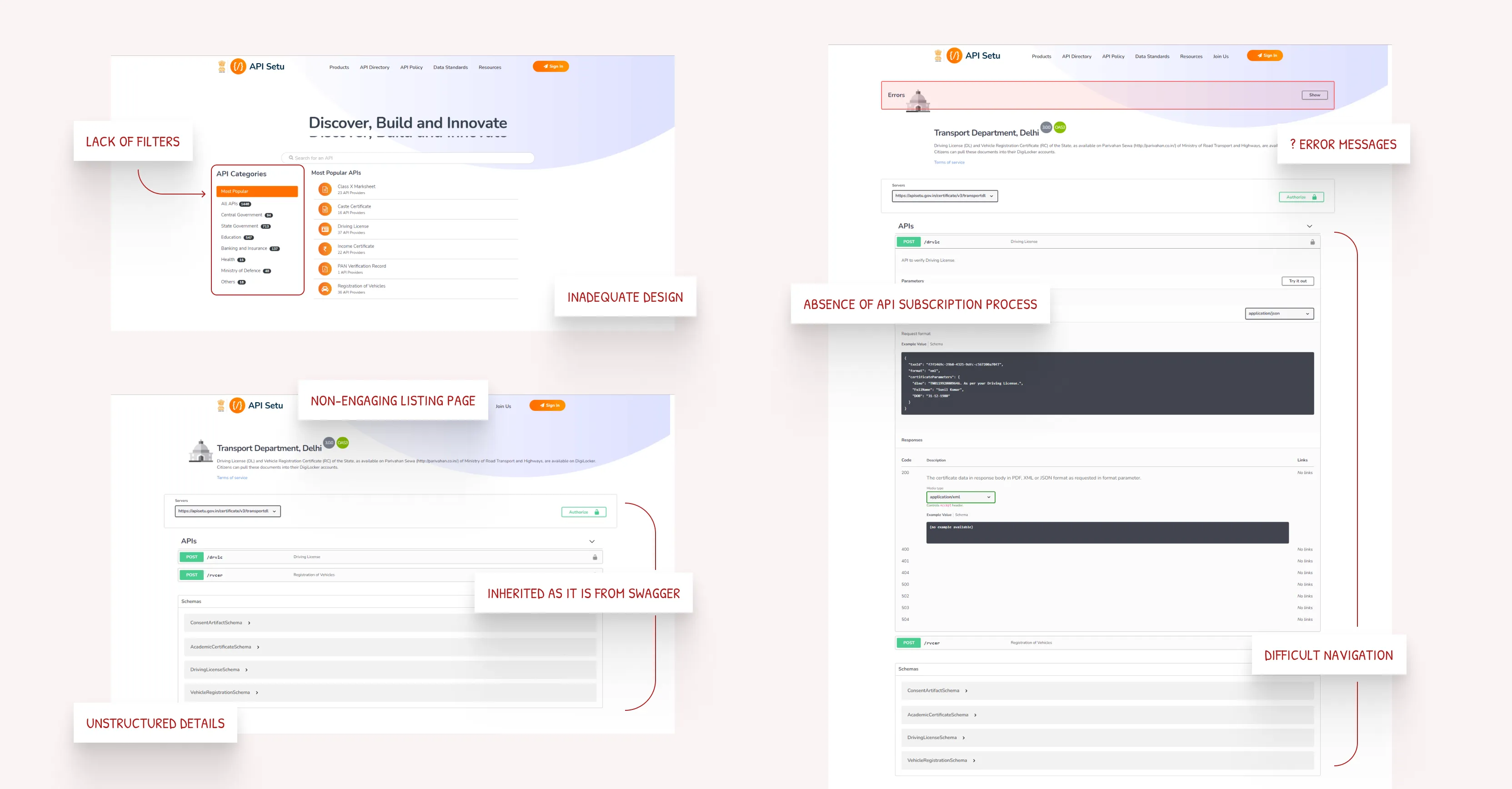
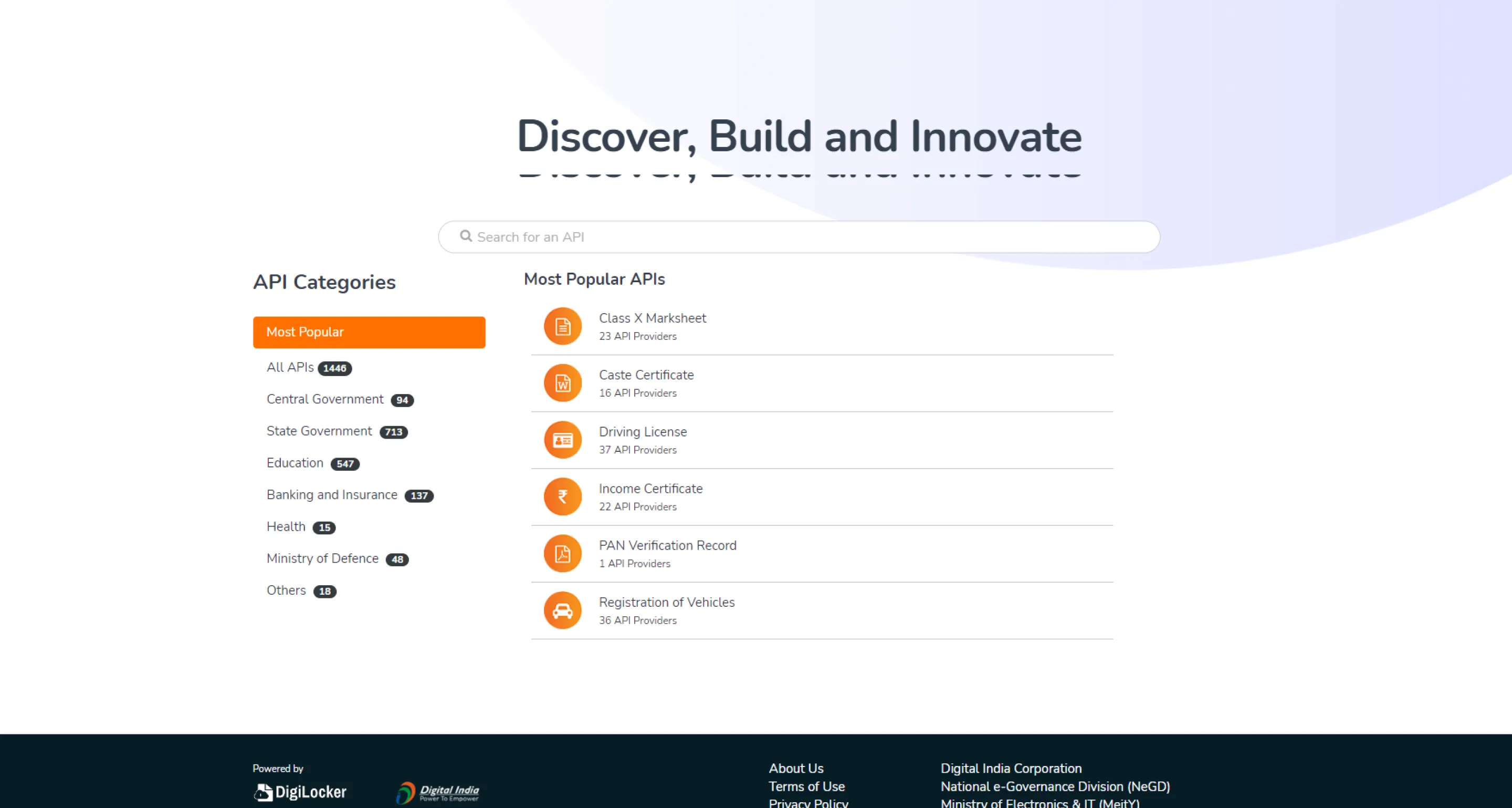
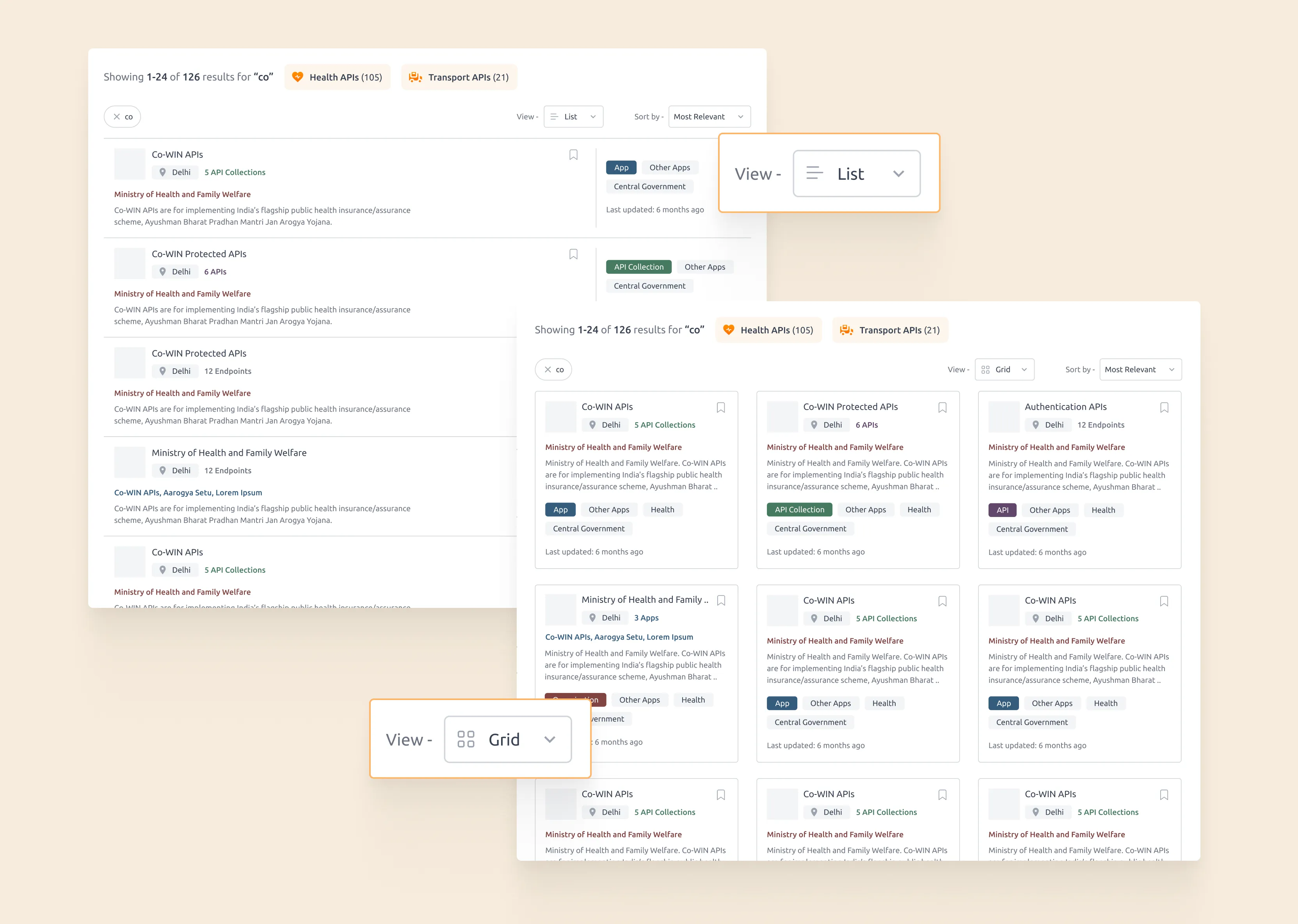
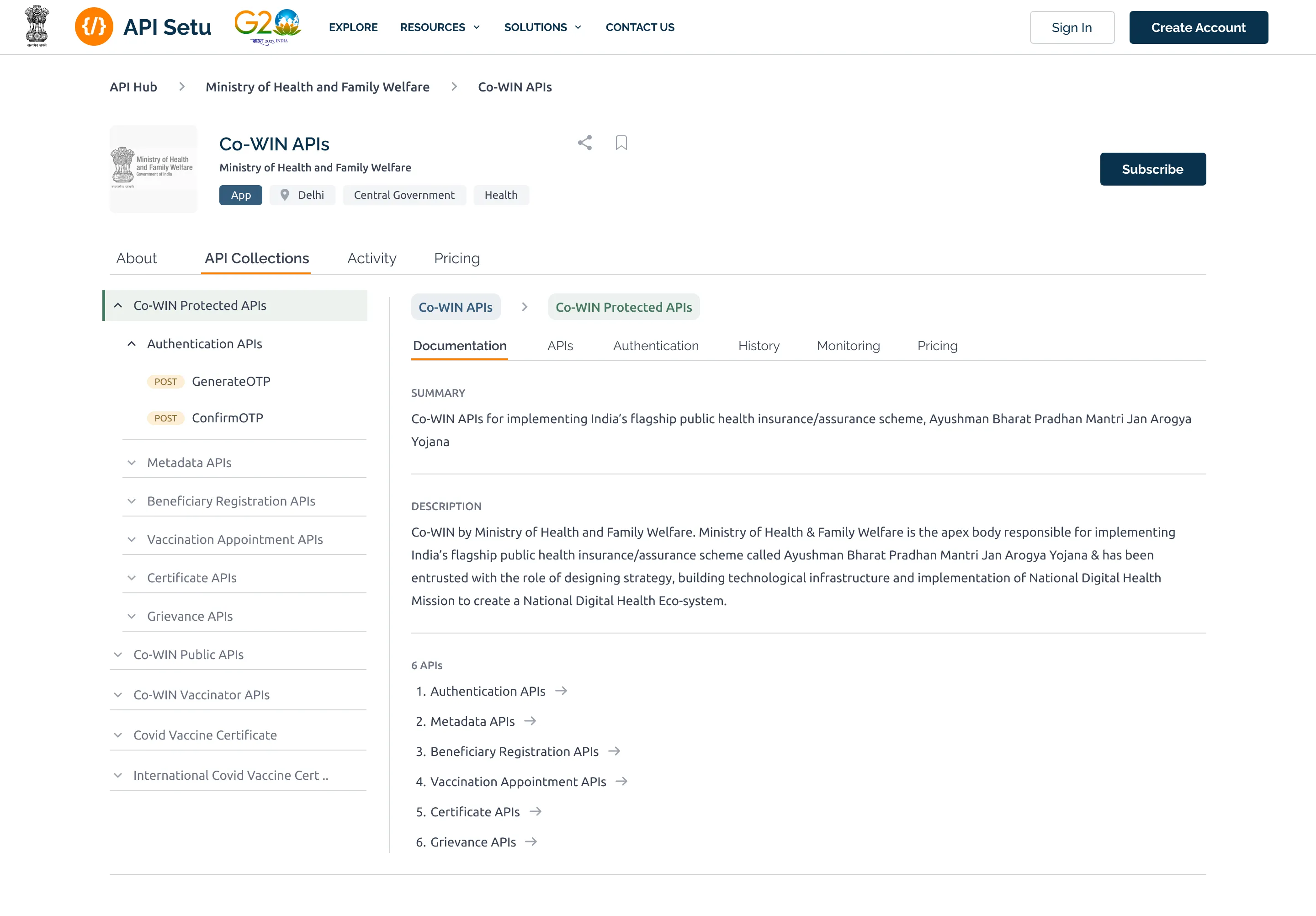
3. Making API discovery actually work
The old API directory was a wall of text. No filters, no categories, no context. You had to already know what you were looking for.
4.3.1
Analysis of existing API directory and listing pages
Images
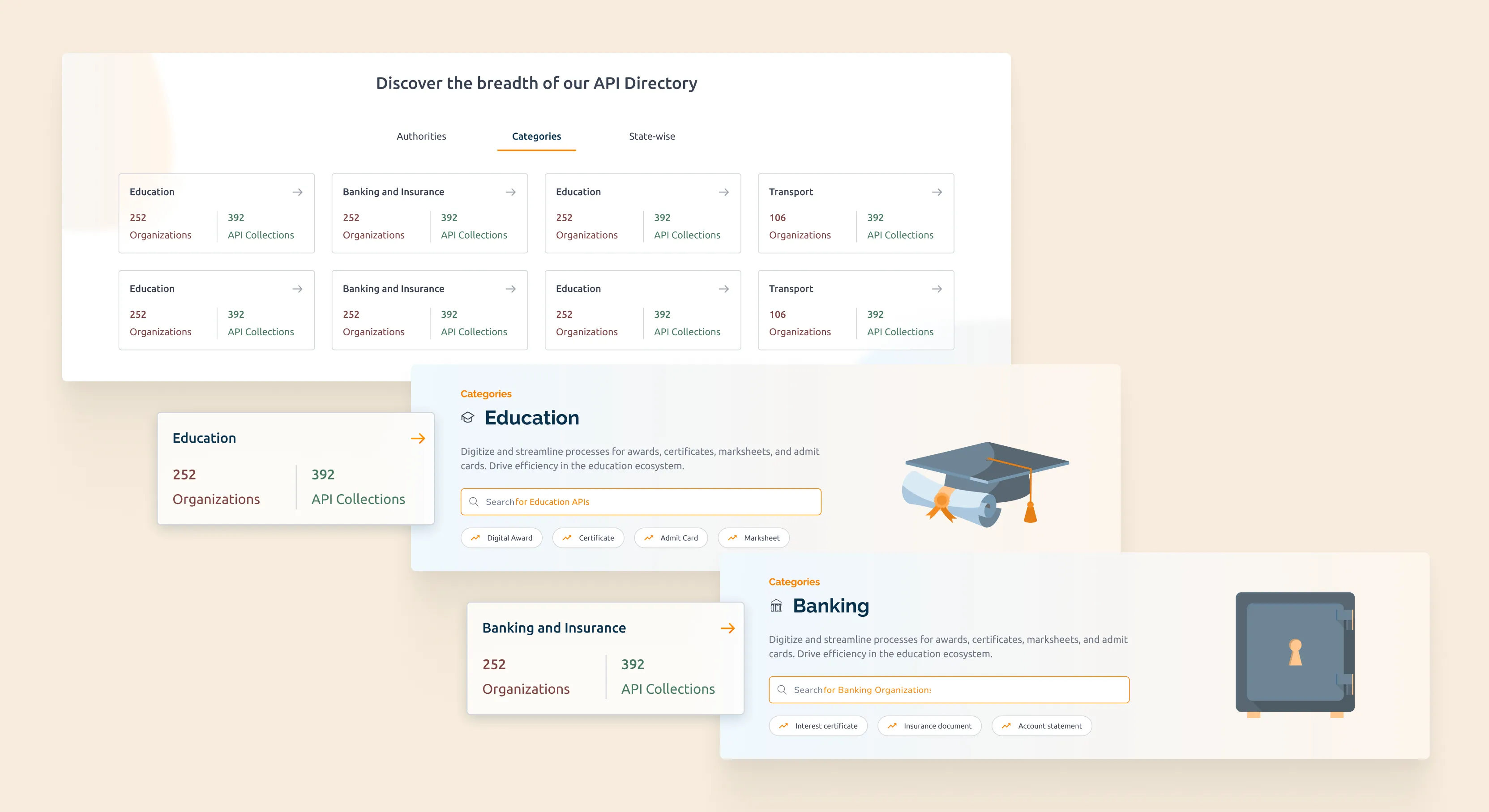
I redesigned it around browsing: structured categories, keyword and criteria filtering, list and grid views, and a basket model so users could shortlist multiple APIs and subscribe in one go. It went from transactional to actually explorable.
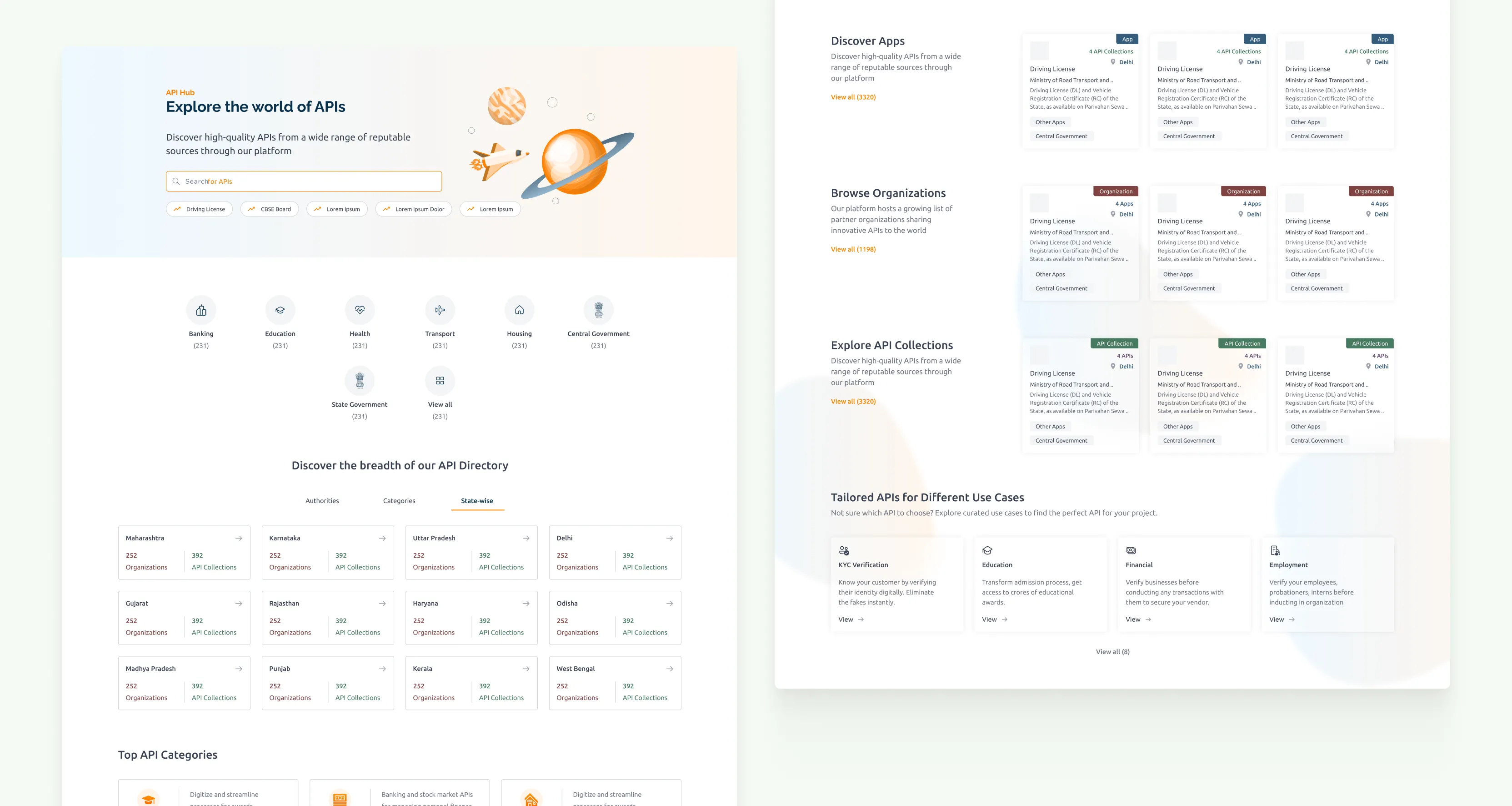
4.3.2
Reimagined API directory page
Images
4.3.3
Redesigned API search and listing page
Images
final designs
Four areas transformed, end to end.
1. Website & Onboarding
New homepage, new visual identity, new sign-up flow. The partner onboarding process was rebuilt so organisations understood what they were getting into before being asked to do anything. Step-by-step, no clutter, no guesswork.
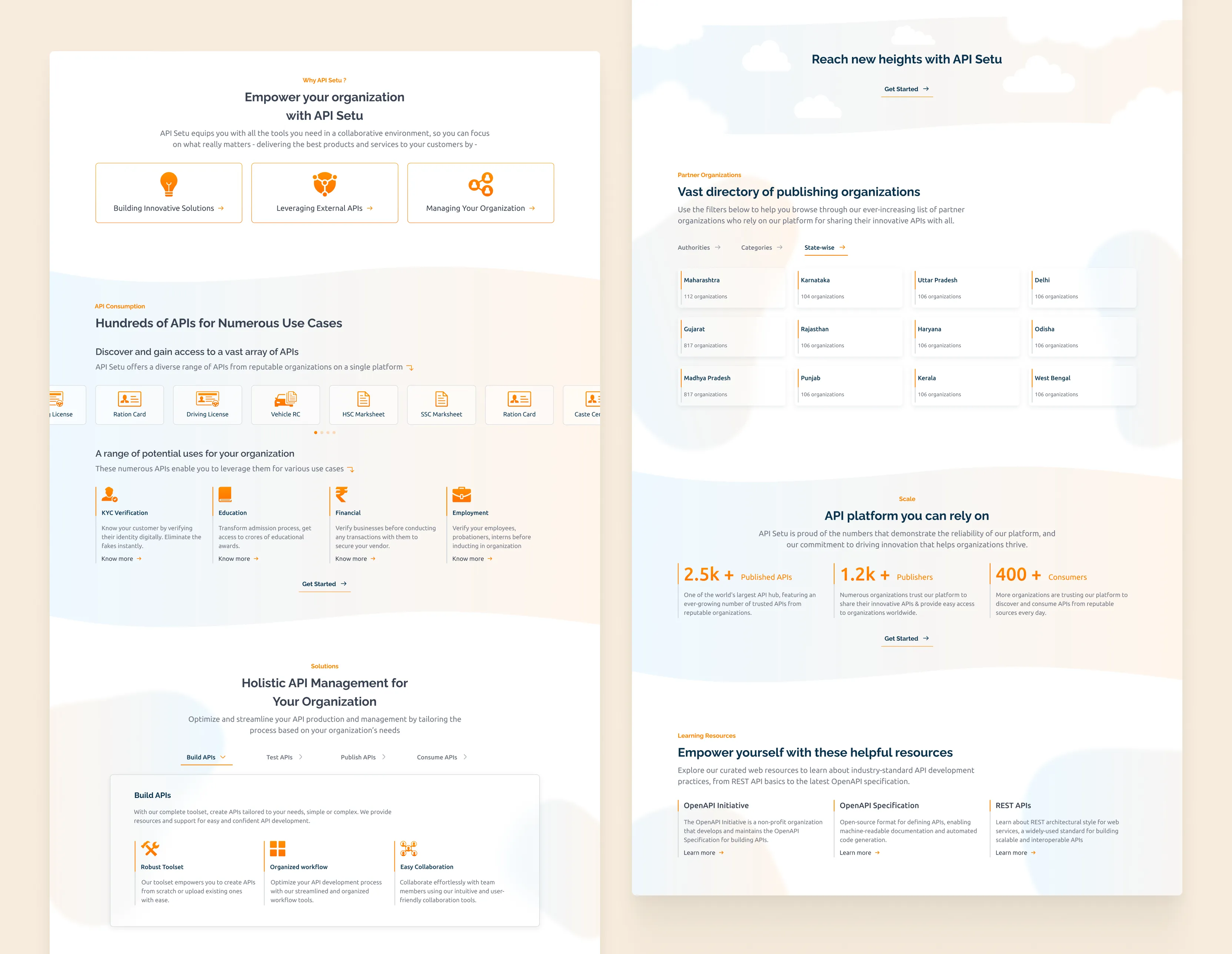
5.1.1
Redesigned homepage zoomed out
Images

5.1.2
Consistent visual design adopted for other pages in the website
Images
I explored different directions for the sign-in/up flow. The visual language of these screens would determine the direction that the entire product would take, so I presented various options to the stakeholders for their review.
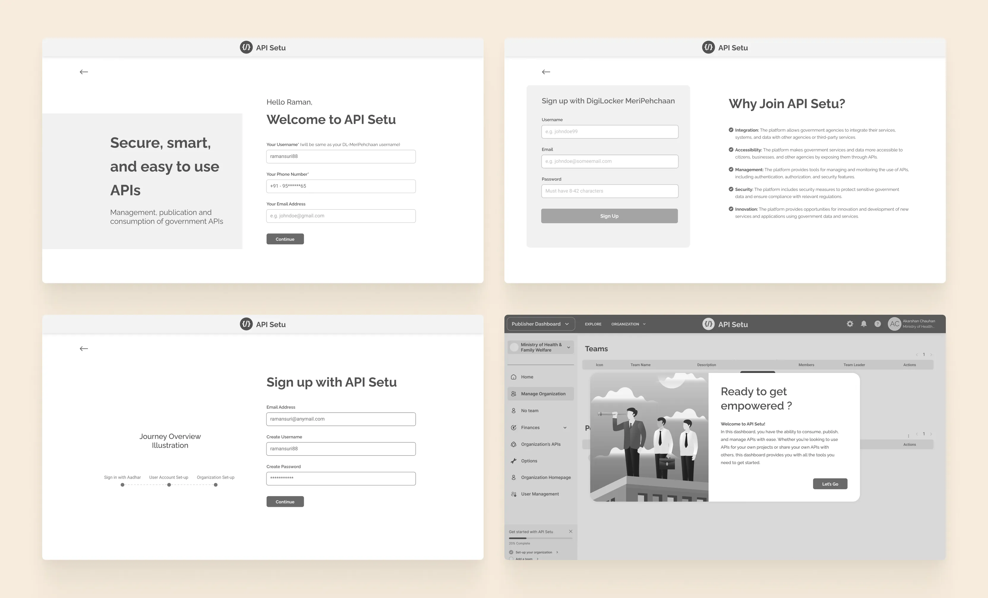
5.1.3
Explorations for sign-in/up page
Images
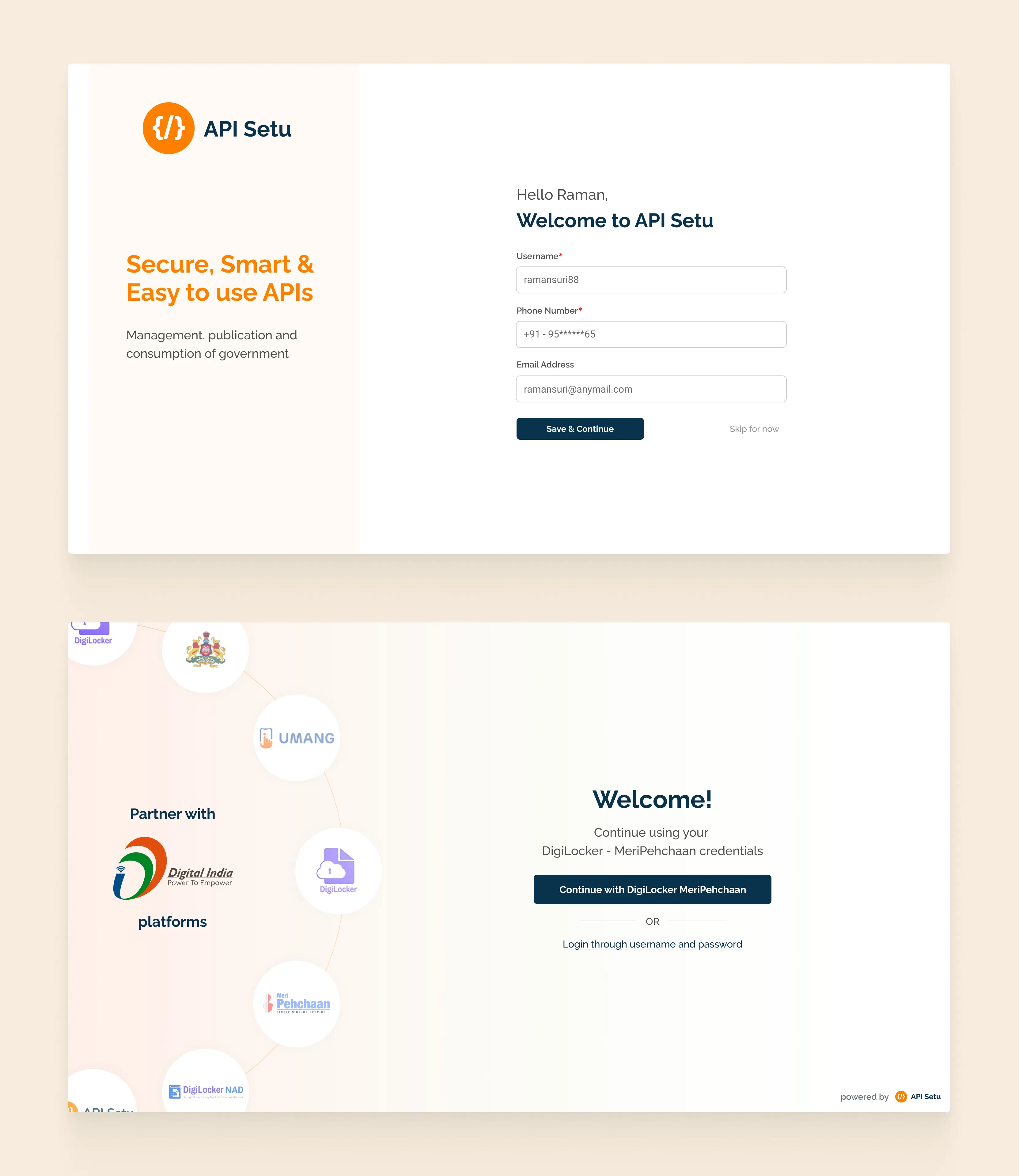
5.1.4
Reimagined onboarding for citizens and partners
Images
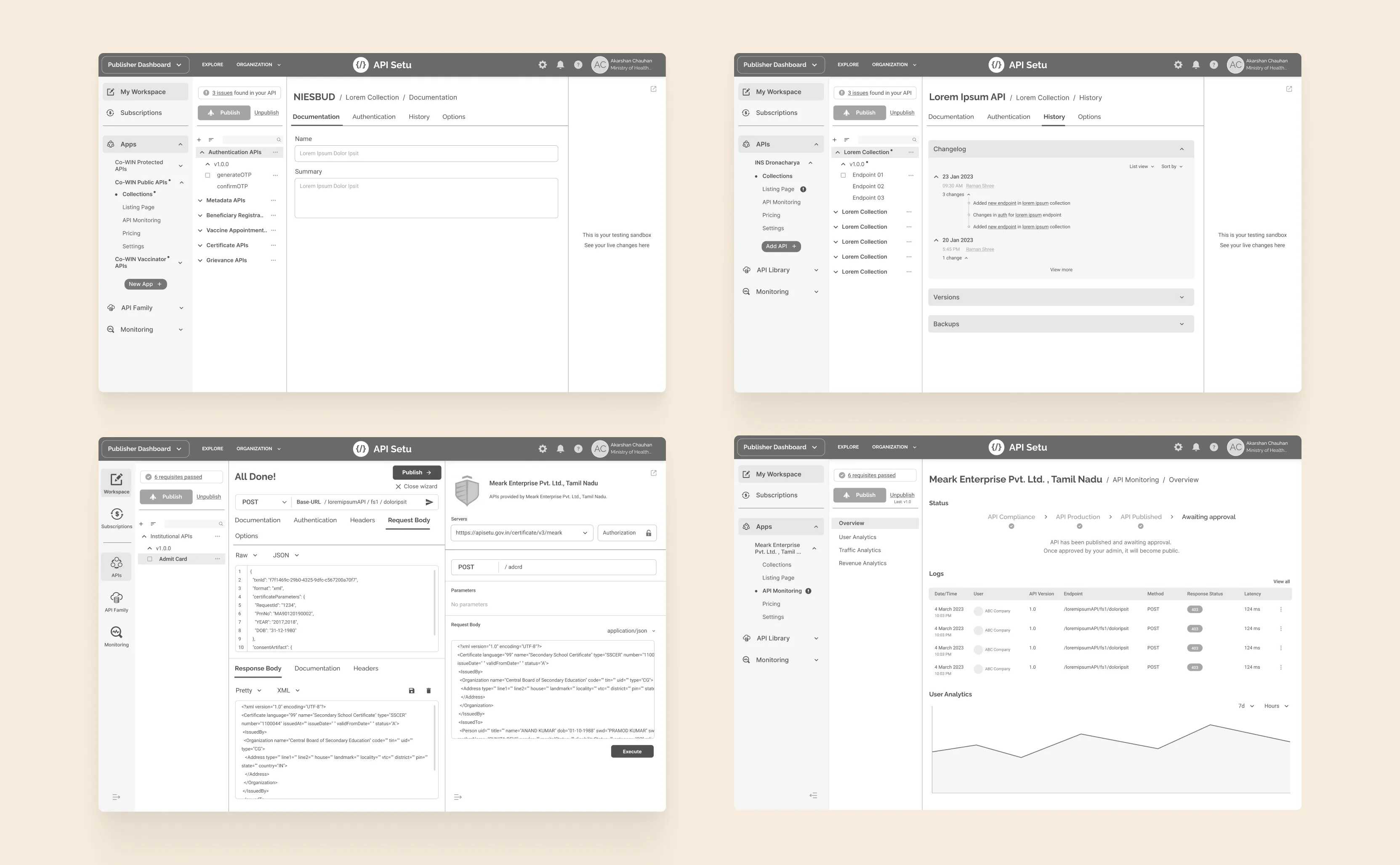
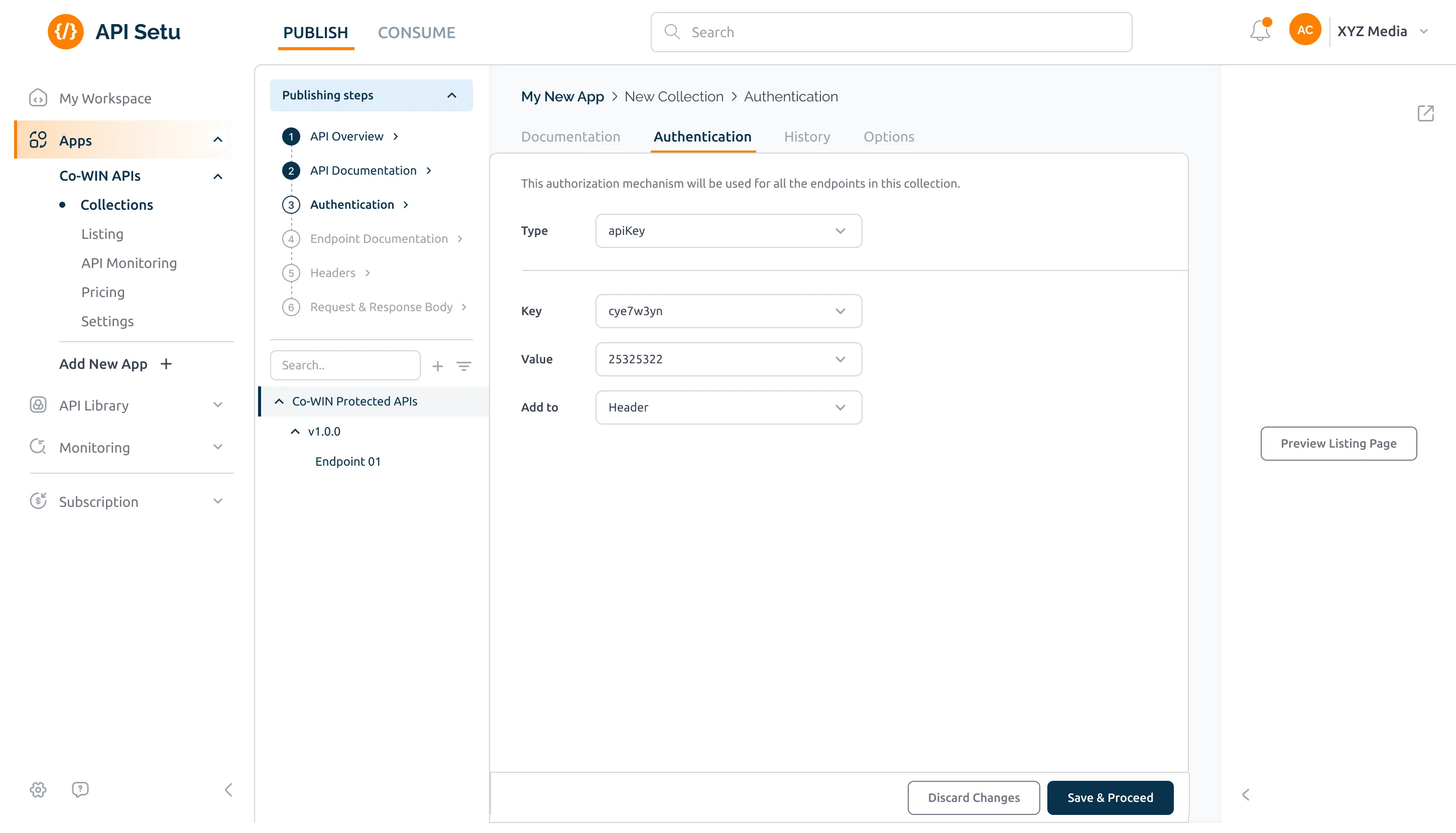
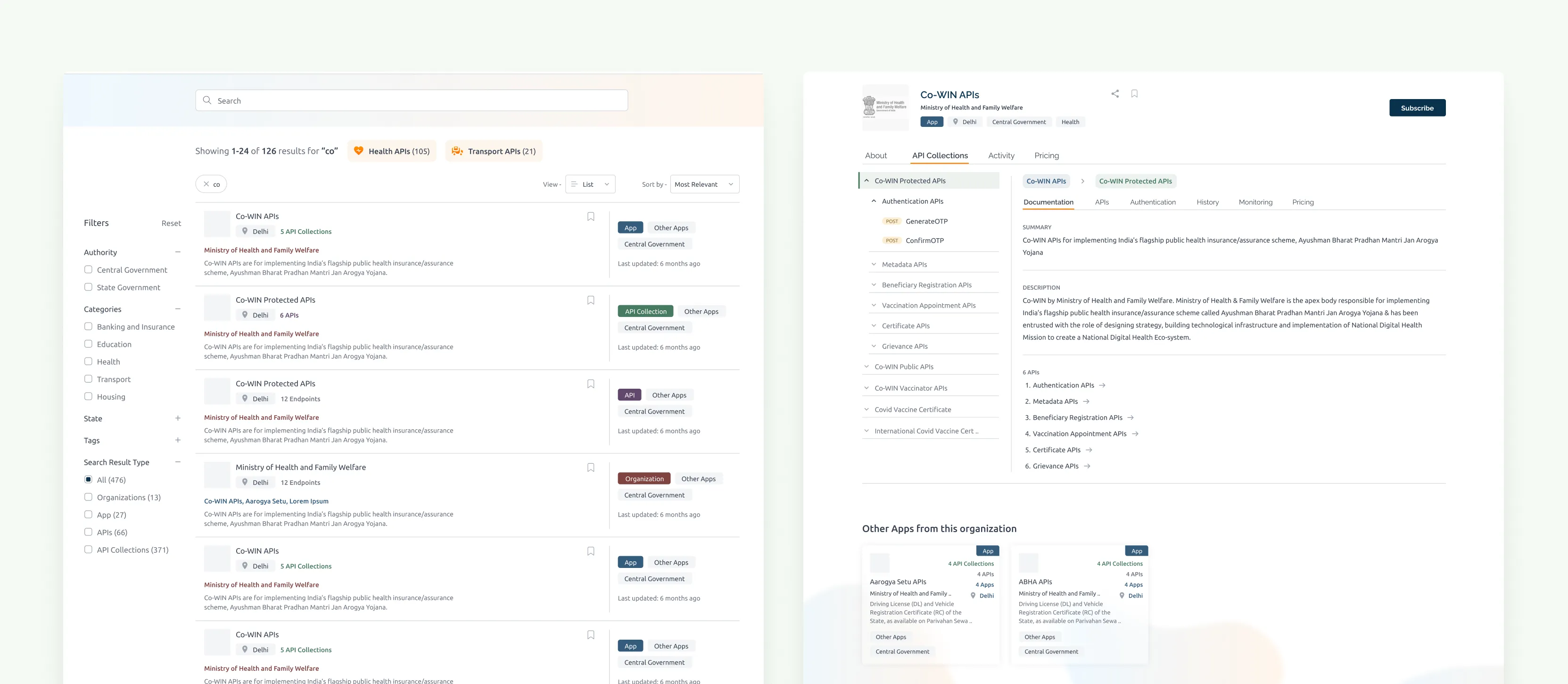
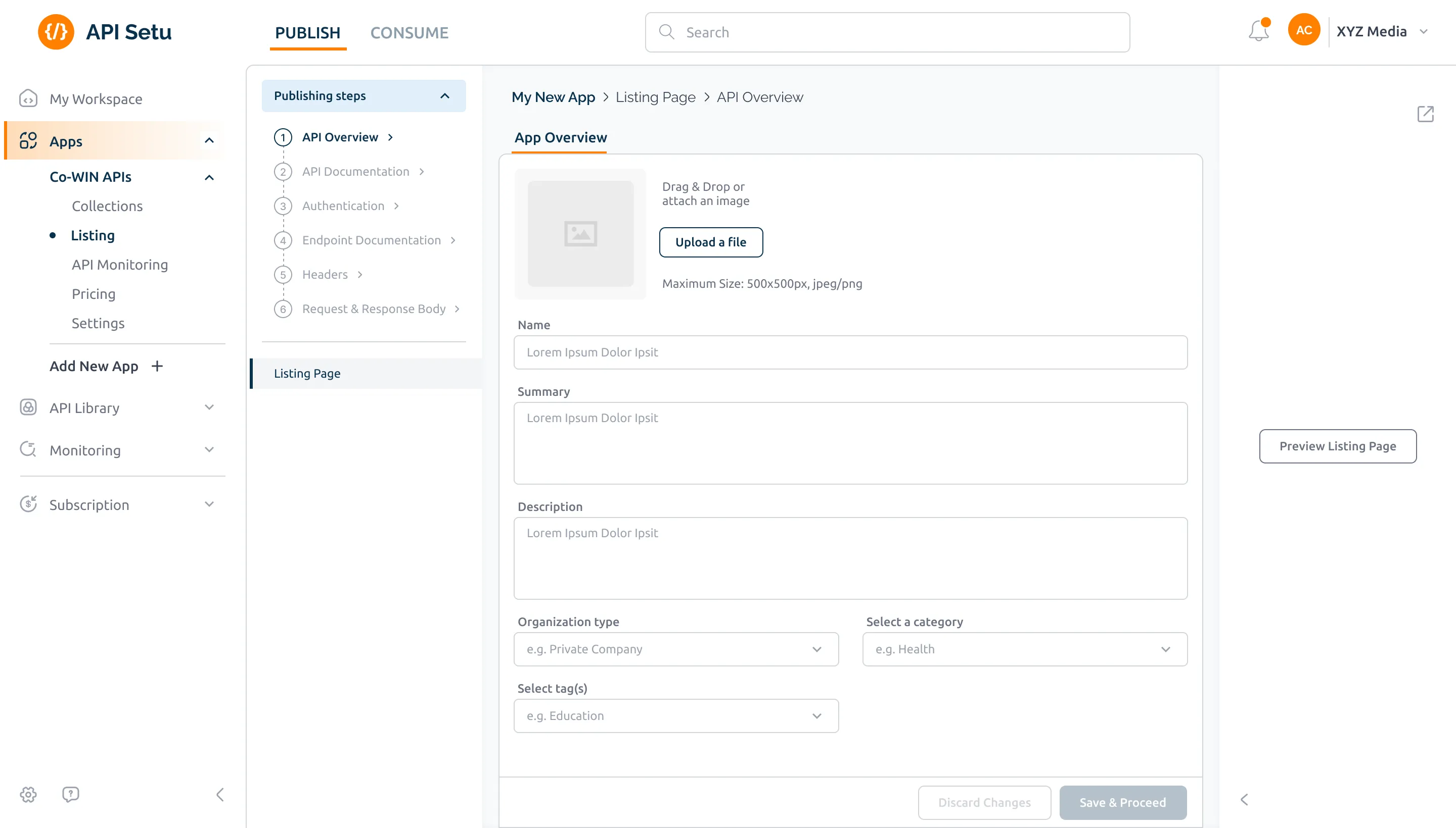
2. API publishing workspace
Non-linear, flexible, built around how developers actually work. First-timers get a guided tour with tooltips throughout. Experienced users can jump straight in. Bulk upload for multiple endpoints. Collapsible nav so the preview panel gets the space it deserves.
5.2.1
API publishing flow - before & after
Slider

5.2.2
Getting new users familiarized using a guided tour
Images
I created a straightforward six-step publishing flow for new users that aligns better with the mental model of our target audience: developers looking to publish APIs for public consumption. These steps won't be pushed to experienced users who choose their own sequence based on their workflow.
5.2.3
Comprehensive API publishing flow
Loop
5.2.4
Collapsible navigation panel
Loop
3. API Discovery & Consumption
Searchable, filterable, browsable. The listing page now puts collections, endpoints, documentation and testing all in one place. Subscribe via a basket, add what you want, review it, commit once. The consumer dashboard shows active subscriptions and usage at a glance.
5.3.1
API directory - before & after
Slider
5.3.2
Switchable list/grid views on the search results page
Images
5.3.3
Category-level exploration of APIs
Images
5.3.4
API listing page - before & after
Slider
5.3.5
Bulk API subscription flow
Loop
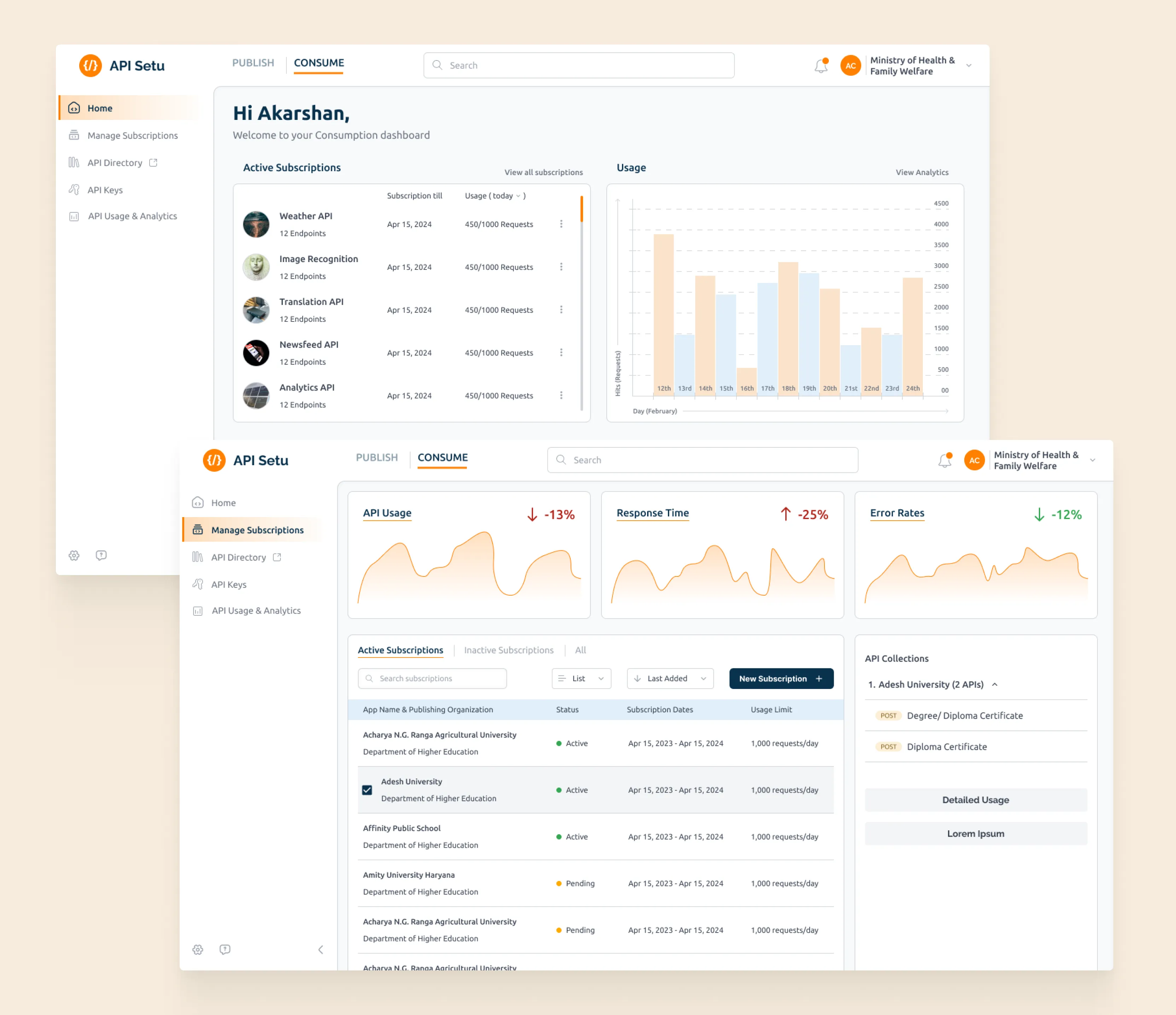
5.3.6
API Consumer dashboard
Image
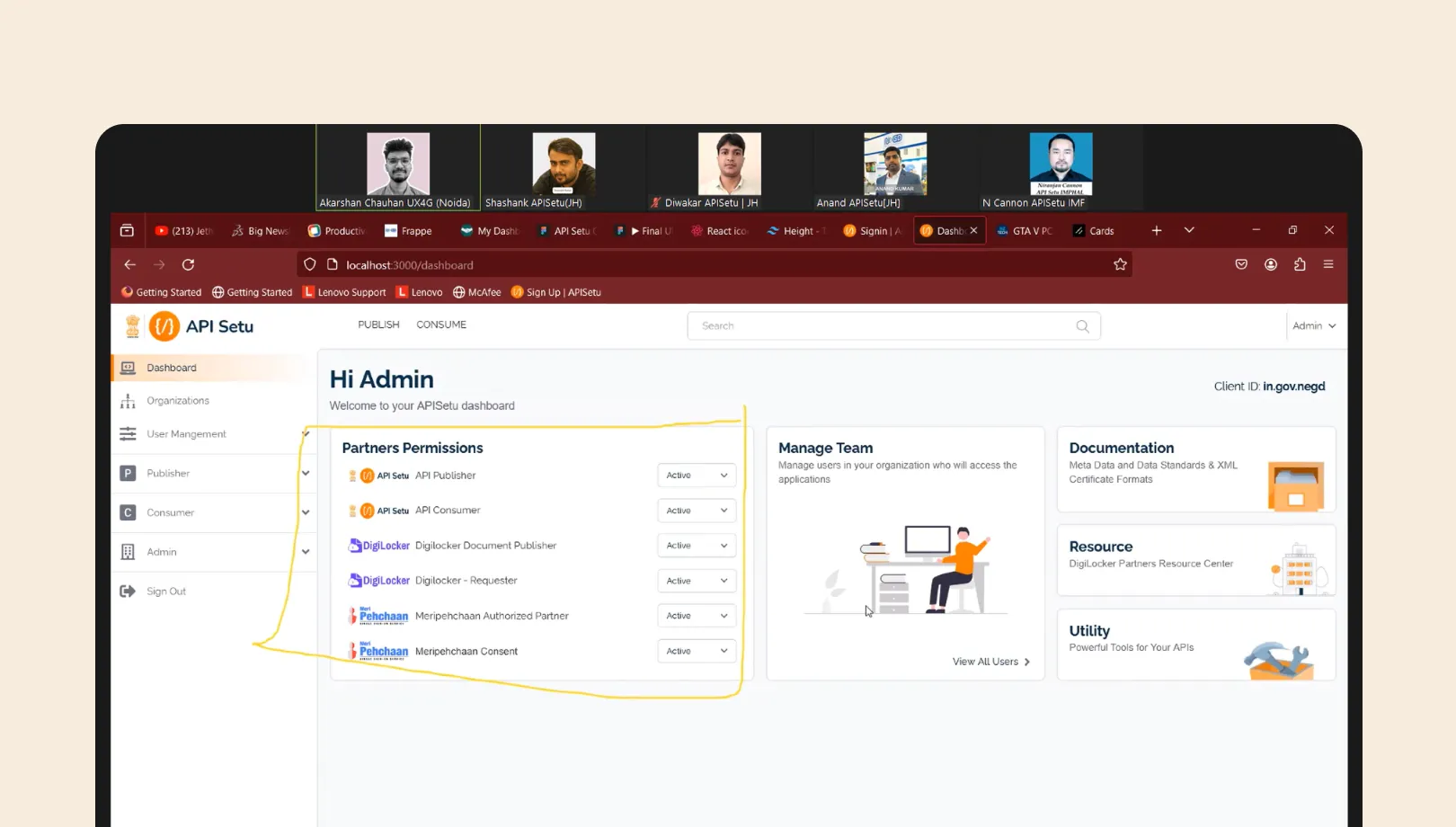
4. Organizational management & admin
Admins finally had a home screen. Teams, roles, permissions, member management, all there. Onboarding requests are reviewable with actual context. Partner service requests from DigiLocker and others have a proper approval flow built in.
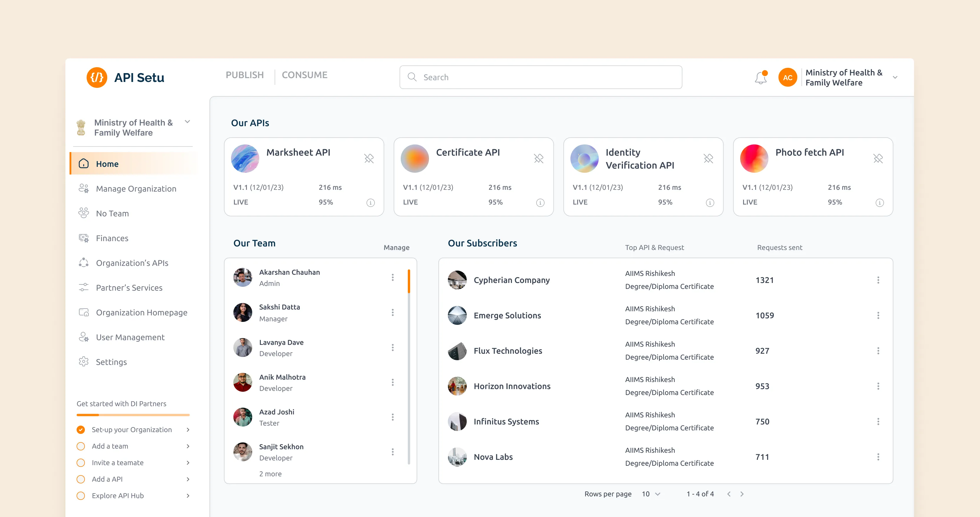
5.4.1
Organization home dashboard
Image

5.4.2
Organization management: teams & people
Image
API setu admins can efficiently manage organization requests for Digital India partner services. They review use cases and organization profiles to make informed approval decisions, enhancing partnership and service management.
5.4.3
Digital India's partners' service request management
Loop
constraints & trade-offs
What the final designs don't show you
A polished set of screens can make a project look straightforward. This one wasn't. There were situations that shaped the work in ways that aren't visible in the final designs, but understanding them explains why certain decisions were made the way they were.
1. No design infrastructure to lean on.
UX4G, the government initiative set up to guide and improve the UX of government digital products including ones under Digital India (like API Setu) was was brand new when I joined this project. I was their representative, parachuted into a dev team that had never worked with a designer. No design system, no brand guidelines, no one to bounce visual decisions off.
Every banner, icon, and illustration I either made myself or hunted down and adapted from online resources. It was scrappy. It also made me significantly more self-reliant than I'd ever had to be before.
2. Every change was a negotiation.
API Setu had real users and real technical debt. The team's default was cautious, and fair enough. More engineering effort, more testing risk, more chance of breaking something that was working.
I learned fast to pick my battles.
Some things I could redesign freely. Others I had to work around. Getting precise about that difference saved a lot of friction.
3. The sandbox- a feature I believed in that didn't ship.
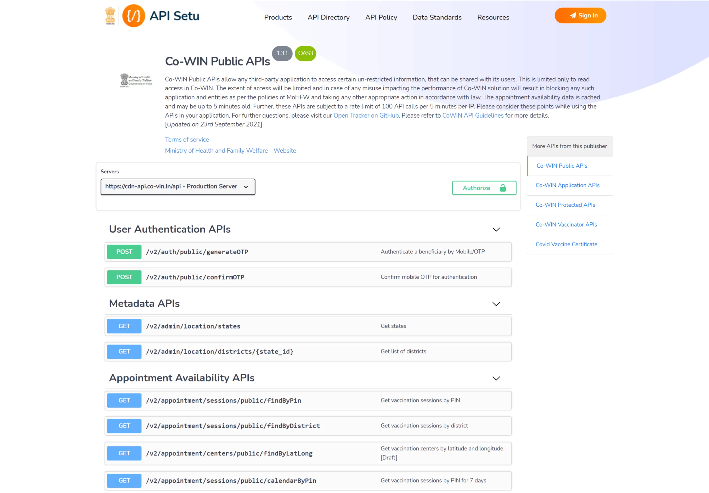
I wanted an integrated testing sandbox, test your API before publishing, try someone else's before subscribing, all without leaving the platform. The kind of thing Postman makes feel obvious.
It didn't make it. A Swagger module was already there, replacing it felt too disruptive, and the call was made to keep it. I understood. I still think the sandbox was right. That tension, between what's best and what's buildable, is one of the more honest parts of this project.
the impact
A platform ready to grow
Quick disclaimer: these numbers weren't caused by design alone. Ministry mandates, Digital India policy push, and growing partner interest all played a part. I'm not claiming credit for the growth. What I do believe, based on three years working alongside these teams, is that the redesign made the difference between people arriving and people actually staying.
At the start of the project
Publishers
Published APIs
Transactions per month
Publishers up 57%. APIs on the platform up 61%. Transactions up nearly 3x. Again, ministry mandates, policy push, and expanding Digital India partnerships all contributed to this. But a platform that developers found confusing and off-putting was not going to onboard 600+ new publishing organisations and retain them. The usability had to be there for the growth to stick.
Post revamp
Publishers
Published APIs
Transactions per month
LEARNINGS
What this project taught me
1. My first time owning a product end to end.
This was the first project where I was responsible for the whole thing, not a flow, not a feature, but a product with four distinct user types and dependencies across government departments. That was a lot. But it's also where I learned the most. How to hold multiple perspectives at once. How to sequence work when everything feels equally urgent. How to explain design decisions to people who live in code.
2. Design systems: wish I'd started earlier.
I came into this project relatively new to the concept of design systems. By the time I was halfway through, I understood why they matter. Without a coherent system in place from the start, the design files became increasingly difficult to manage & redundant components started existing. Decisions made early created inconsistencies that took time to untangle later. The further into the project I got, the more I wished I had established the design system foundations first rather than building them reactively.
3. Sometimes you make the case and still lose.
The sandbox was the feature I fought hardest for. I thought it was the thing that would bring the experience closest to what developers actually expected. It didn't ship. Swagger stayed. The call was pragmatic and I respect it, but I'd still push for the sandbox first thing if I ever got back into this.