Reducing friction inside a complex API platform
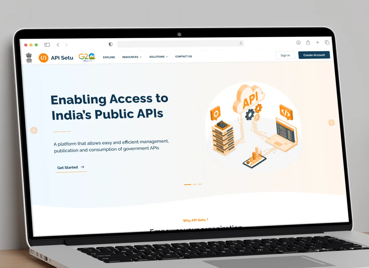
Product Designer leading UX for API Setu through UX4G, redesigning critical national API infrastructure end to end: public website, publishing workspace, discovery flows, and org admin.
A platform that worked. But only if you already knew how
API Setu was functional. APIs were being published and consumed. Spend any time with it and the cracks showed up fast. The platform assumed you'd figure it out. No guidance for new users, no flexibility for experienced ones, and nothing that communicated why this platform was worth trusting over anything else.
1. It didn't look or feel credible
Cartoony illustrations, bright playful colours, buried navigation. The homepage read like a side project, not national infrastructure. For a platform handling sensitive government data and developer integrations, that mismatch in tone was killing trust before users even got started.
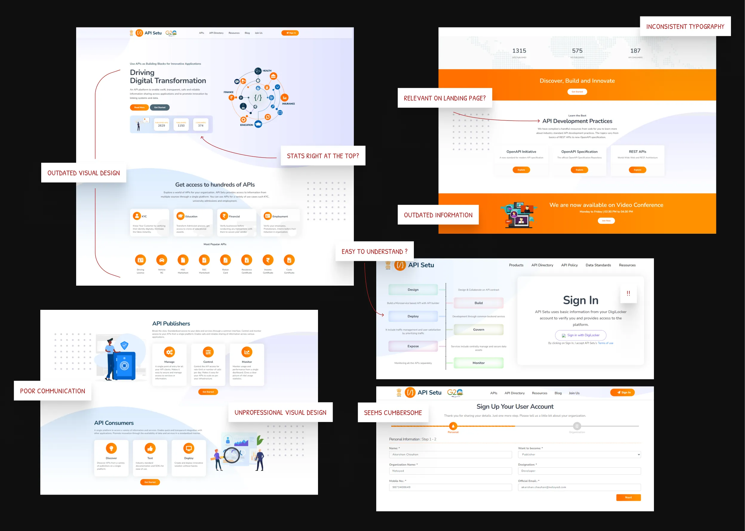
2.1 Existing website, the visual and UX problems.
Images2. Workflows were rigid and unforgiving
The publishing flow was locked into a strict linear sequence. No going back, no previewing, no room to breathe. Every developer I spoke to mentioned Postman within the first few minutes. The comparison wasn't flattering.
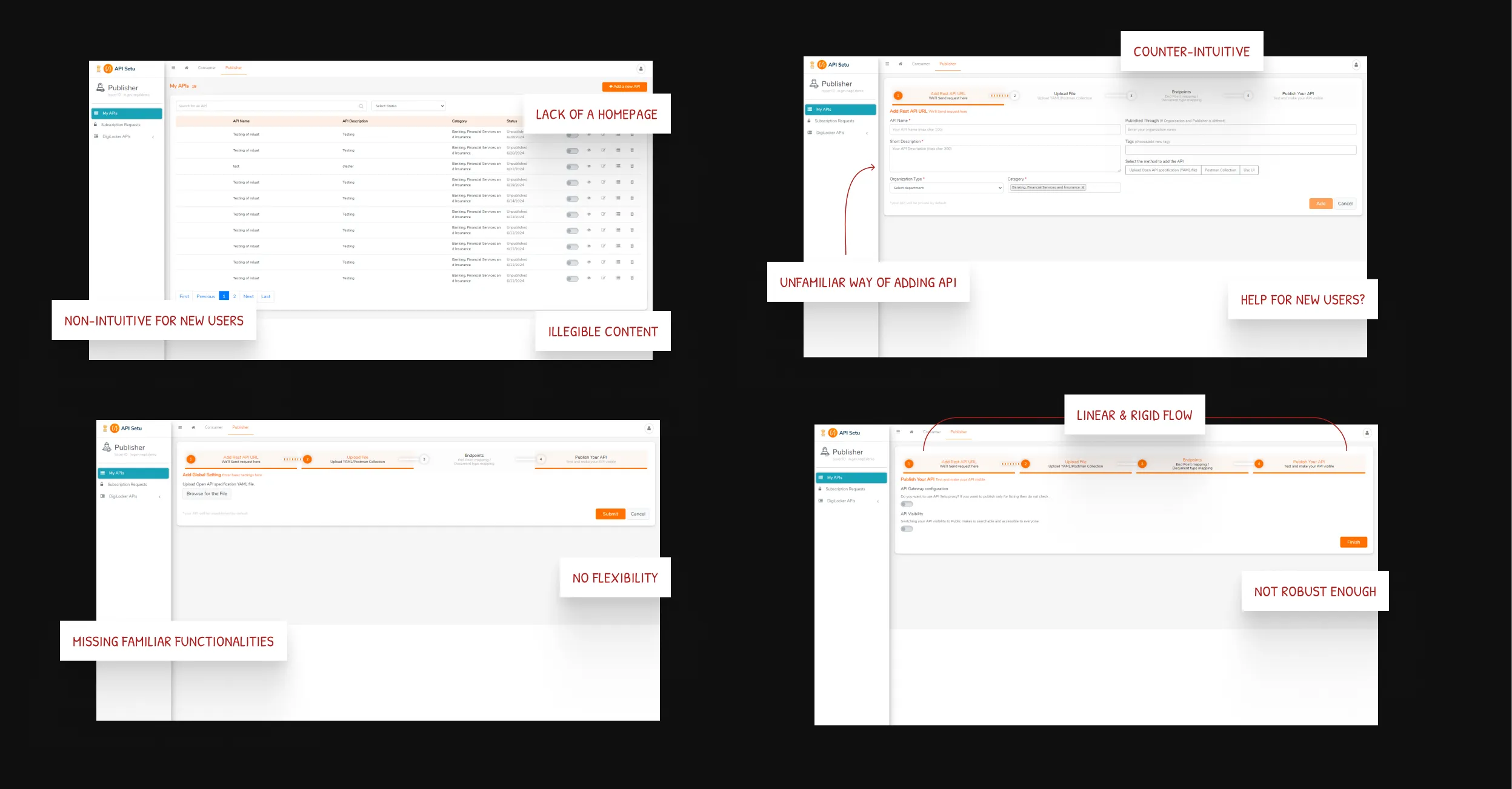
2.2 Existing publishing flow, a rigid, linear sequence.
Images3. Discovery and management were afterthoughts
The API directory was a flat list with no filters, no categories, no way to evaluate an API before committing to integration. For organisations managing teams and permissions, the admin side was rougher still: complex controls with almost no visibility into what was actually happening.
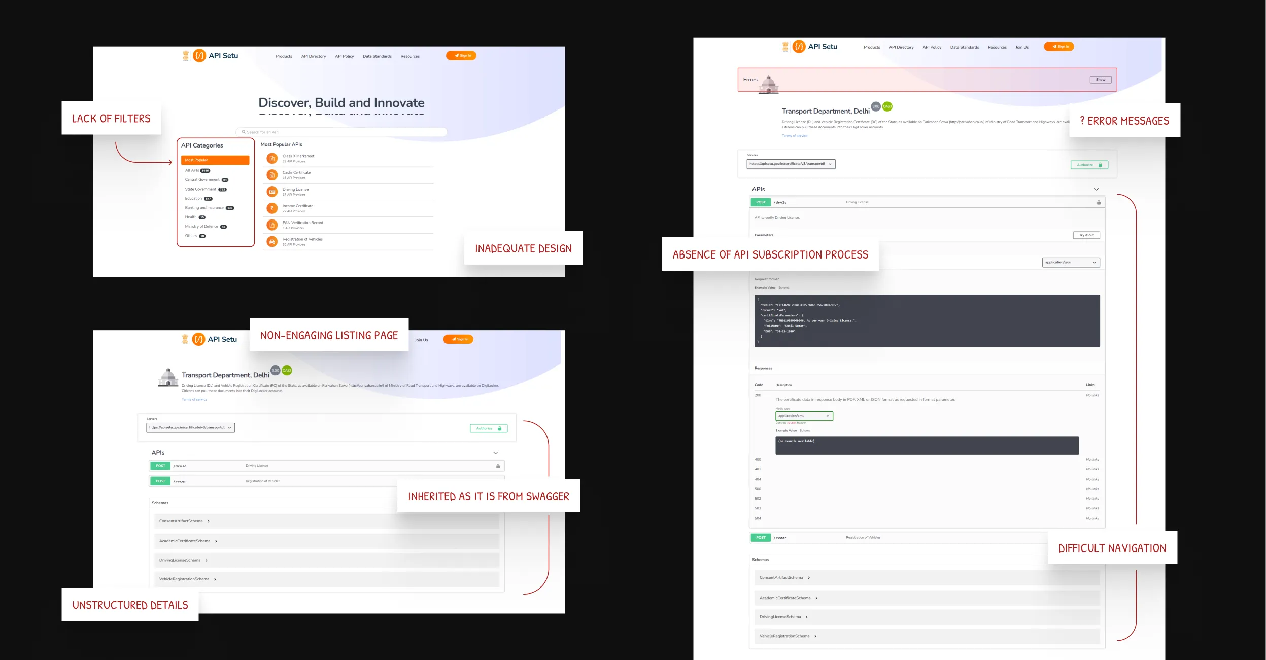
2.3 The existing API directory and listing pages, analysed.
ImagesThree ways into the same problem
Turning gut feel into an evidence-backed argument
I ran a structured UX audit of the existing site and portal before talking to anyone. Inconsistent hierarchy, vague CTAs, a visual language that undermined rather than built trust. None of it was subtle. Writing it all up against established UX principles gave me a clear, evidence-backed argument for why this needed more than a visual refresh, and why the team should care about it.
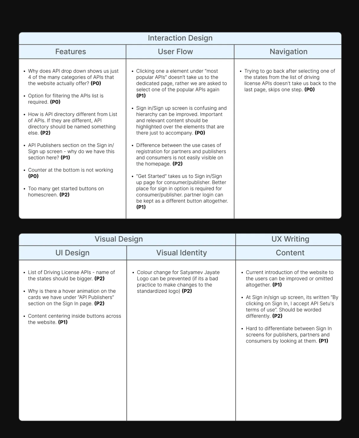
3.1 The existing product, audited.
ImageWhat developers already expected, and weren't getting
I studied Postman, RapidAPI, and a few other platforms developers actually enjoy using. The pattern was consistent: flexible flows, inline testing, workspaces that felt like theirs. These weren't advanced features. They were the baseline expectation. Any platform that fell short of this felt broken, regardless of what it was technically capable of.
3.2 Competitor analysis: Postman, RapidAPI, and others.
ImageThey wanted a platform worth showing off
The API Setu developers were my main stakeholders and my closest proxy for actual users. That was unusual, and genuinely useful. I could get real reactions to early ideas fast, understand what was technically possible, and catch assumptions before they became design decisions. The thing I took away most wasn't a feature request. It was this: they wanted a platform they'd be proud to show another developer. That set the bar.
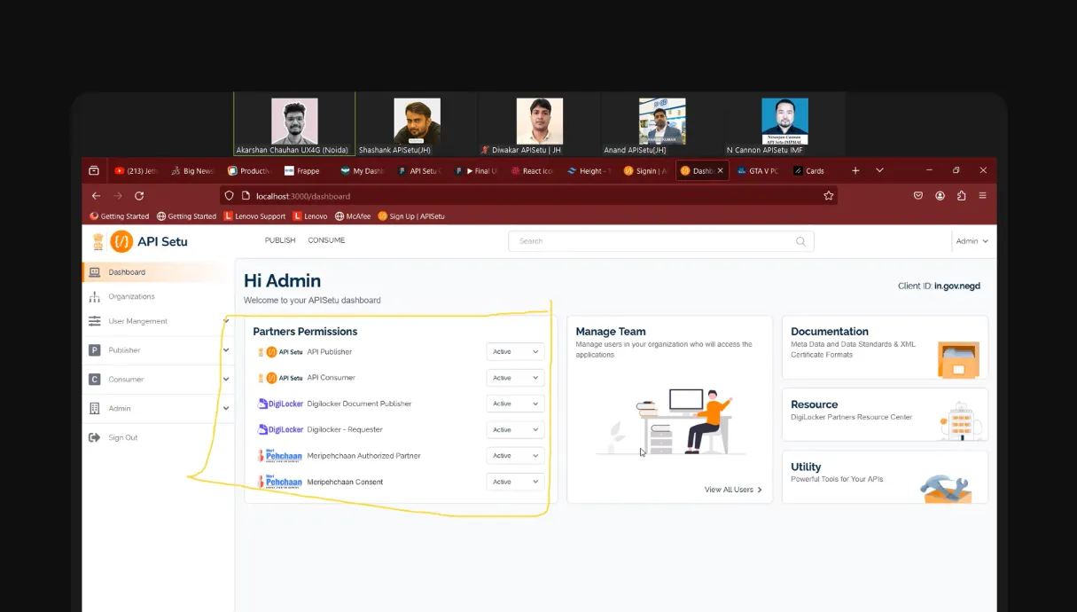
3.3 Working sessions with the development team.
ImageFour areas transformed, end to end
1. What should a government API platform look like?
The old homepage was too casual. The obvious fix was to go corporate and clean, but that felt wrong too. API Setu needed to feel like somewhere worth being, not just somewhere official. It needed to attract developers who had Postman as their reference point.
I explored a few directions before landing on a space exploration theme: APIs as navigating a digital universe. It sounds abstract, but it worked. It gave the platform ambition and personality while staying within government design guidelines.
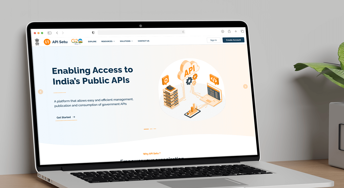
4.1.1 Redesigned hero section on the landing page.
Image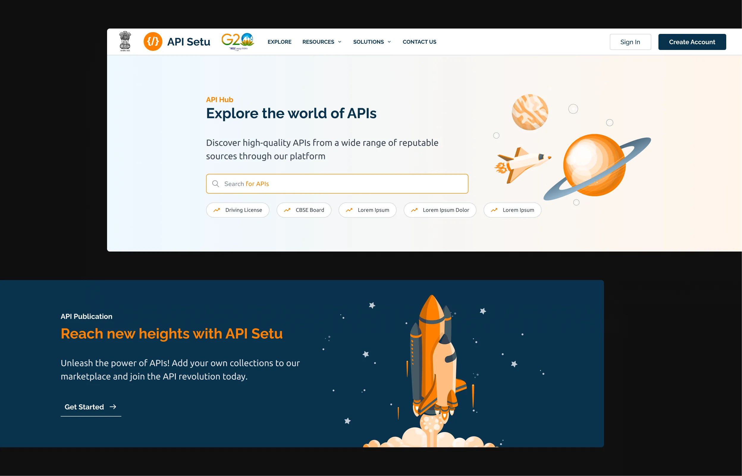
4.1.2 The space exploration theme, applied throughout.
Image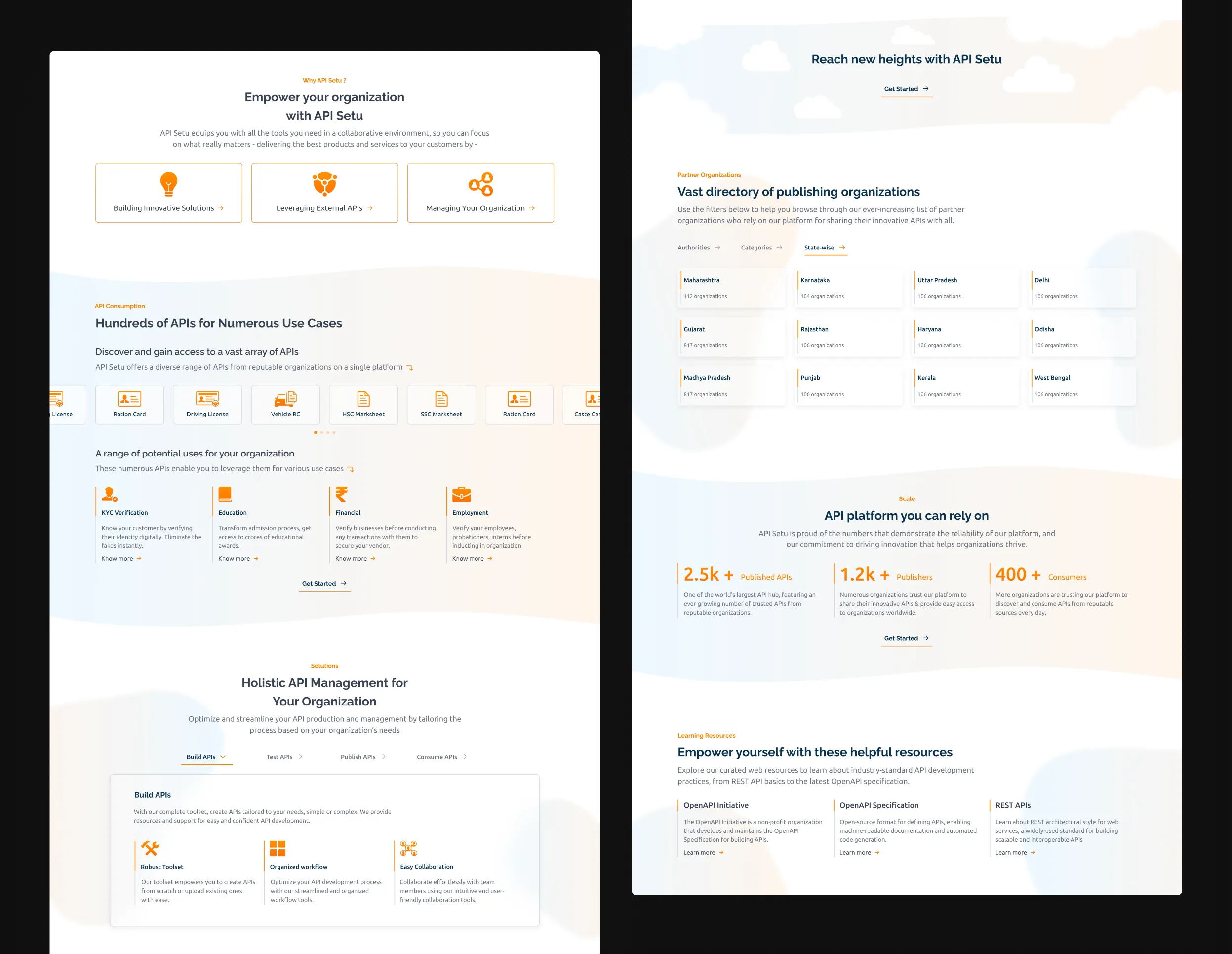
4.1.3 Redesigned homepage.
Image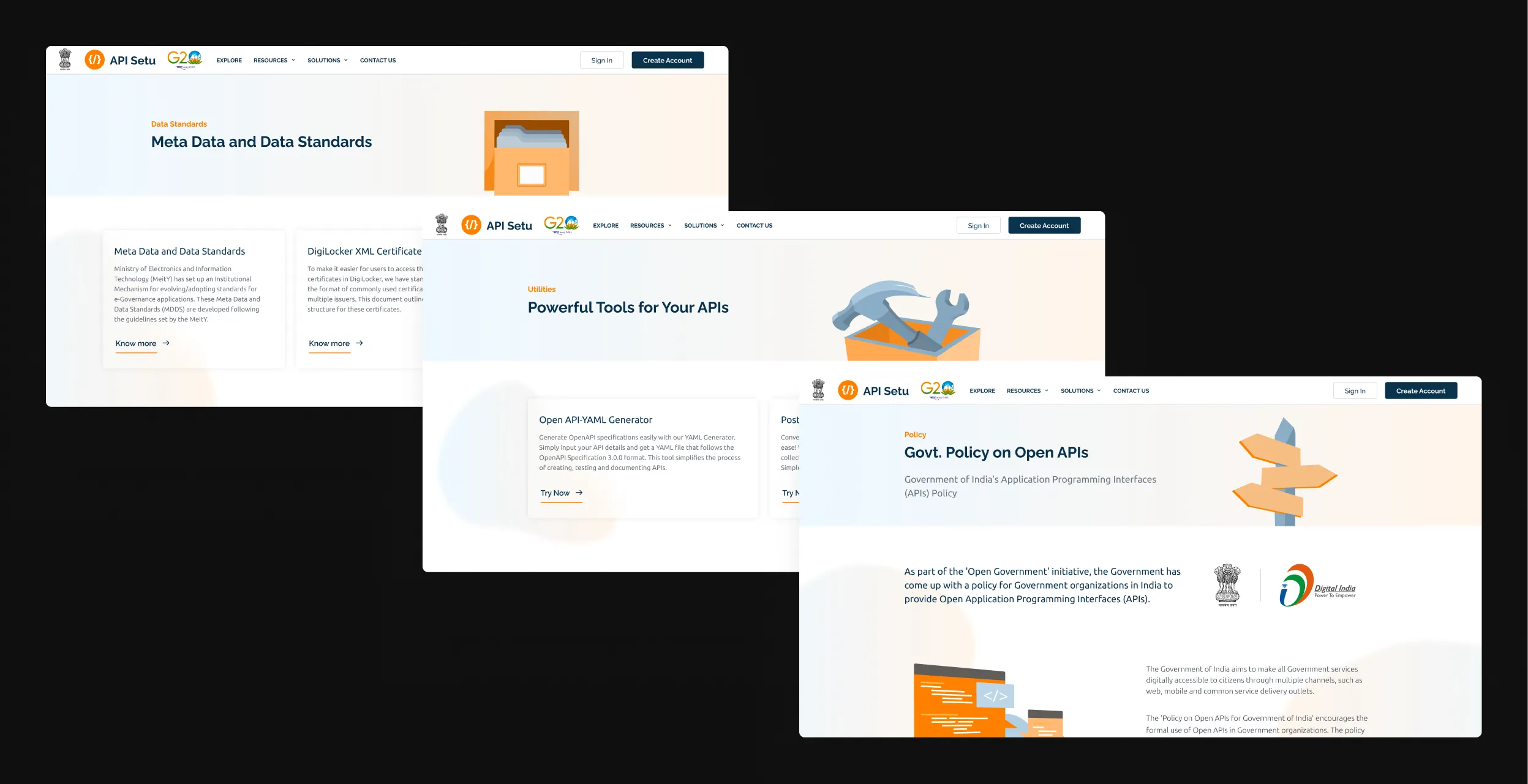
4.1.4 The same visual language, carried across other pages.
ImagesSign-in and sign-up screens set the visual language for the entire product, so I presented multiple directions to stakeholders before committing to one.
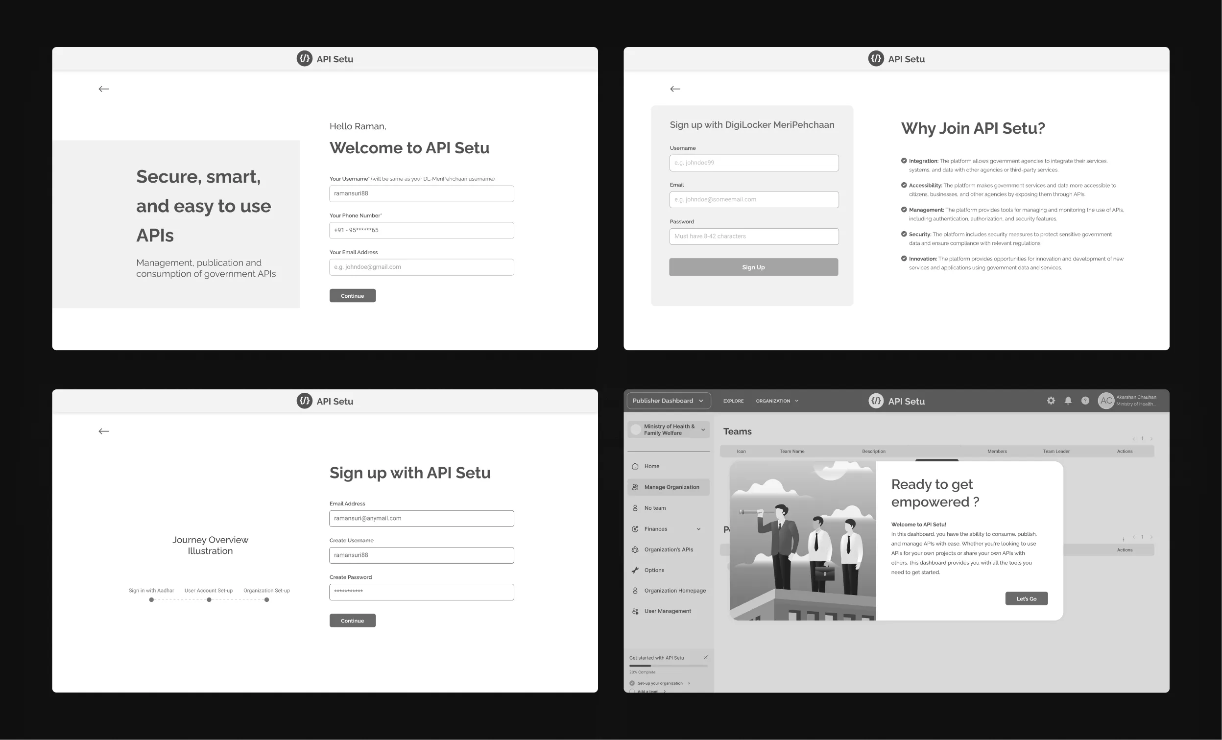
4.1.5 Explorations for the sign-in and sign-up page.
Images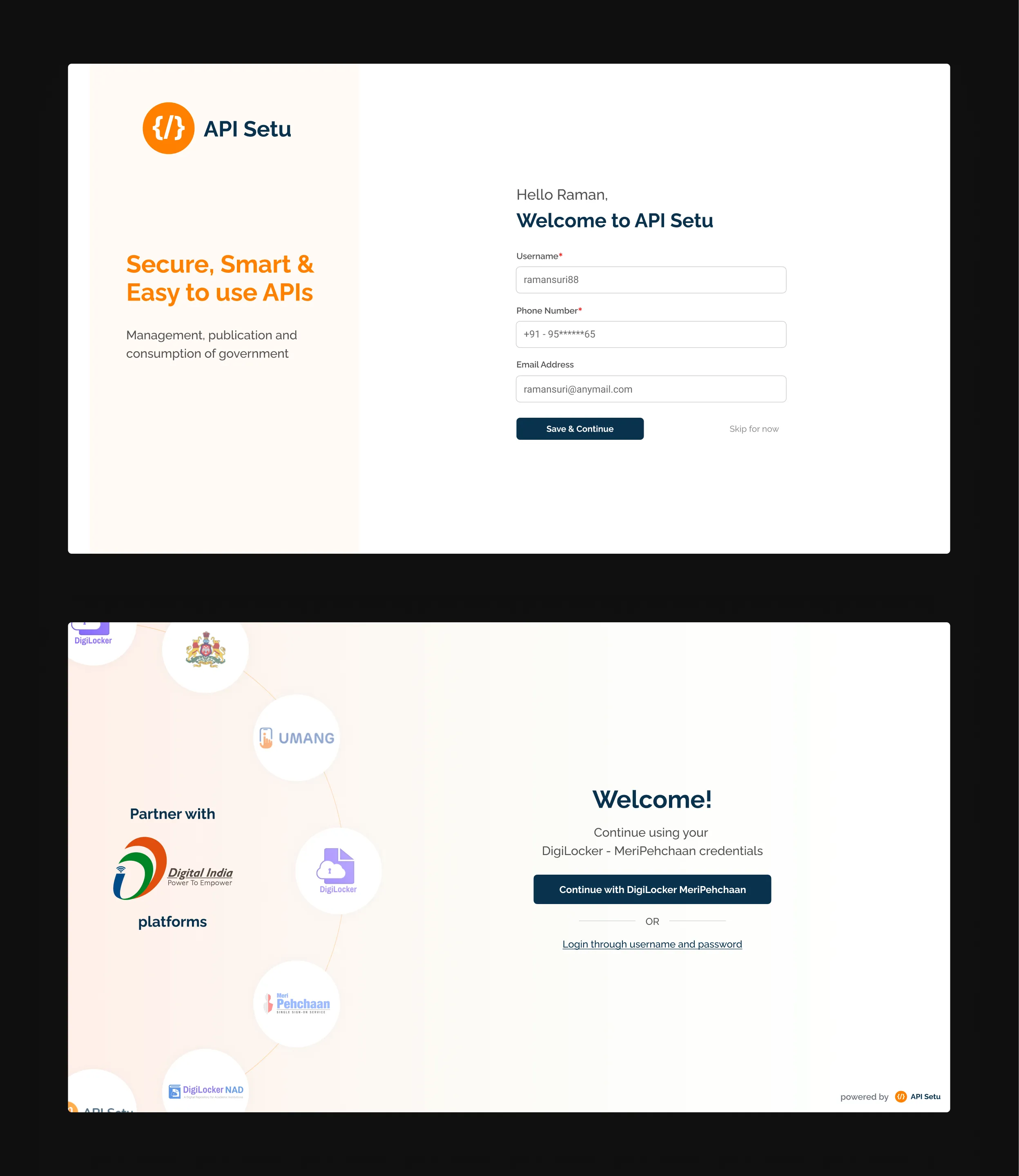
4.1.6 Reimagined onboarding for citizens and partners.
Images2. From a straight line to a workspace
The old flow had one mode: forward. Step 1, step 2, step 3, no going back.
The moment I reframed the question, from "how do we fix the steps" to "how do we make this feel like a workspace," everything changed.
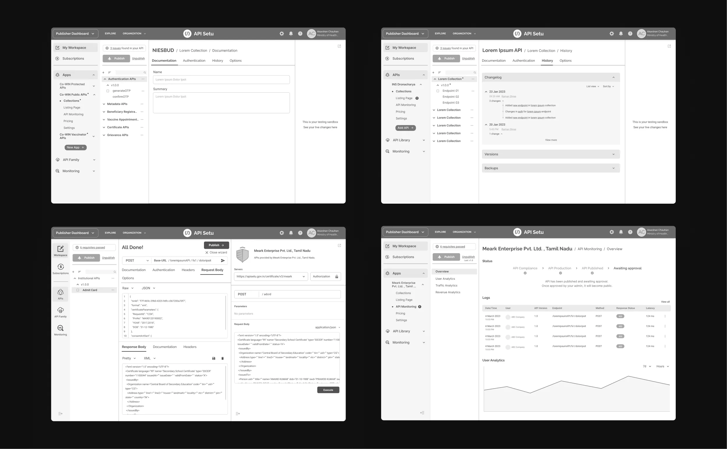
4.2.1 Publishing flow, explored.
ImagesThat reframe gave us collapsible navigation, a persistent preview pane, inline docs, and jump-to-any-step freedom. Developers could move the way they actually think, not the way a form tells them to.
First-timers get a guided tour with tooltips throughout. Experienced users can jump straight in.
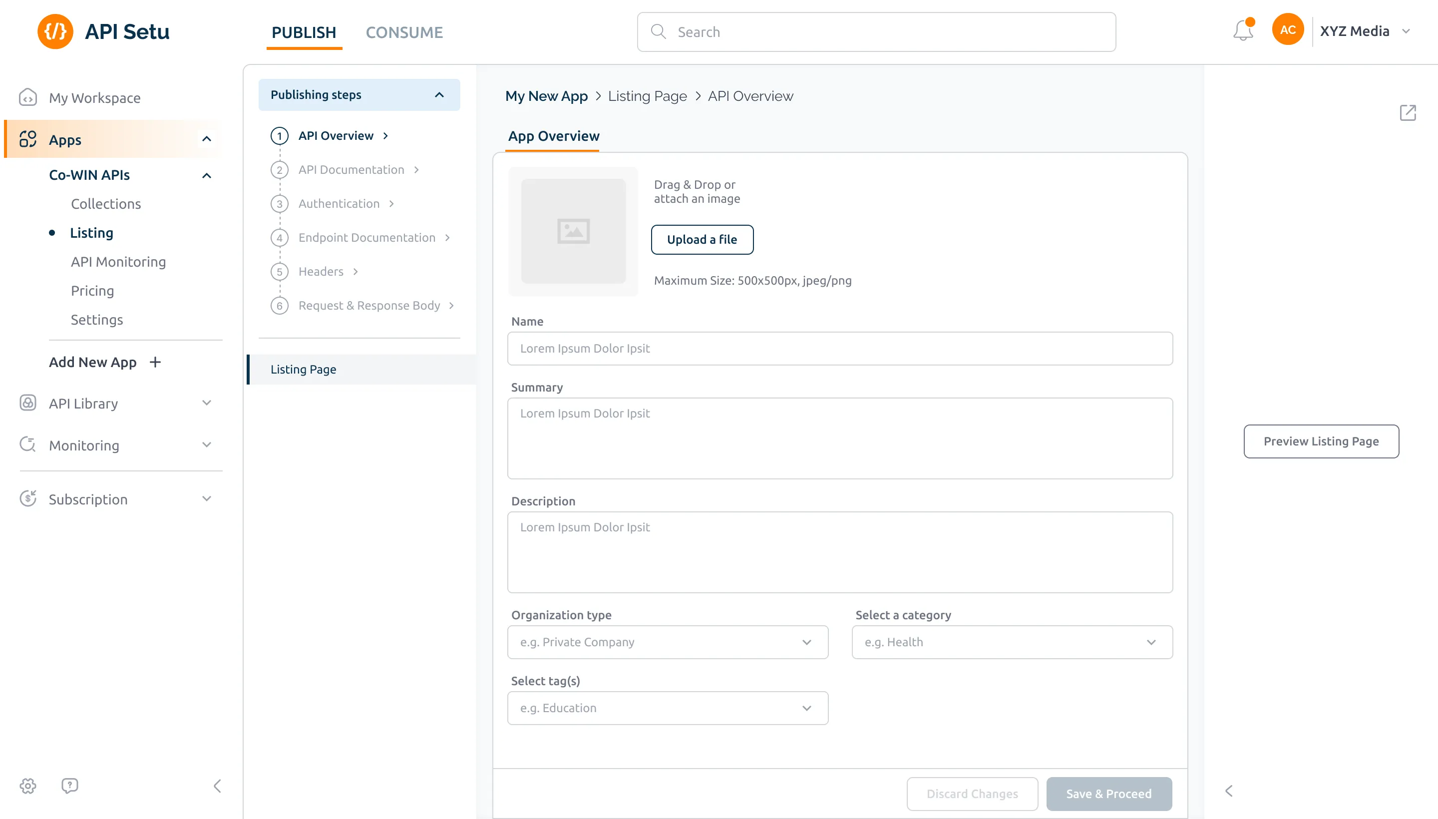
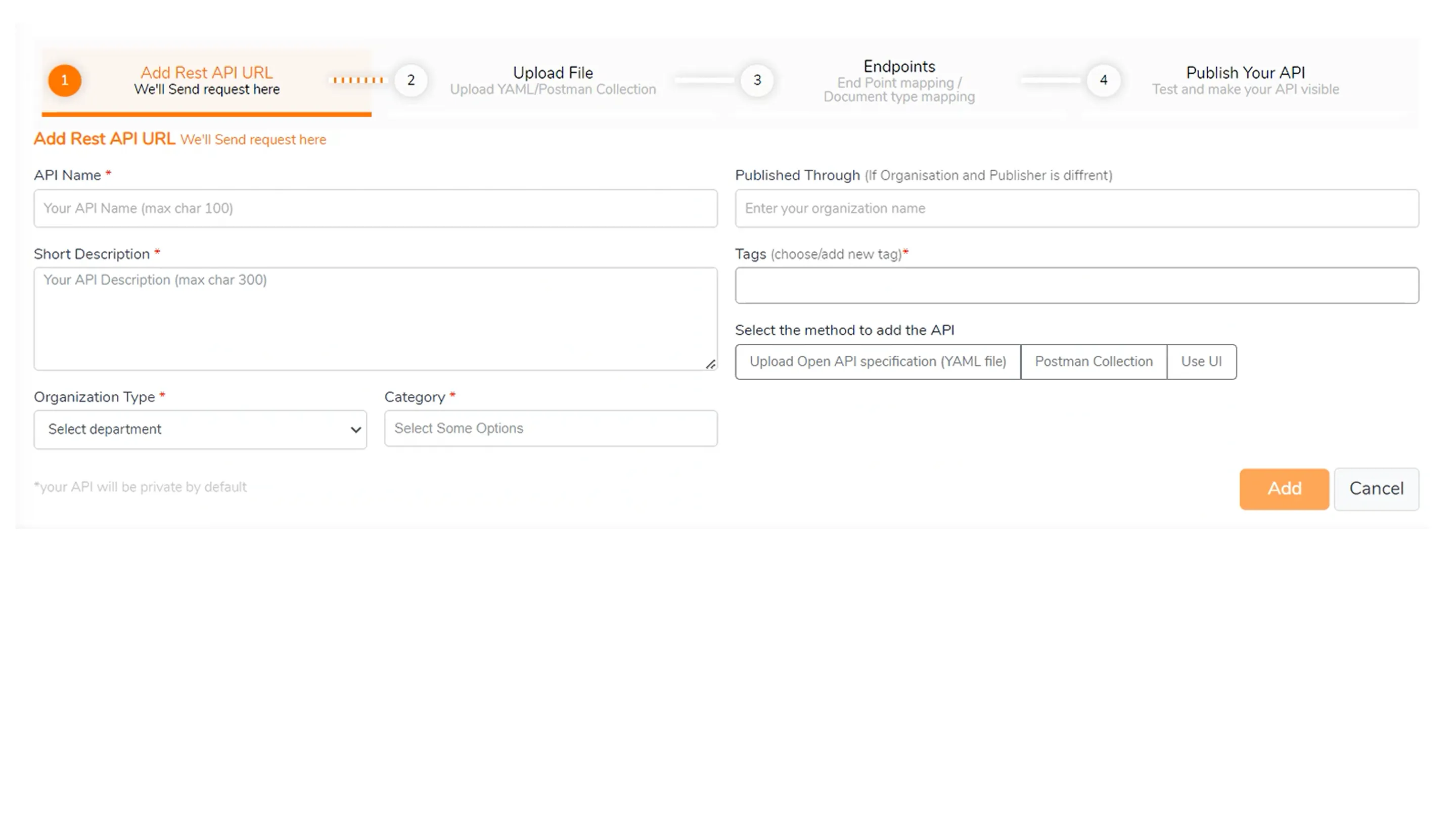
4.2.2 API publishing, before and after.
Slider4.2.3 The full publishing flow, in motion.
Loop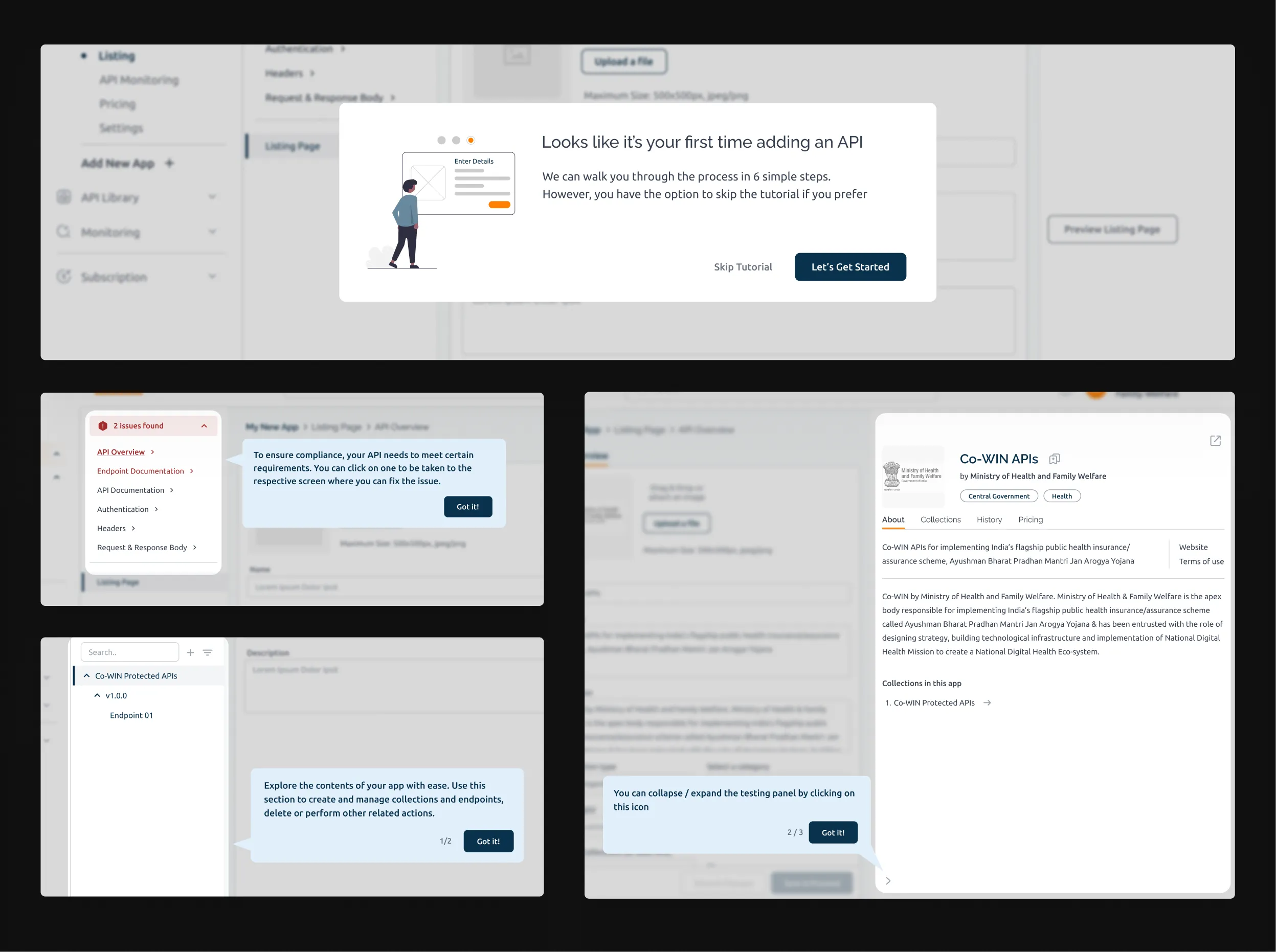
4.2.4 Getting new users familiarised, with a guided tour.
Image4.2.5 Collapsible navigation, in motion.
Loop3. Making API discovery actually work
The old API directory was a wall of text. No filters, no categories, no context. You had to already know what you were looking for.
I redesigned it around browsing: structured categories, keyword and criteria filtering, list and grid views, and a basket model so developers could shortlist multiple APIs and subscribe in one go.
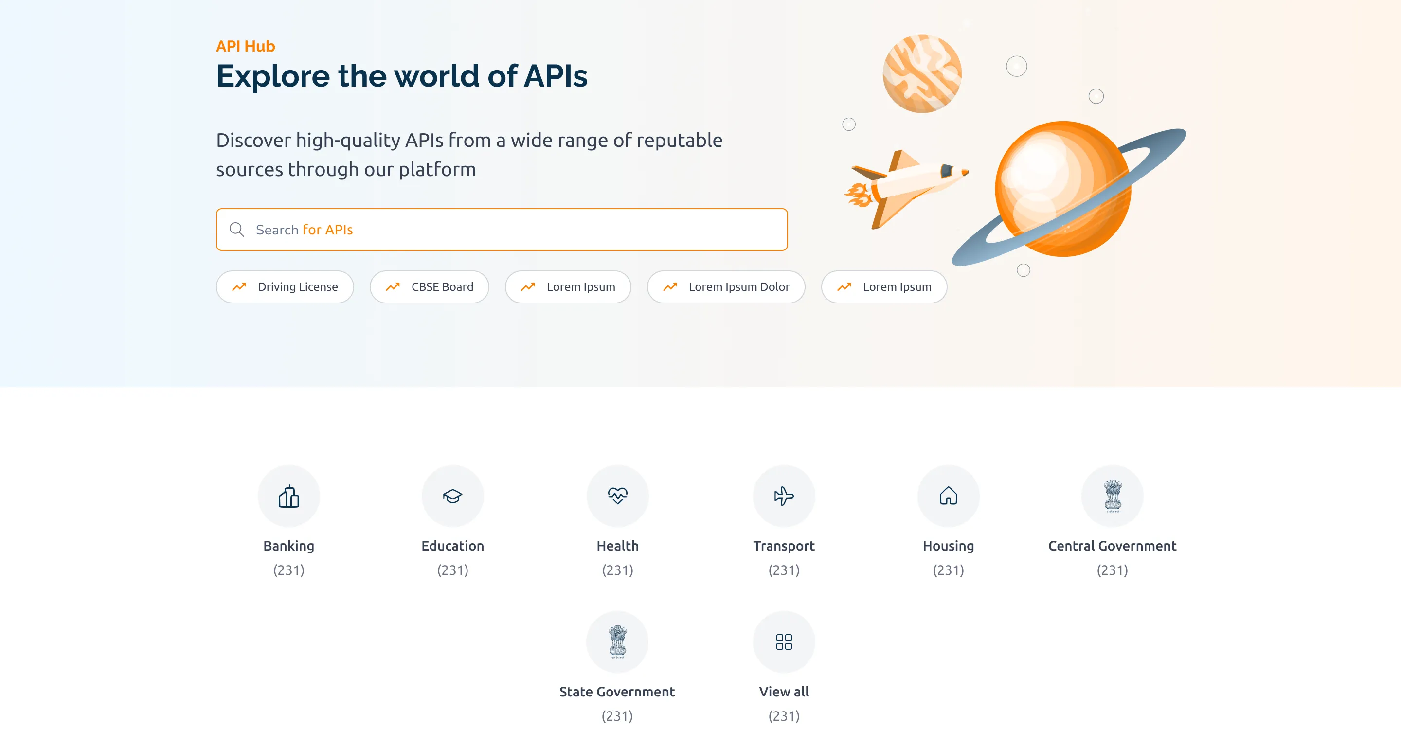
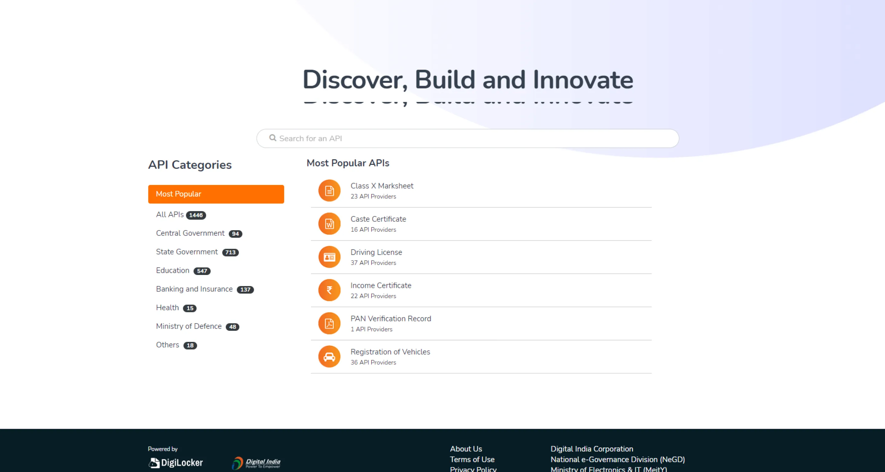
4.3.1 API directory, before and after.
Slider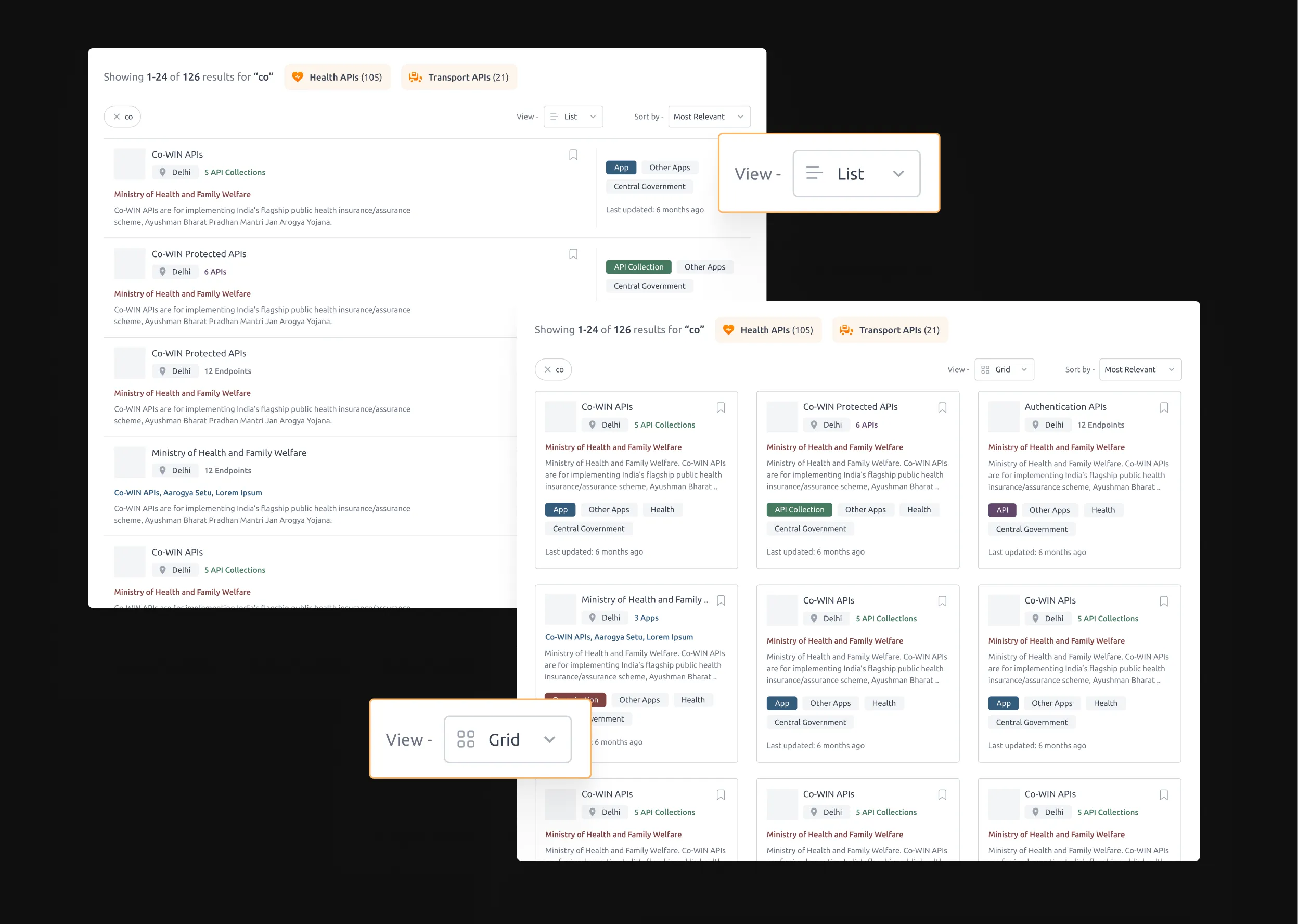
4.3.2 Switchable list and grid views.
Images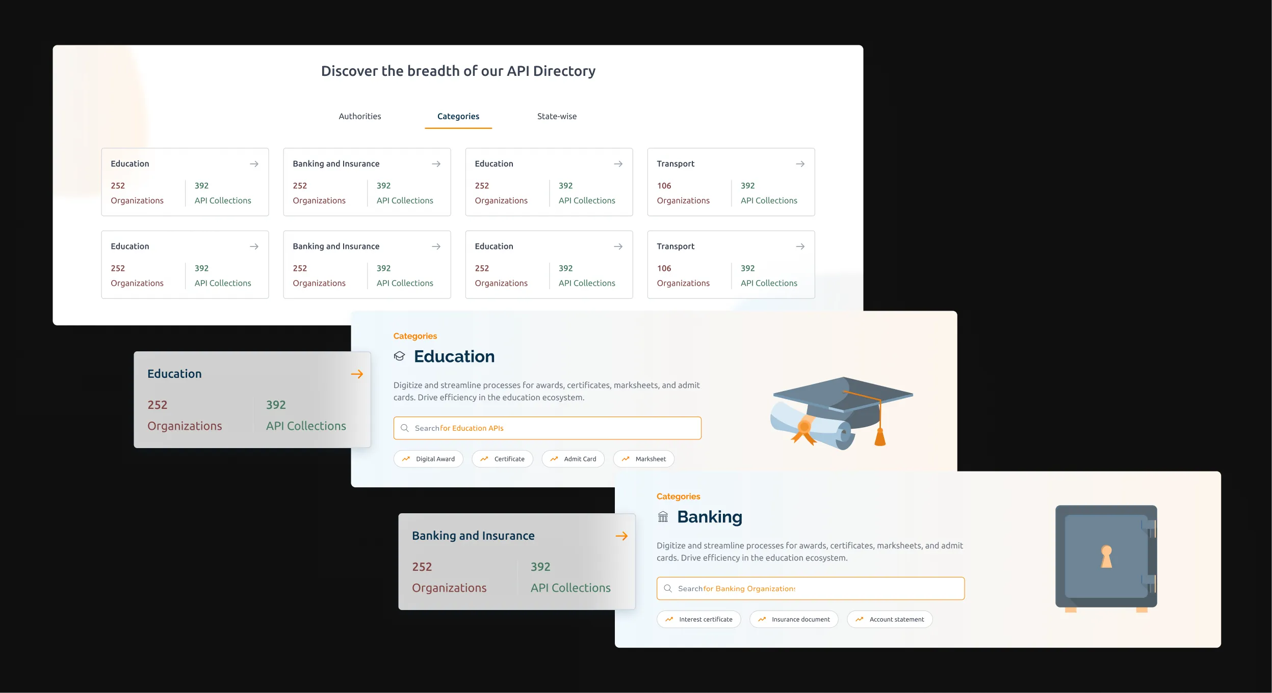
4.3.3 Category-level exploration.
Images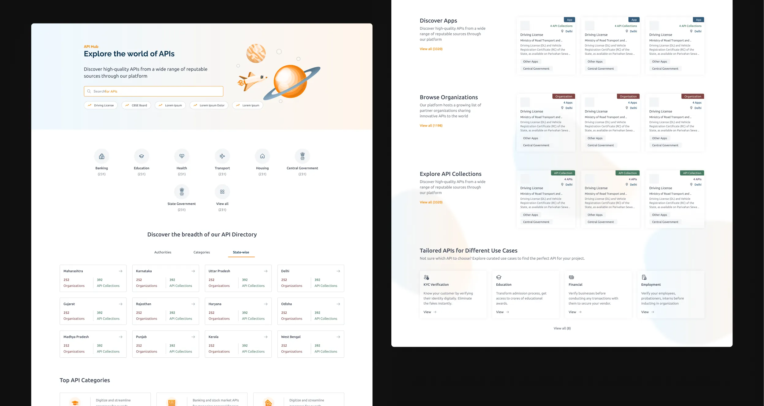
4.3.4 Redesigned API directory page.
ImagesEach API listing page now puts collections, endpoints, documentation, and testing all in one place. Subscribe via a basket: add what you need, review it, commit once.
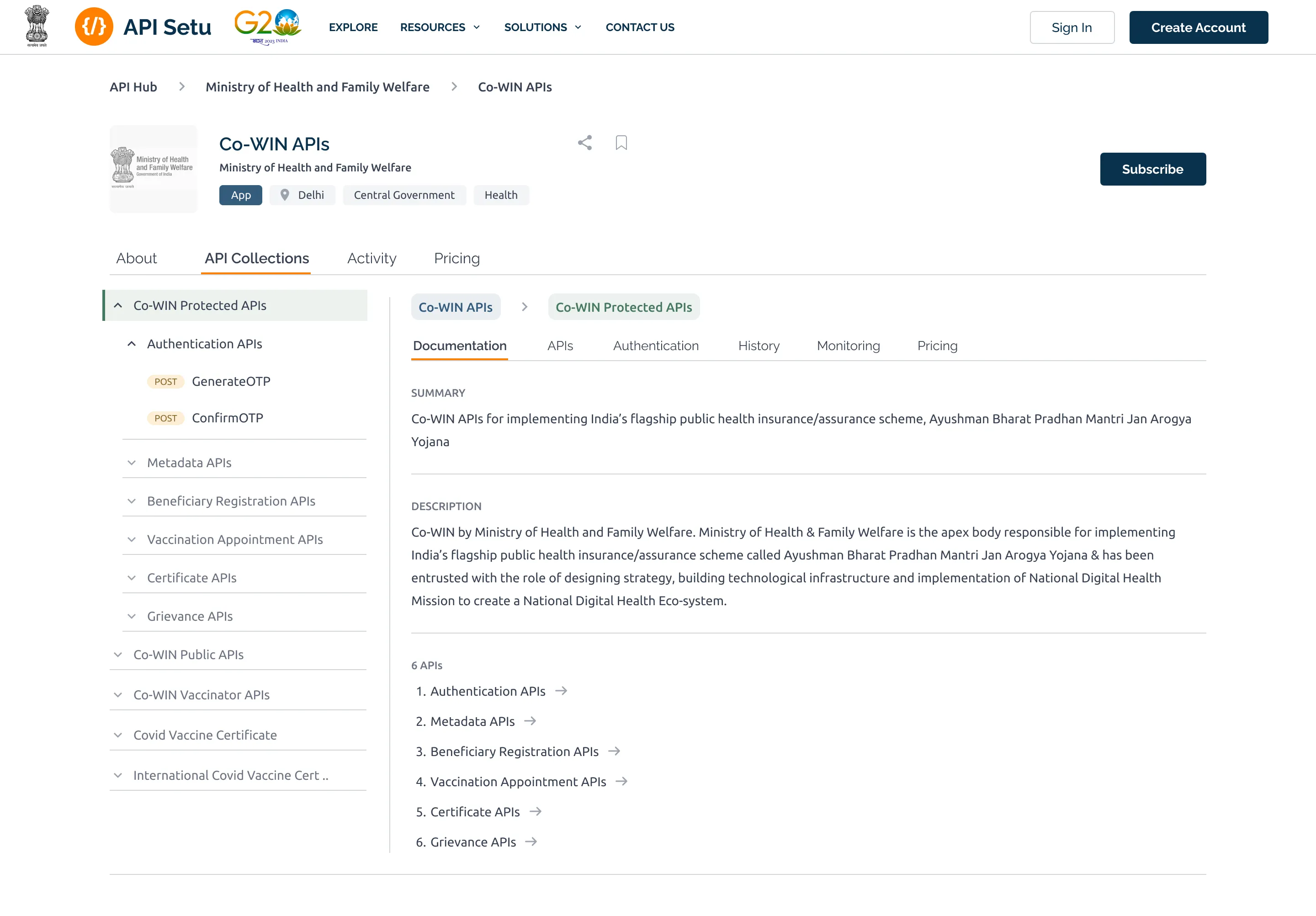
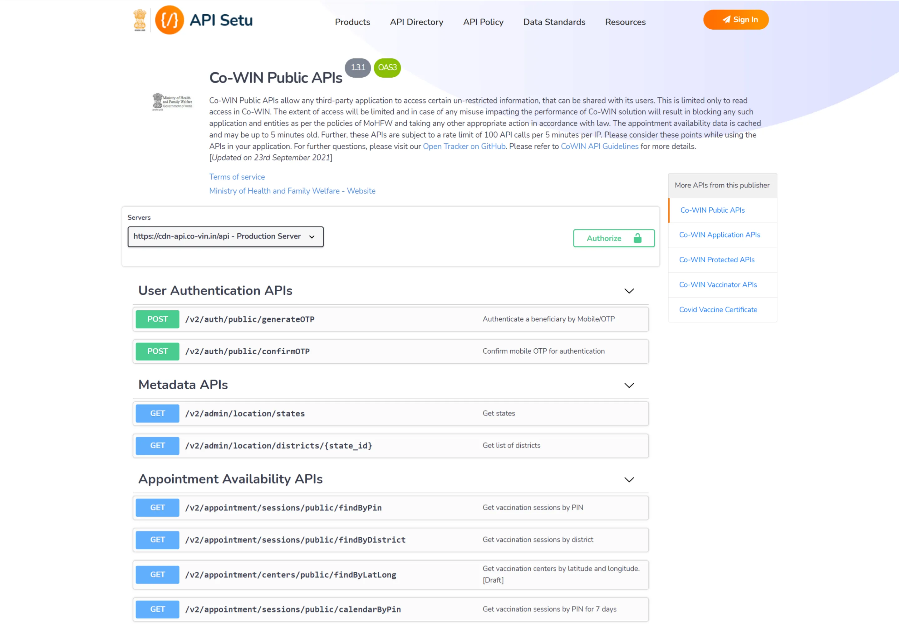
4.3.5 API listing page, before and after.
Slider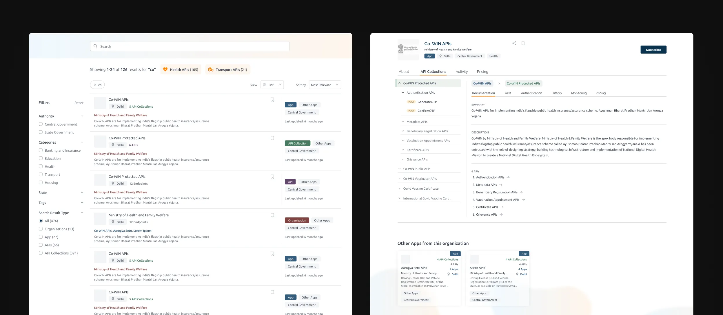
4.3.6 Redesigned API search and listing page.
Images4.3.7 Bulk subscription, in motion.
LoopThe consumer dashboard shows active subscriptions and usage at a glance.
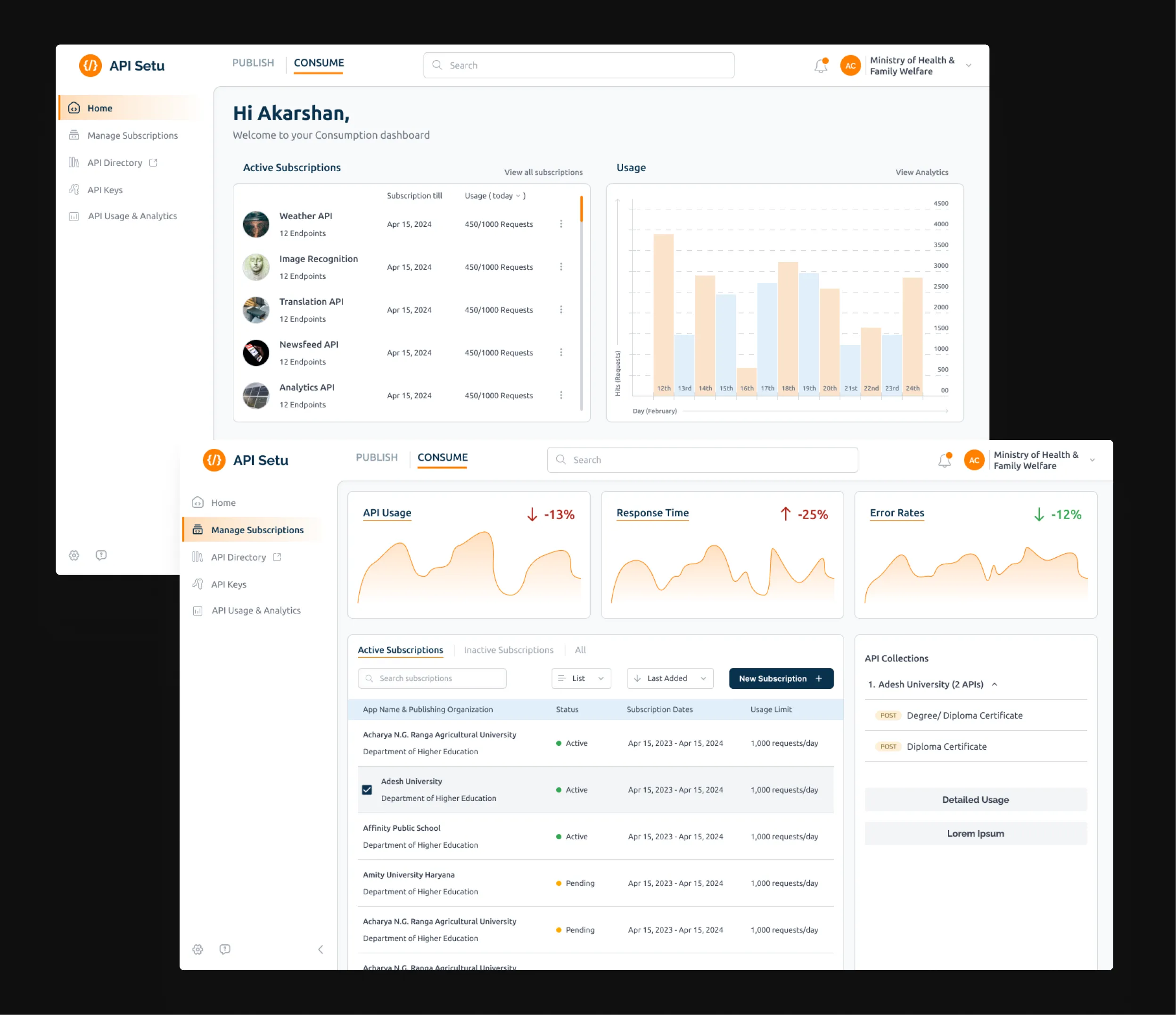
4.3.8 API consumer dashboard.
Image4. Admins finally had a home screen
Teams, roles, permissions, member management: all there. Onboarding requests reviewable with actual context. Partner service requests from DigiLocker and others with a proper approval flow built in.
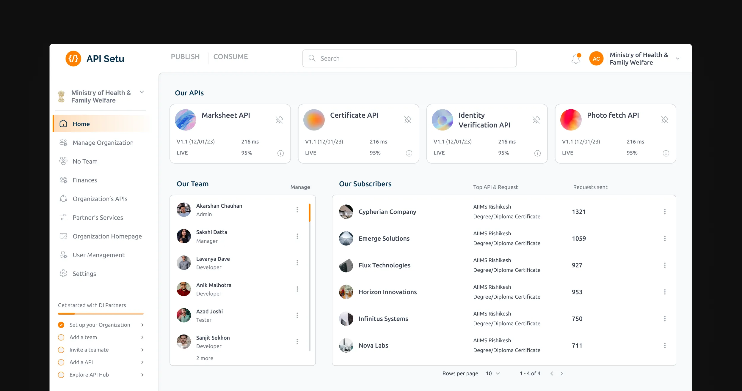
4.4.1 Organisation home dashboard.
Image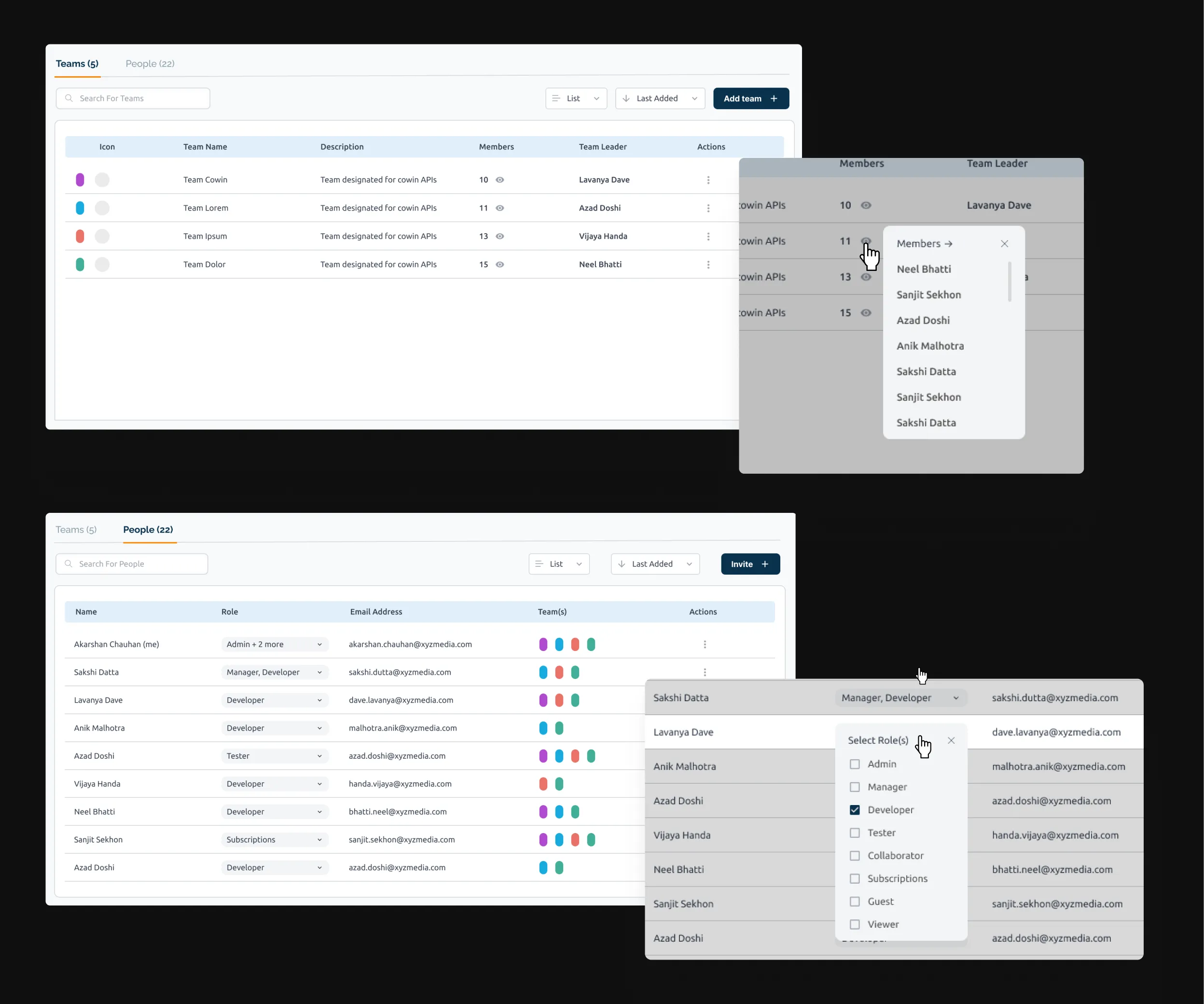
4.4.2 Organisation management: teams and people.
ImageAPI Setu admins review Digital India partner service requests, from DigiLocker and others, with the use case and organisation profile in view, so approval decisions are made with proper context.
4.4.3 Partner service request management, in motion.
LoopWhat the final designs don't show you
Three things made this project harder than a standard redesign, and one feature I fought for that didn't make it.
No design infrastructure to lean on
UX4G was brand new when I joined this project. I was their representative, parachuted into a dev team that had never worked with a designer. No design system, no brand guidelines, no one to bounce visual decisions off.
Every banner, icon, and illustration I either made myself or found and adapted from other sources. It was scrappy.
It also made me more self-reliant than I'd ever had to be before.
Every change was a negotiation
API Setu had real users and real technical debt. The team's default was cautious, and fair enough. More engineering effort meant more testing risk and more chance of breaking something that was working.
I learned fast to pick my battles. Some things I could redesign freely. Others I had to work around.
Getting precise about that difference saved a lot of friction.
The sandbox that didn't ship
I wanted an integrated testing sandbox: test your API before publishing, try someone else's before subscribing, all without leaving the platform. The kind of thing Postman makes feel obvious.
It didn't make it. A Swagger module was already in place, replacing it felt too disruptive, and the call was made to keep it.
I understood the logic. I still think the sandbox was right.
That tension, between what's best and what's buildable, is one of the more honest parts of this project.
A platform ready to grow
Publishers up 57%. APIs on the platform up 61%. Transactions up nearly 3x.
At the start of the project
Post revamp
Quick caveat: these numbers weren't caused by design alone. Ministry mandates, Digital India policy push, and growing partner interest all played a part.
What I do believe, based on working alongside these teams across the project, is that the redesign made the difference between people arriving and people actually staying. A platform that developers found confusing and off-putting was not going to onboard 600+ new publishing organisations and retain them.
The usability had to be there for the growth to stick.
What this project changed about how I work
First time owning a product end to end
This was the first project where I was responsible for the whole thing, not a flow, not a feature, but a product with four distinct user types and dependencies across government departments.
That was a lot. It's also where I learned the most: how to hold multiple perspectives at once, how to sequence work when everything feels equally urgent, how to explain design decisions to people who live in code.
I wish I'd built the design system first
I came into this project relatively new to the concept of design systems. By the time I was halfway through, I understood why they matter.
Without a coherent system in place from the start, the design files became increasingly difficult to manage: redundant components started appearing, and decisions made early created inconsistencies that took time to untangle later.
The further in I got, the more I wished I had established the foundations first rather than building them reactively. That lesson shaped how I approached everything after this.