Rebuilding a design system from the ground up
Lead designer on a complete overhaul of UX4G, India's national government design system: from a Bootstrap-dependent UI kit to a research-grounded, token-based system built for the full complexity of Indian government service delivery.
A design system that existed but wasn't being used
UX4G is India's national design initiative under MeitY, developed and maintained by NeGD under Digital India. The UX4G Design System is the core of that initiative: a shared system that government teams and their vendors can use to build faster and more consistently, without reinventing decisions that have already been made.
The system had versions. 1.0 was Bootstrap with a government coat of paint. 2.0 was a more deliberate effort: a Figma library and a more cohesive visual direction. In an ecosystem where most government platforms had no design coherence at all, that mattered.
But the limits of 2.0 became harder to ignore the more you worked with it.
1. Material Design dressed as government
Any designer familiar with Material UI would recognise the 2.0 components immediately. They were not built for Indian government platforms, which have different information densities, different user demographics, and specific requirements around trust and legal credibility.
2. Bootstrap from day one, no token architecture
Using UX4G meant using Bootstrap. No design tokens, no custom theming architecture, no separation between the design system and the framework. The system had no identity in the codebase and could not be themed by adopting organisations.
3. Shallow component coverage, no patterns
States, variants, edge cases: most of it was not covered. Teams constantly detached, customised, and improvised. And there were no patterns: no guidance on how to compose components into government-specific interactions like eligibility checks, Aadhaar authentication gates, or grievance tracking flows.
The gap between visibility and adoption
2.0 usage had been mostly in conversations and presentations, not in actual implementation.
The gap between a system teams can reference and a system teams actually build with is largely a documentation and tooling problem. That was the signal to act.
Starting from services, not components
UX4G 2.0 had been built from convention and imitation. It looked at existing design systems and adapted them for a government visual language. The components existed, but they were not derived from how Indian government services actually work.
3.0 needed a different starting point.
Analysing ~12,000 government services
The starting point was the CSC Digital Seva Portal: every government service delivered through the VLE network, across central and state platforms, financial inclusion, health, legal, agriculture, and more. The site blocked programmatic access, so we went to the National Government Services Portal (services.india.gov.in) and official source documents: service catalogues, VLE onboarding kits, process flows, and state e-District portal documentation from multiple states.
The question was not "what components do government platforms need." It was "what are citizens actually being asked to do, across all of these services, at the structural level?"
Mapping 12,000+ services across 15 categories produced 10 structurally distinct journey types. Not features, not screens, but journeys. Each one has a different trust model, different failure modes, and different patterns that keep recurring within it.
2.1 Interactive coverage map — 14 categories, 72 sub-categories, ~12,000 services, each mapped to its journey types. Click a category to expand.
Interactive10 canonical service journeys
Out of this analysis, 10 journey types emerged. Every government service in India, regardless of ministry or domain, is one of these, or a combination of them: Apply, Pay, Enrol, Verify, Update, Access, Transact, Consult, Lodge, Assess.
These are not taxonomic categories. They are structural archetypes: each one has a different shape, a different trust model, different failure modes, and different patterns that recur within it.
2.2 The 10 canonical journey types — select one to see its definition, requirements, and example services.
InteractiveFrom journeys to patterns
With the 10 journey types defined, we broke each one into constituent steps: every screen a citizen sees in sequence, what they need to do at each step, what the system needs to do, what variations occur (VLE versus self-service, with fee versus without, online versus offline fallback), and what the most common failure modes are.
These step maps revealed what keeps recurring across journey types. Aadhaar authentication shows up in Apply, Enrol, Verify, Update, and Transact, differently each time, but structurally similar enough to standardise. Document upload shows up in Apply, Update, Lodge, and Assess, with specific VLE kiosk variations that do not exist in self-service.
2.3 Step-by-step flow for each journey type — select a journey to walk its end-to-end sequence.
Interactive12,000+ services analysed. 10 canonical journey types. Step-by-step journey maps.
A layered system, not a component library
3.0 is not a component library. It is a layered system, and the layers are ordered by specificity: research and journey archetypes at the top, patterns that compose those journeys in the middle, and components that make up those patterns at the base. That is the order the work happened in.
Below, the layers are presented in reverse: components first, then the patterns that compose them, then the journeys those patterns ultimately serve, so each layer's foundation is visible before you see what it enables.
Foundations first
Every component inherits from the foundation layer. Getting it wrong first means unpicking it later, across everything. Colour and typography come before journeys, patterns, and components because everything above depends on them holding.
The raw palette
Primitive tokens are the starting point. Every semantic token traces back to one of these values.
3.1 Base color primitives, the foundation every semantic token resolves back to.
IMAGEWhat color means, not just what it is
Semantic tokens map a primitive to a UI role.
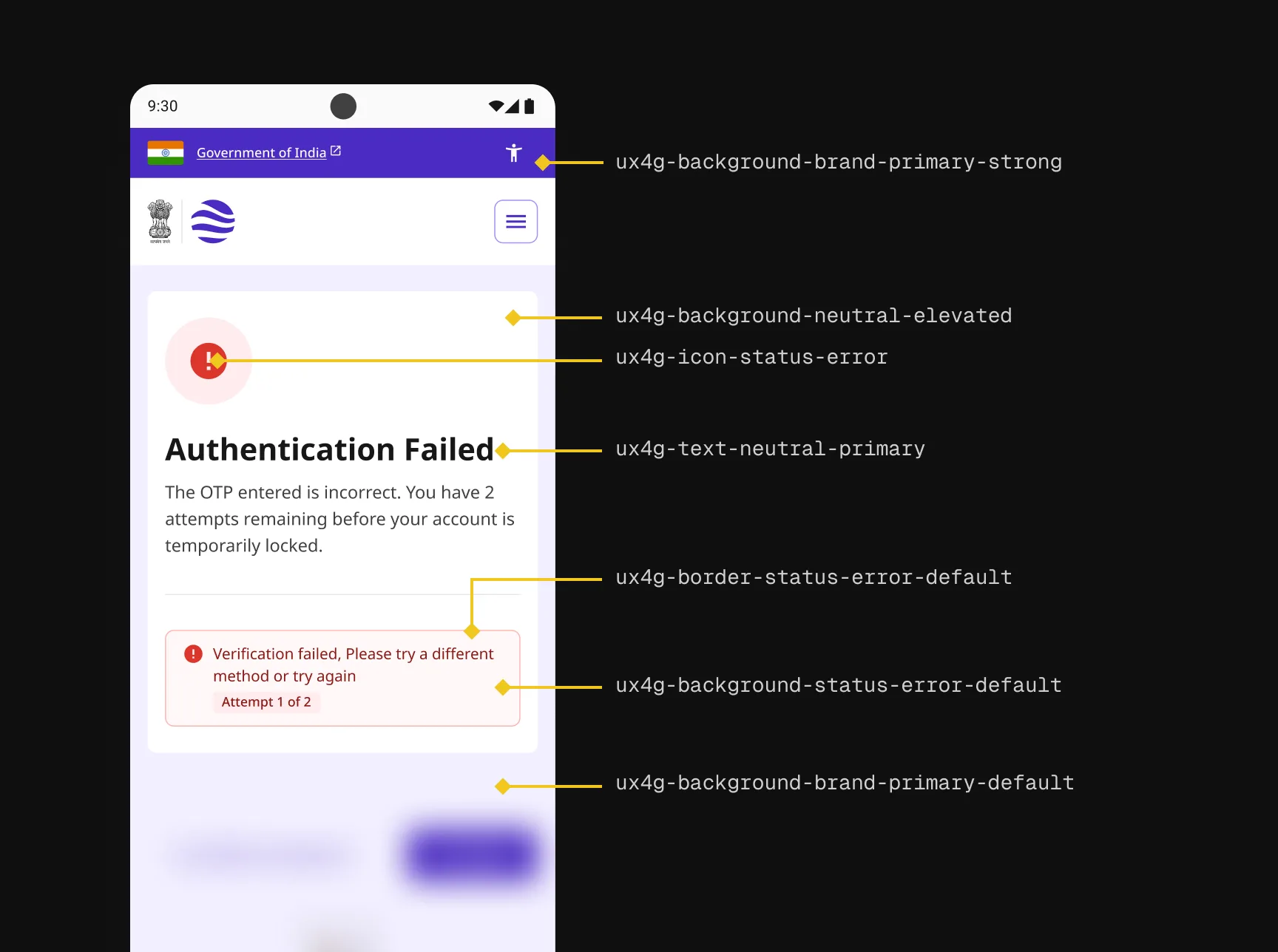
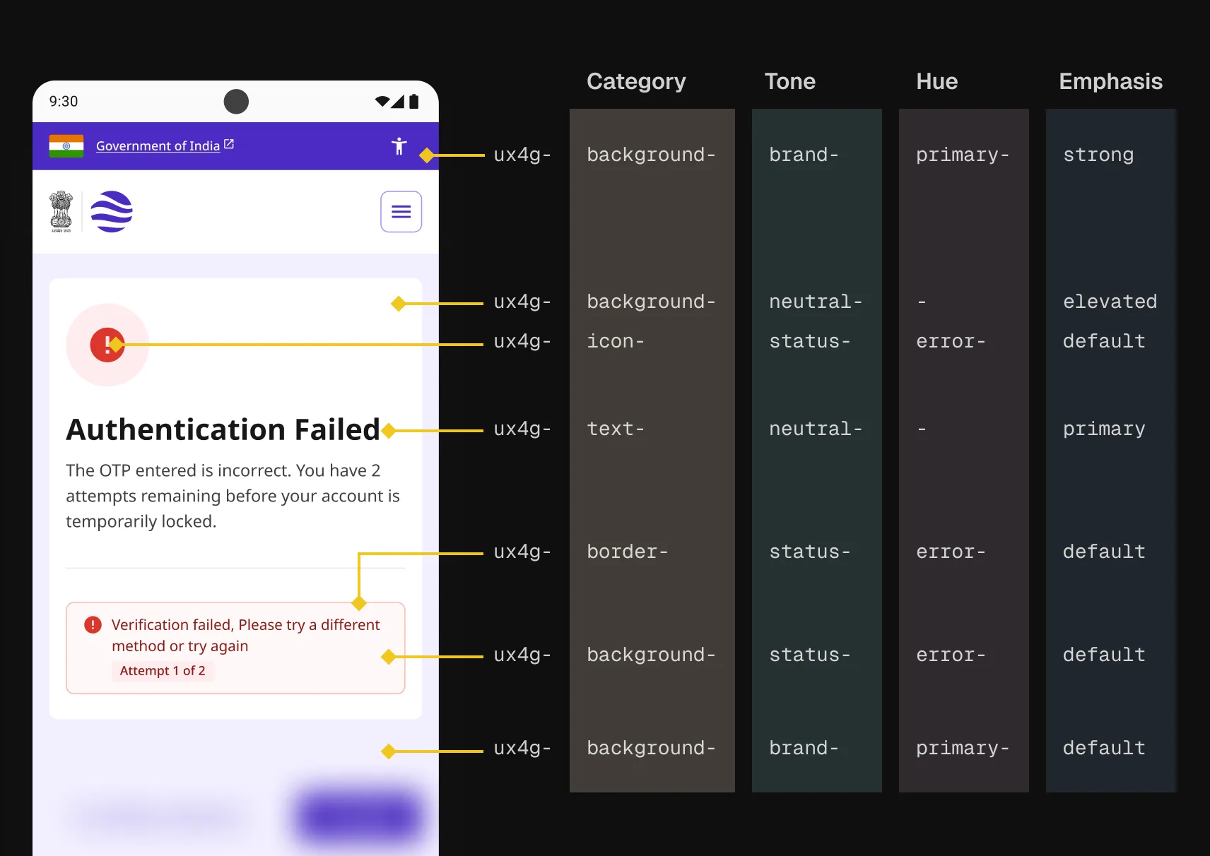
3.2 A semantic token broken into its four naming segments: Category, Tone, Hue, Emphasis.
IMAGEButtons carry more structure
Action tokens add two more segments: variant and state. A single interaction touches multiple properties at once.
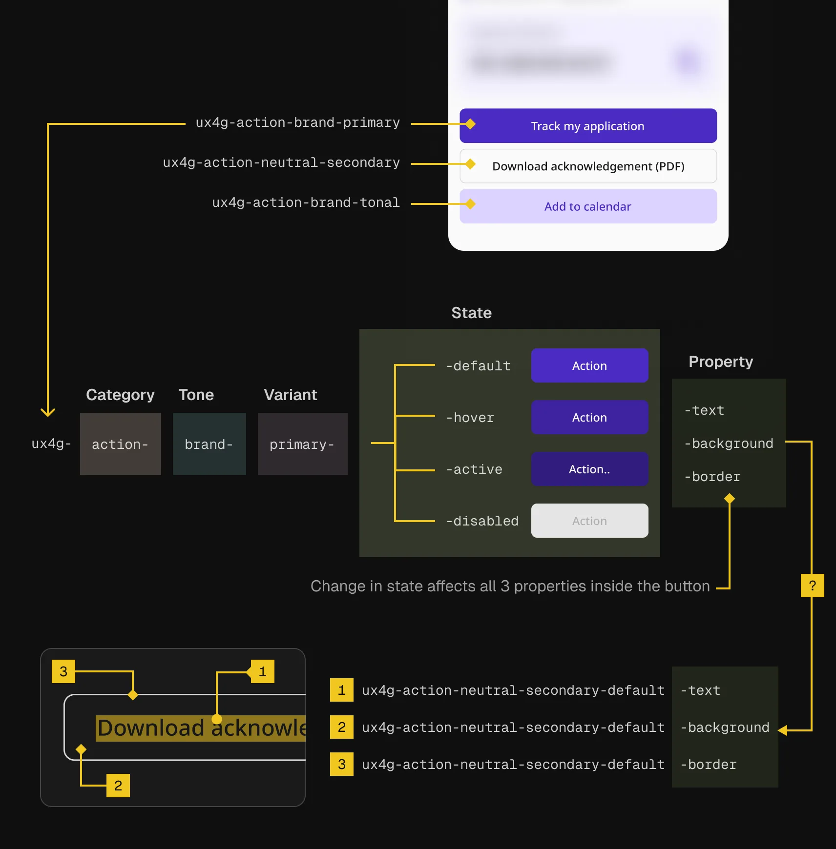
3.3 Action tokens carry two extra segments, Variant and State, to handle button treatments and interaction states.
IMAGESame idea, different logic
Controls skip tone and variant entirely. State vocabulary changes depending on which property you're looking at.
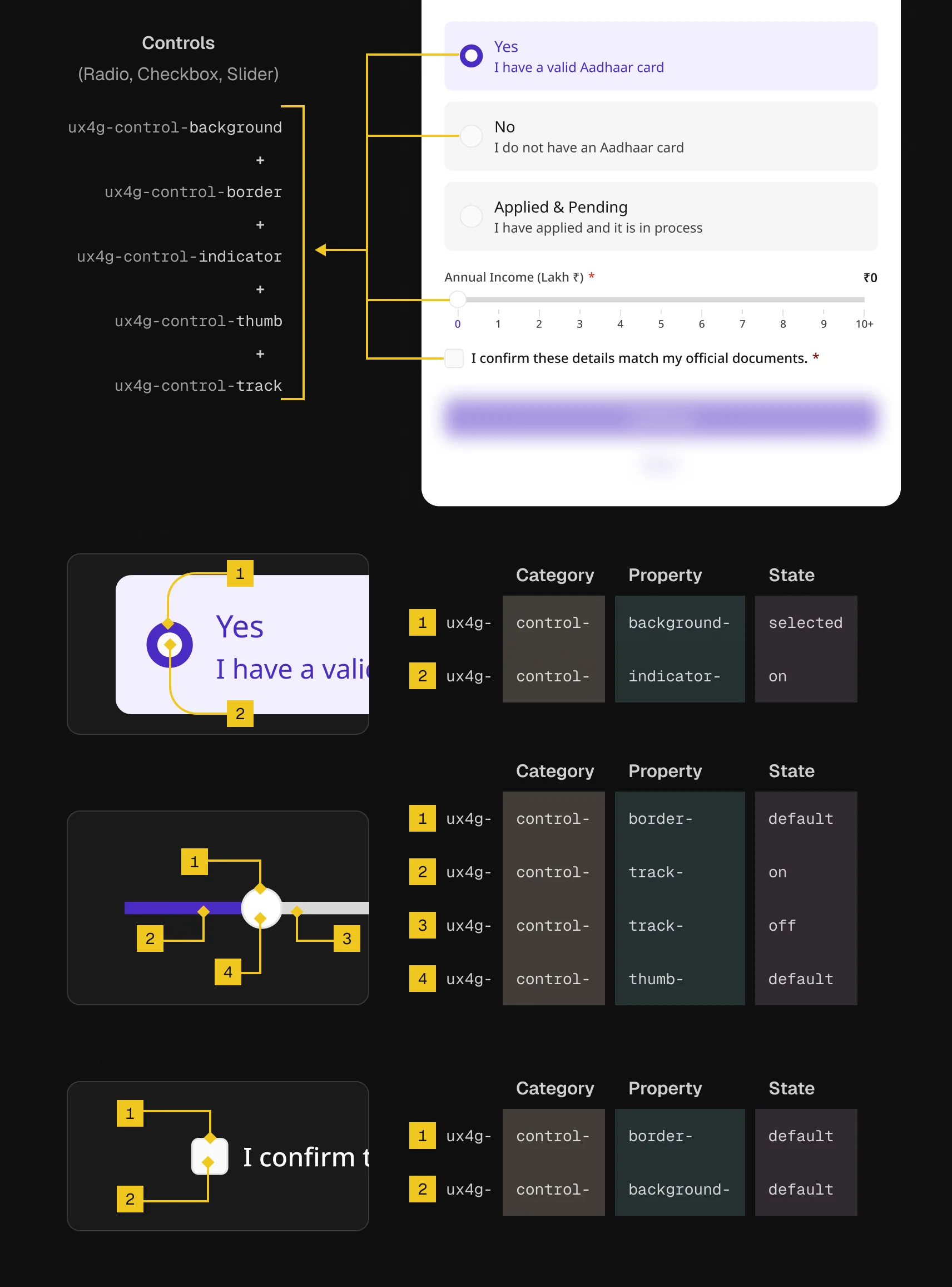
3.4 Control tokens follow their own logic: state vocabulary changes per property, unlike Action.
IMAGEProof it holds together
Every token resolves automatically across themes. No manual overrides, no exceptions.
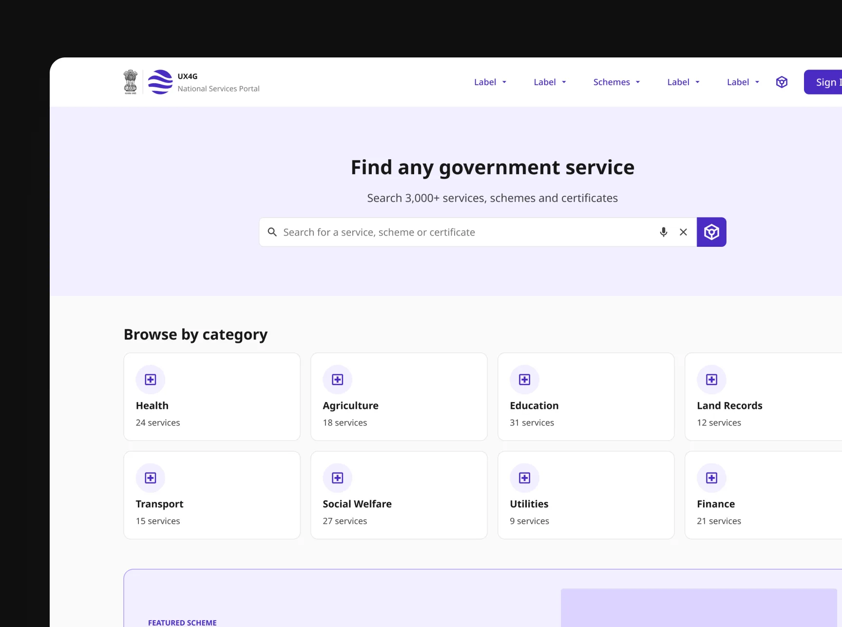
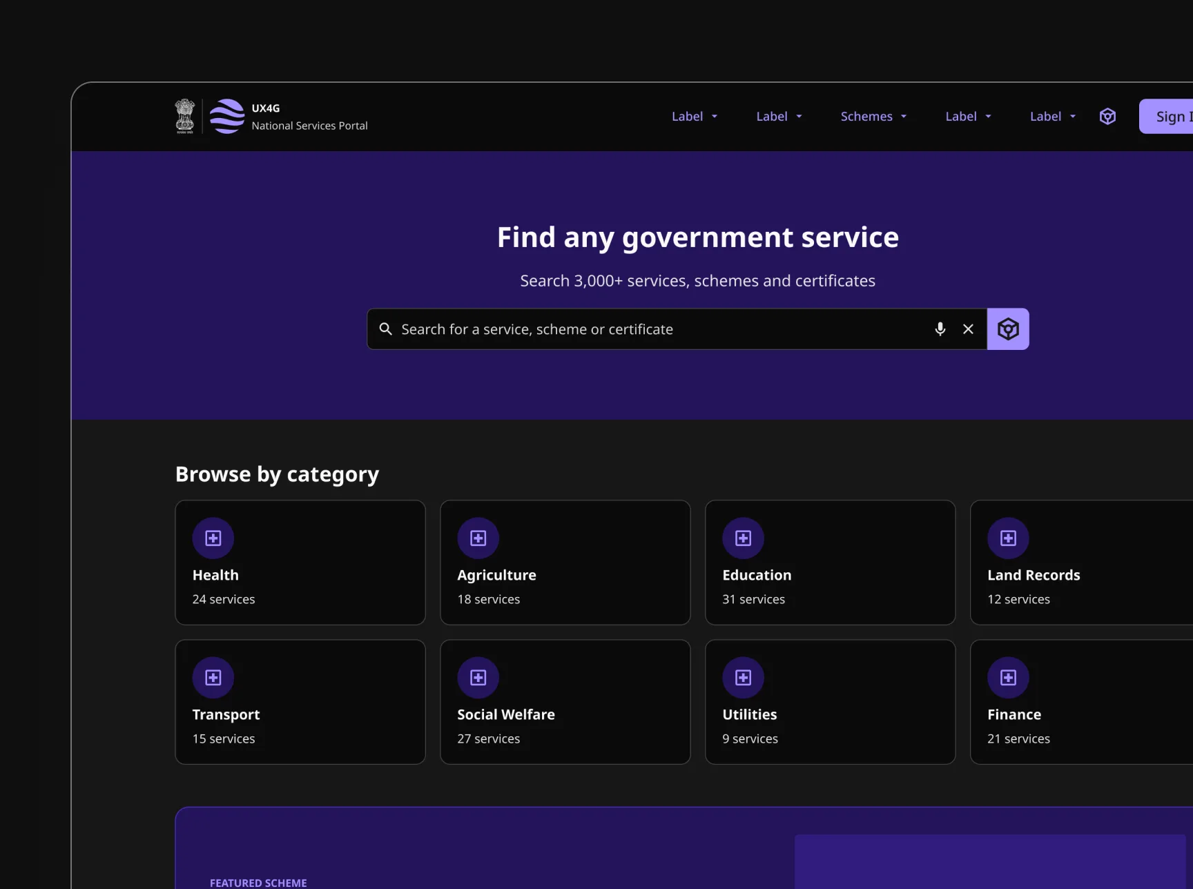
Every token in the previous sections resolves automatically — no manual retheming.
3.5 The same page, fully retokened for light and dark mode with no manual overrides.
IMAGETypography is built on Noto Sans (body) and Noto Sans Display (display), chosen specifically for coverage of Devanagari and the range of Indian scripts required for regional language support across government platforms.
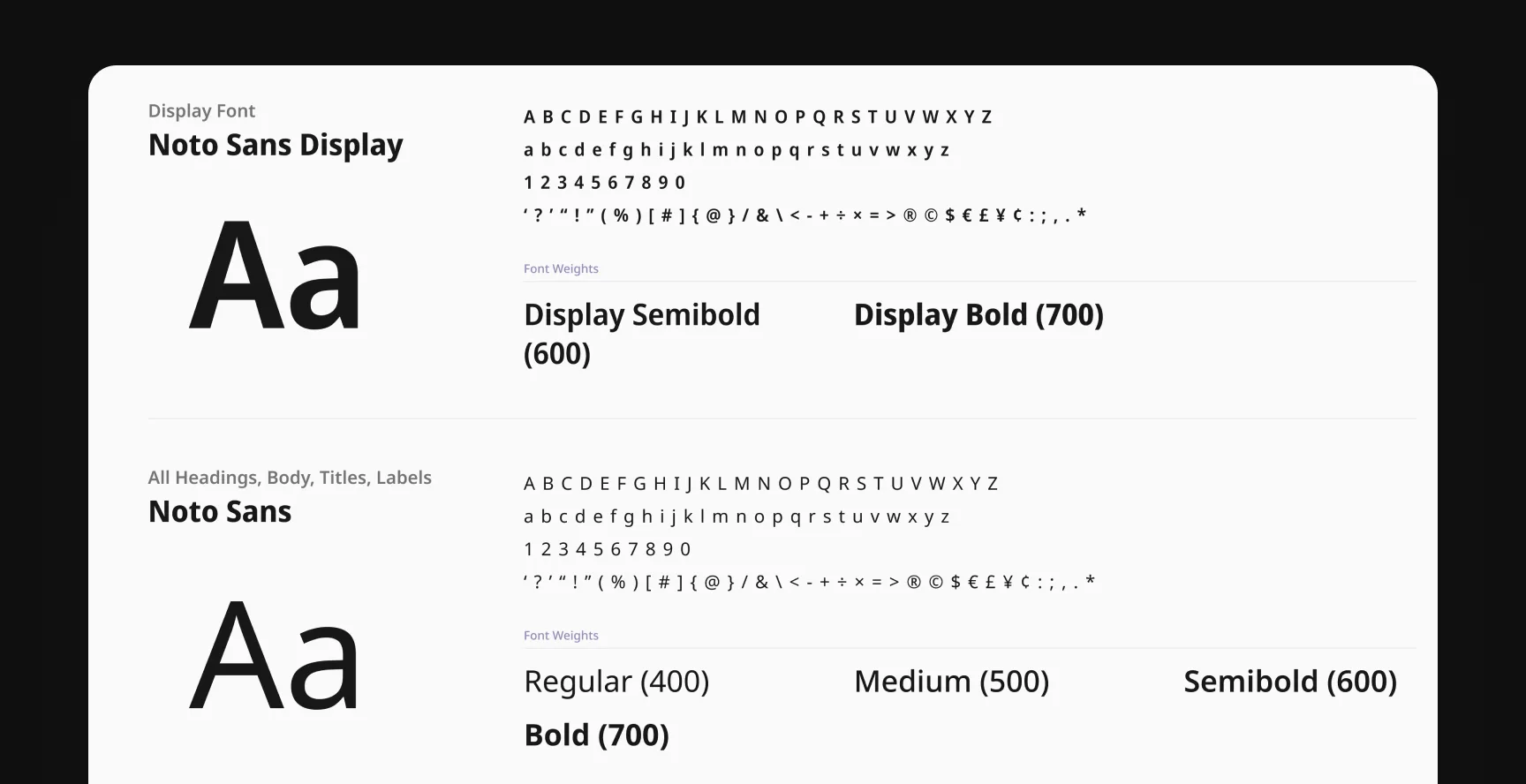
3.6 Two typefaces cover the entire system: Noto Sans Display for display text, Noto Sans for everything else.
IMAGE3.8 Full type scale across five categories. Data unchanged, left as-is.
IMAGE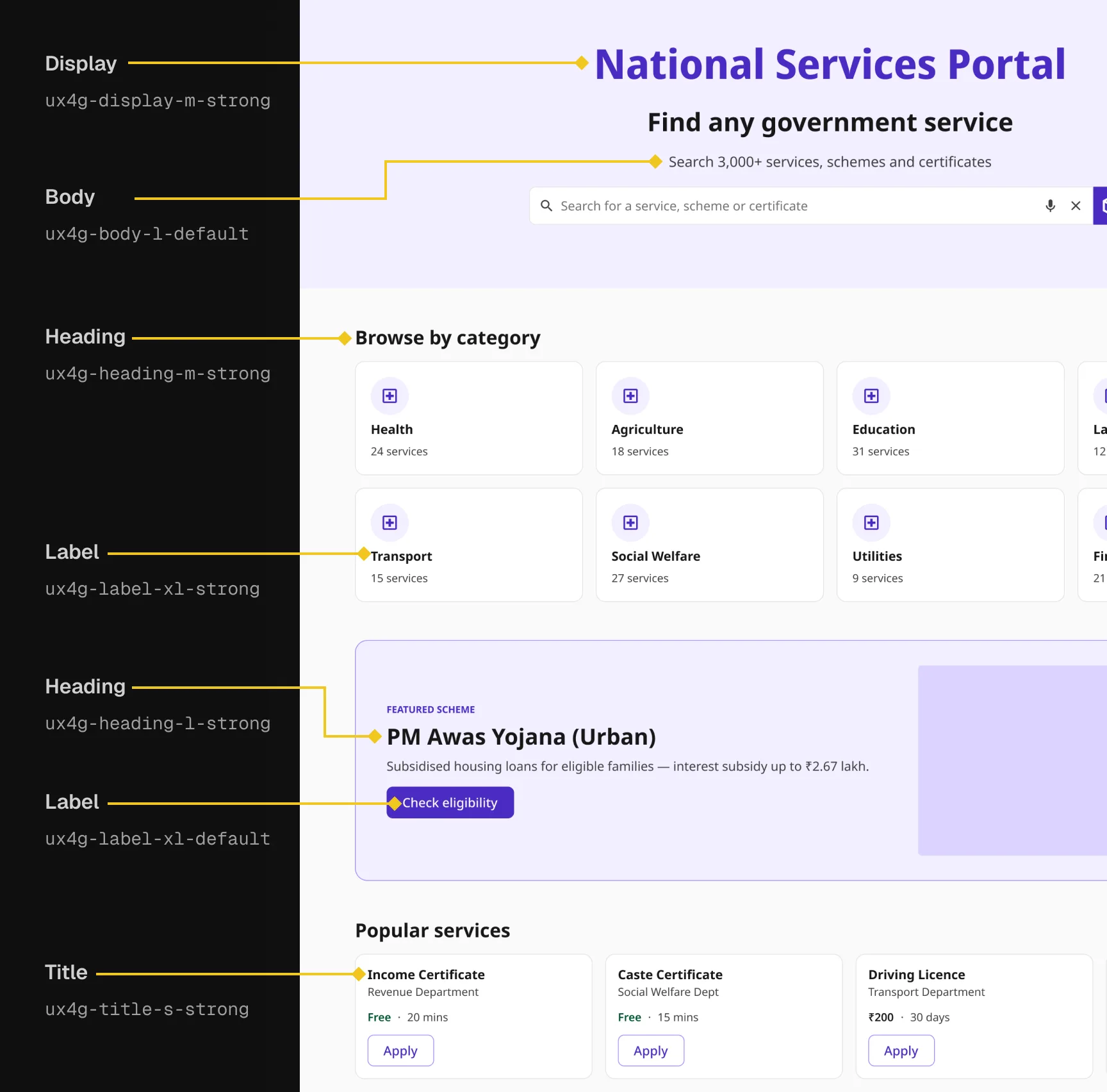
3.9 Five type tokens in use across a single screen, from page title down to card labels.
IMAGEWith the foundations in place, the next layer up is the smallest reusable unit: the components everything else is built from.
60+ components across 6 groups
The component set was chosen by frequency of use across the journeys, not by what looked comprehensive on paper. The research phase told us exactly what components were needed. The journey maps told us exactly what states and variants each component had to support.
Six groups: Form Elements (13), Feedback (13), Data Display (17), Navigation (9), Capture and Verification (1), Utility (4).
Every component was defined with anatomy: named layers, explicit properties, documented states. Every Figma component property maps to something that exists in the code. If a property existed in Figma but had no code counterpart, it did not belong in the component.
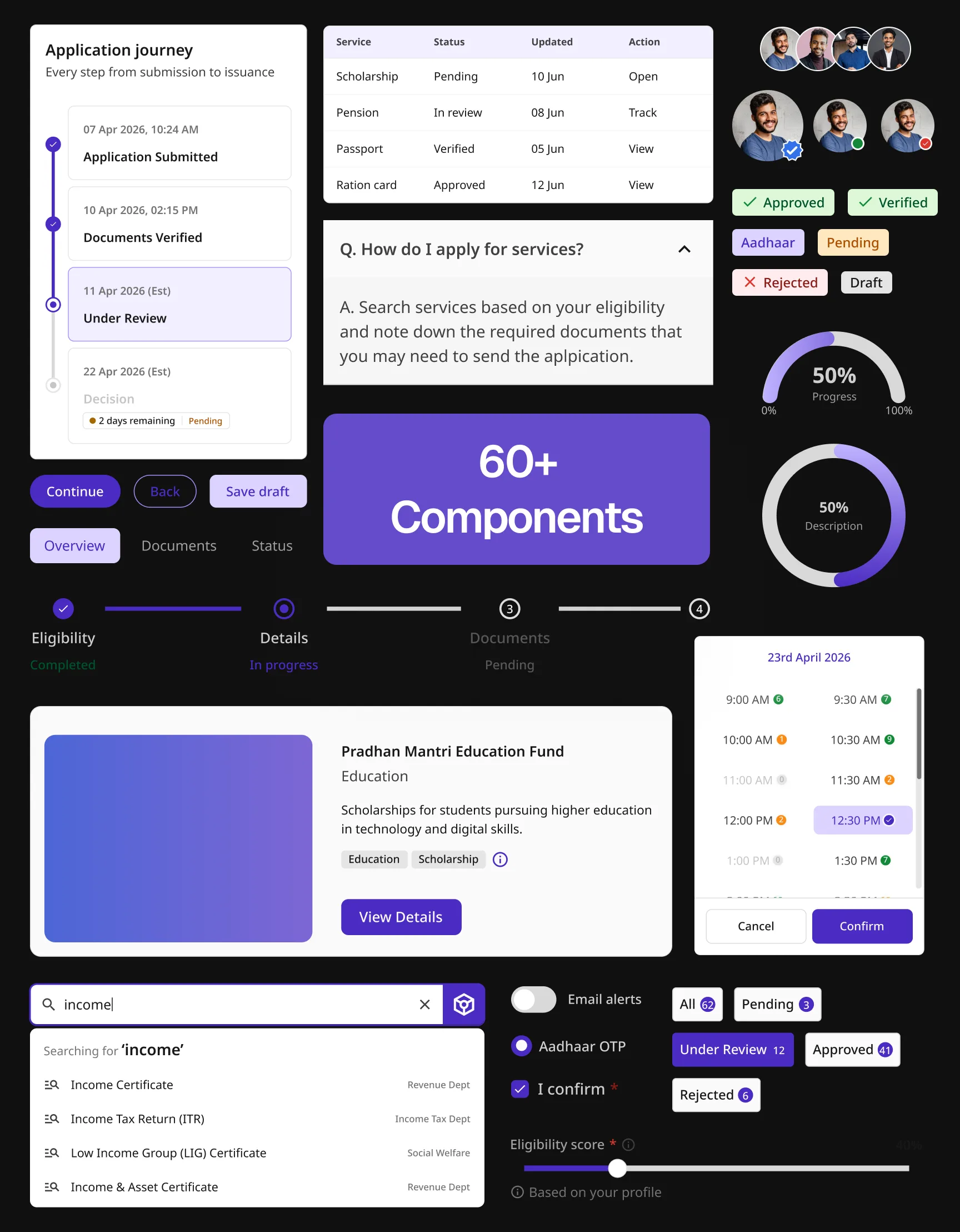
3.10 A sample of the component library in use: timelines, status tables, progress indicators, search, and form controls across real application flows.
IMAGEGovernment-specific components that don't exist elsewhere
Several components were created from scratch because the research made them necessary, not aesthetic choices, but responses to specific legal requirements, verification standards, and accountability obligations inside Indian government service delivery. Some are shaped by the Right to Service Act and DARPG guidelines around processing deadlines. Others come from UIDAI's Aadhaar authentication standards, or CPGRAMS' requirements for grievance escalation.
A generic component library was never going to cover this.
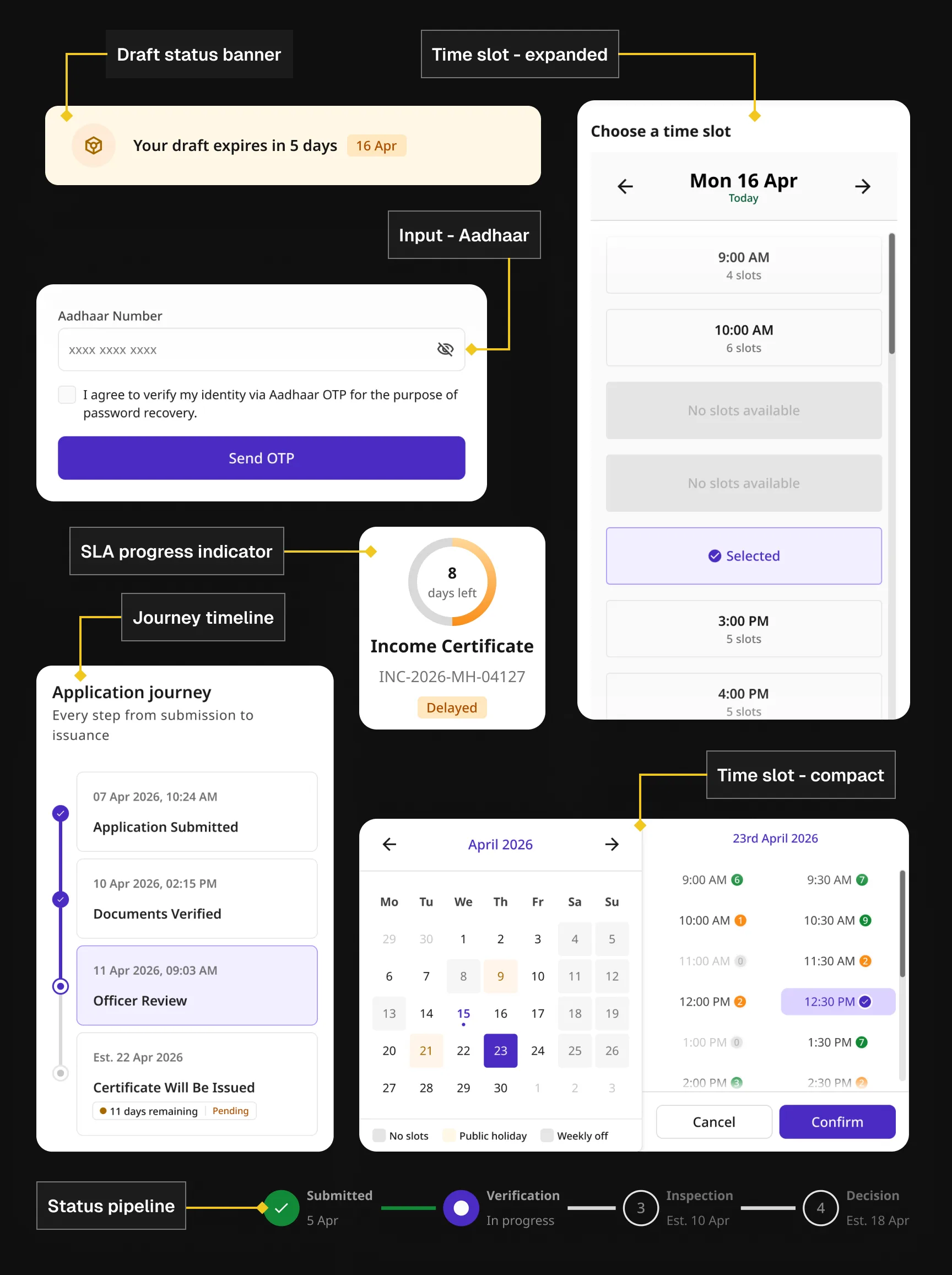
3.11 Draft expiry banners, Aadhaar-linked inputs, SLA progress rings, application journey timelines, and slot booking in both compact and expanded states.
IMAGE36 patterns across 9 groups
Patterns sit one level above components: each one composes multiple components into a complete interaction that solves a specific user-facing problem. They are the layer that translates a component library into a design system.
The nine groups: Identity and Access, Consent and Declaration, Application and Submission, Status and Tracking, Payment and Transactions, Search and Discovery, Dashboard and My Applications, Notifications, Feedback and Communication.
Three patterns worth calling out specifically:
The Aadhaar Authentication Gateappears in 5 of the 10 journey types. It presents four authentication methods in order: OTP (default), Face (UIDAI liveness detection), Fingerprint (hardware device, VLE contexts), and TOTP. In VLE kiosk mode, the method set changes: fingerprint is primary, webcam face auth is never offered, and the VLE's own identity is logged alongside the citizen's for audit.
These are not design preferences. They are compliance requirements.
The DPDP Act Consent Capture pattern covers explicit consent per data category, separate consent for biometric and sensitive data, clear disclosure of retention period, and a complete audit trail. Required and optional data categories are visually and functionally distinct. Bundled or implied consent is not permitted under the Digital Personal Data Protection Act 2023.
The Document Scan and Uploadpattern in VLE kiosk mode always uses separate Scan and Upload buttons, never a combined control, because kiosk operators work with physical documents and flatbed scanners, not phone cameras. On validation failure, show "Please compress or re-scan," never "Upload failed" without a reason.
3.12 The 36 patterns across 9 groups. Data unchanged, left as-is.
Interactive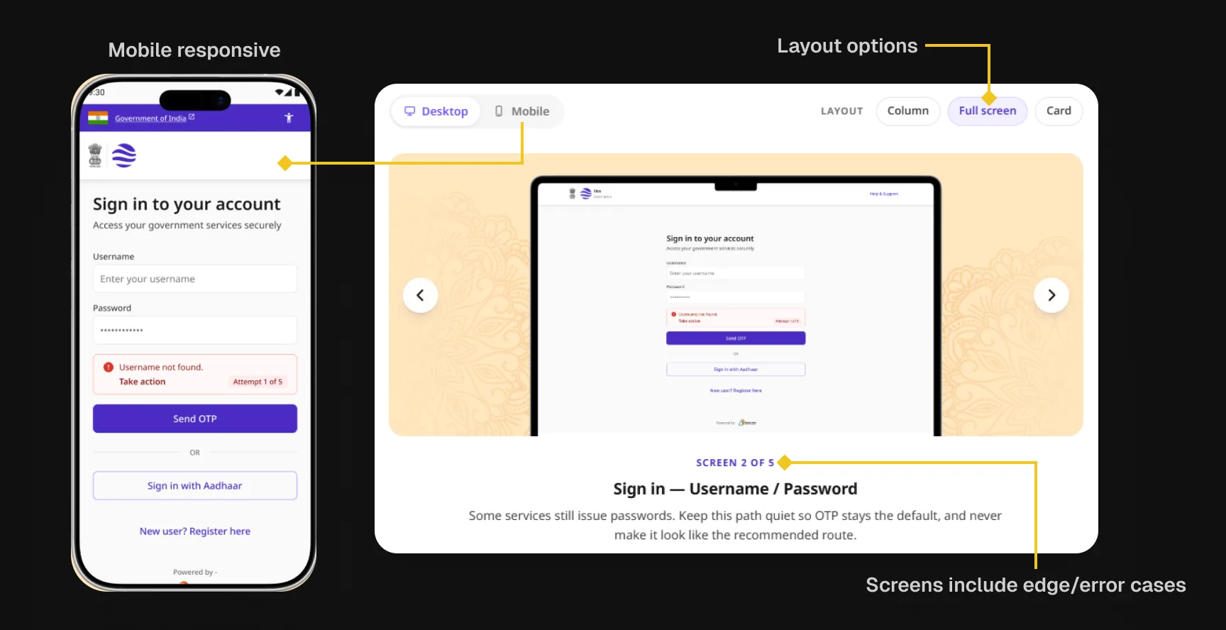
3.13 An example of a pattern from one of the 9 categories, showing multiple screens to choose from, including branch flows and edge cases.
IMAGEPatterns solve individual problems. Journeys are where all of it comes together into something a citizen actually completes.
Service journey blueprints
10 complete end-to-end journey blueprints cover the full citizen experience for each journey type. Each is a connected sequence of mobile frames from service landing to post-completion, with all edge cases and branch flows documented. All patterns referenced rather than redesigned.
These matter because for government services in India, the composition of patterns into a complete flow is largely determined by law, administrative procedure, and the nature of the service category. A team building an income certificate application does not need to decide whether to put Aadhaar authentication before or after consent capture. The Apply blueprint answers that question.
The team's job is to implement, not to rediscover.
The Apply journey alone composes 12 patterns: Eligibility Check Wizard, Sign In, Aadhaar Authentication Gate, Consent Capture, Government Form with Validation, Document Scan and Upload, Save and Resume, Declaration Before Submission, Payment and Confirmation, Submission Acknowledgement, Application Status Tracker, and Journey Progress Indicator.
3.14 Apply journey blueprint, patterns in sequence. Data unchanged, left as-is.
InteractiveDocumentation website
Early in component development, a pattern emerged. Components were being handed off with clear Figma specs. What came back in code did not match, not in dramatic ways, but consistently: a spacing value here, a state behaviour there, a property name that did not align with the definition.
The issue was not carelessness. Reading a Figma file and understanding the intent behind every decision are two different things.
This was not in anyone's brief. I built an internal documentation website where every component had its own page: visual examples across all states, defined properties, exact class names and values, and annotations explaining the reasoning behind key decisions. Once live, developers used it alongside the Figma files as their primary reference.
The gap between designed and built components narrowed significantly for the rest of the phase.
This internal site later became the foundation for the public-facing UX4G 3.0 documentation website, currently in production, covering Foundations, Fundamentals, Components, and Patterns.
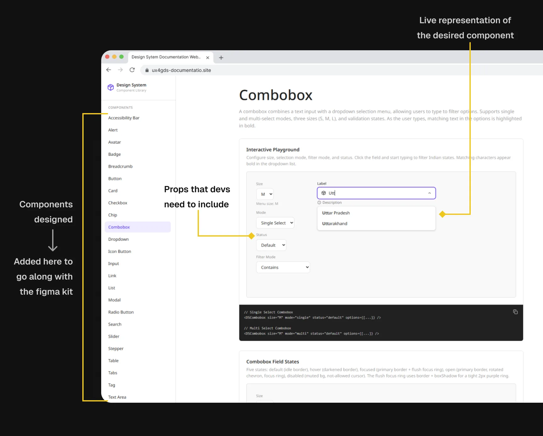
3.15 Every component gets an interactive playground, a live prop configurator, and copy-paste code output.
IMAGEWhat else was built
Beyond the core system: a four-part design specification document covering all components, patterns, and service journeys, the primary handoff reference for the engineering team. A Figma plugin allowing adopting government organisations to modify foundation tokens without breaking component structure, using the Figma Variables API and the culori library for OKLCH colour ramp generation. An AI Integration Guide for government teams on integrating AI tools (Figma Make, Claude Code, Cursor, Copilot) into UX4G workflows, with DPDP Act 2023 and MeitY advisory compliance guidance.
Bitter pills to swallow
No precedent to lean on
Neither the design team nor the development team had built a system at this scale from scratch before. Every significant decision, how to name tokens, how component properties should map to CSS, how to structure state logic, how to scope a pattern versus a component, had no internal precedent.
Every decision required researching how other systems had handled the same problem before taking a position.
Slower process. More defensible decisions.
Pressure to show the work before it was ready
While phase 1 was in progress and developed components were still in testing, there was pressure to start showing the work externally: presenting to higher-ups, running workshops, building awareness before the system was fully validated.
A design system's credibility depends entirely on people trusting that what it tells them to do is correct. Presenting an untested system as production-ready risks that trust in a way that is hard to recover from.
We navigated it by being transparent about what was tested and what was not.
Existence was never the problem. Adoption is
The gap between a design system that exists and one that gets adopted is largely a documentation and tooling problem. 2.0 existed. Adoption was minimal.
The Figma plugin, the specification document, the documentation website, the AI integration guide: these are all attempts to close that gap for 3.0.
Whether they succeed is something only adoption numbers over the next 12 to 18 months will answer honestly.
Phase 1 done. Adoption is the real test
Phase 1: complete
The foundations, all 10 service journey blueprints, 36 patterns, 60+ components, the documentation website, the Figma plugin, the specification document, and the AI integration guide are all done and handed off to the engineering team.
Phase 2: scoped
The public-facing documentation site is live. Phase 2 covers the npm package and proper versioning, documentation for designers and product managers alongside the existing developer docs, Figma MCP and Code Connect validation, and a community component repository where government teams can contribute components back to the system.
The honest measure of whether this worked is not how comprehensive the system is. It is whether teams building government platforms actually use it.
That answer is still being written.
What this project changed about how I work
Start from services, not components
Starting from services rather than components changes what you build. The SLA Progress Indicator, the Escalation Tree, the Biometric Capture component, the specific constraints on Aadhaar-prefilled fields: none of these would exist if we had started from a component inventory.
They exist because the research made them inevitable. That sequencing matters, and I would not approach a design system differently now.
Your users are designers and developers
Your users are other designers and developers, and that changes the quality bar. Not just "does this feel right," but "is this defensible, consistent, and correct at a level someone will inspect, compare against GOV.UK, and write a critical LinkedIn post about."
Designing for practitioners requires a different kind of rigour than designing for end users.
The work I wasn't assigned mattered most
The work I was not assigned turned out to be some of the most useful work I did. The internal documentation website was not in anyone's brief. The AI integration guide was not in anyone's brief.
Both came from noticing problems and deciding to fix them rather than manage the symptoms. That is the thing I want to do more deliberately.