NATIONAL CAREER SERVICE (NCS) 2.0
Reimagining India's national
employment platform
from the ground up
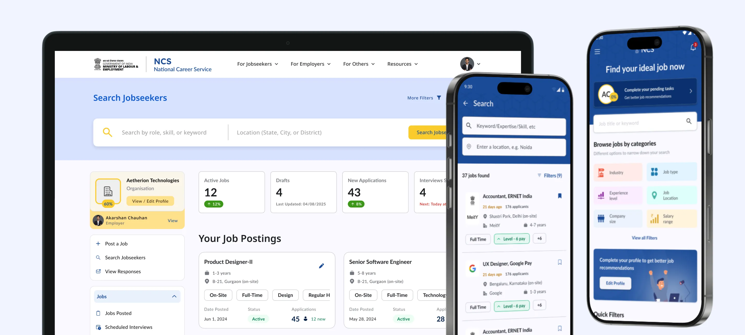
End-to-end redesign and development of NCS, the government platform connecting India's jobseekers and employers across formal and informal sectors.
MY ROLE
Product Owner
responsibilities
Research, Design, Product ownership
TIMELINE
Nov 2024 - Ongoing
CLIENT
Ministry of Labour & Employment
how this started
A concept proposal I sent cold. Months later, it became a full project.
This one didn't begin with a brief. I put together a concept proposal covering a few key modules of the NCS jobseeker app and sent it to the Ministry of Labour and Employment as an outreach. No one asked for it. I just thought the platform needed it.
Six or seven months passed with no response. Then a follow-up came, and what started as a few concept screens eventually turned into a full end-to-end design and development engagement. I moved from being the person who sent the proposal to being the product owner across the entire thing: conducting research, owning the design from first principles, and coordinating the development pipeline.
The core modules are now live. The platform is still actively evolving.


the problem
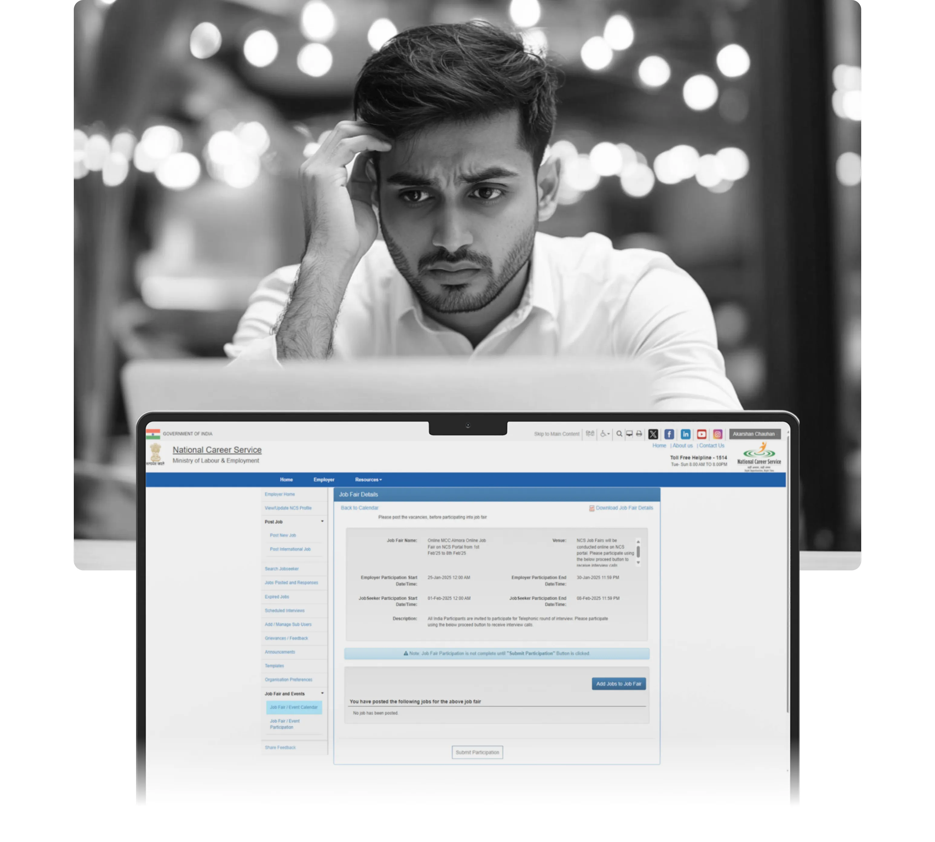
A national platform that felt like it hadn't moved since 2012.
NCS was functional in the way a lot of legacy government platforms are functional: it existed, it had features, and if you were determined enough you could eventually do what you came to do. But the experience was genuinely discouraging.
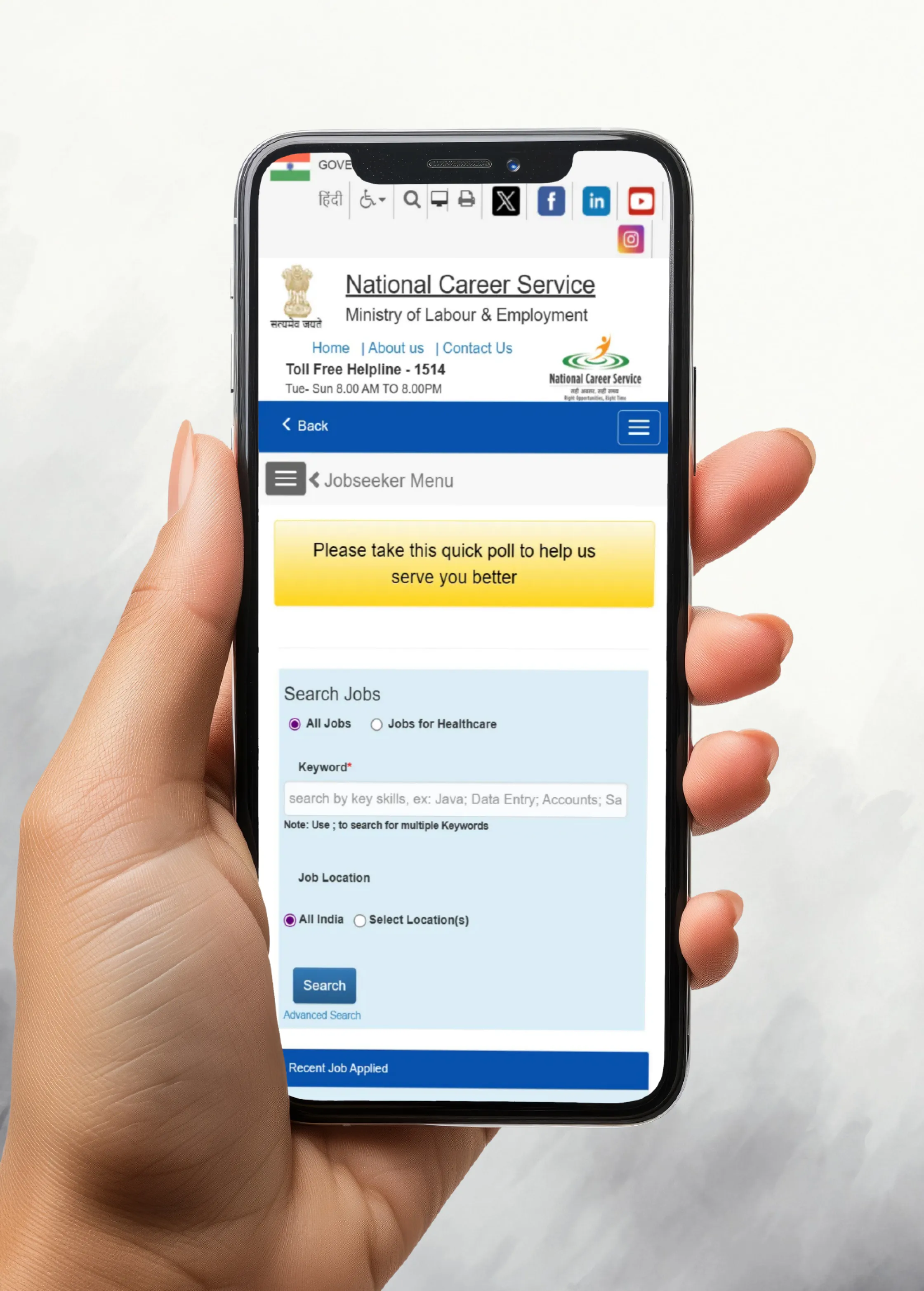
1. The mobile app was a dressed-up desktop site
The NCS app was essentially the desktop website wrapped in a mobile shell with no adaptation for how people actually use phones. For a platform meant to serve millions of jobseekers, many of whom use their phone as their primary or only device, this was a fundamental failure.

2.1
Existing NCS mobile app
Image
2. Key features were buried or broken
Job fairs, career counselling, application tracking: these existed on paper but were so hard to find and use that most users either didn't know about them or gave up. The information architecture seemed to have grown organically over years without anyone ever stepping back to look at the whole thing.
3. The platform wasn't designed for its actual users
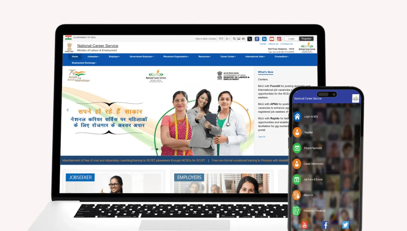
NCS isn't a platform for white-collar professionals switching jobs. It serves a much broader demographic: first-time jobseekers, informal sector workers, people with limited digital literacy, people applying for government roles from rural areas. The existing design made no concessions for any of this. It assumed a level of comfort with digital tools that most of its users didn't have.
2.2
Old NCS website and mobile app
Image
research & insights
Understanding the problem before designing the solution
Auditing the existing platform
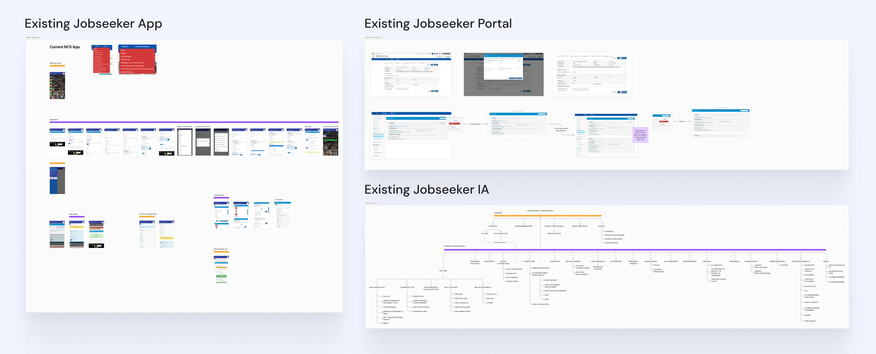
Before talking to anyone, I did a thorough teardown of the existing NCS app. Every section documented: welcome screen, registration flow, hamburger menu, main screen, search flow, job listings, counsellor discovery. The audit gave me a factual baseline of what was there and what was broken, not just a general impression.
3.1
Existing Jobseeker audit
Research board

3.2
Existing Employer audit
Research board
Competitive analysis: Indian and international platforms
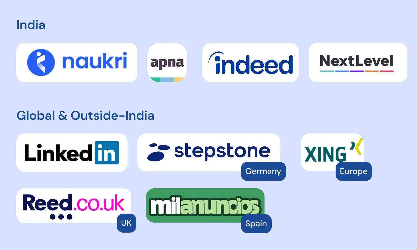
I studied seven platforms in depth across two markets: Indian & International. For each platform I mapped the registration flow, main screen, job search, listing page, application process, profile, and job preferences. The international platforms were particularly useful for understanding how public employment services handle scale and accessibility in ways private platforms don't have to think about.
3.3
Similar platforms benchmarked
Image

3.4
Competitive analysis
Research board
Talking to users: jobseekers and employers
For jobseeker insights, I spoke to people around me: friends, family, colleagues, and some blue-collar staff in the organisation. Not a perfectly representative sample, but real people with honest reactions. The gap between NCS and what they considered a normal job platform was obvious and consistent across every conversation.
For the employer side I took a different route. Through references from people at the ministry, I got visibility into how job aggregators post on the platform and how modules like career counselling and employment centres actually work. I also got useful insights from recruiters working within my own organisation. Not formal interviews, but real operational context that shaped how I approached the employer flows.
Ideation: from problems to features
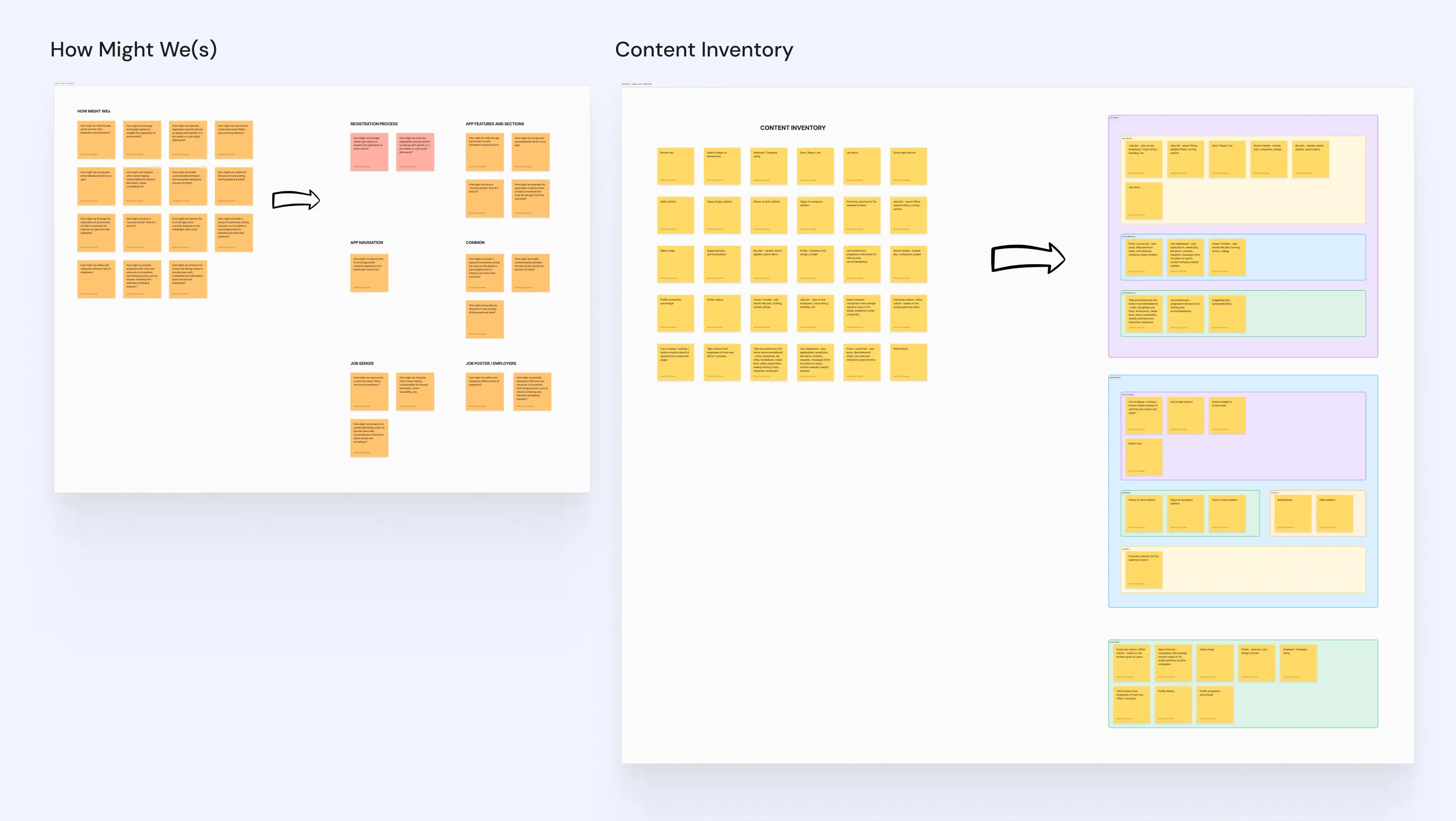
Before touching any design, I ran a structured How Might We session covering both personas. Questions like: How might we leverage the Government of India association to maximise trust? How might we improve the IA which currently relies entirely on a hamburger menu? How might we incorporate personalisation? How might we handle the full lifecycle of a job posting through to hire?
From there I built a content inventory, taking those opportunities and translating them into concrete features, then organising them by where they'd live in the product: job search, user dashboard, job preferences, app features, user profile. This was the bridge between research and design. Before any screen was made, I knew what the product needed to contain and where.
3.5
HMWs & Content Inventory
Research board
A government platform doesn't get to have a lower bar than a private one. Not when the stakes are someone's livelihood.
EXPLORATIONS
Not everything that was designed made it to the product.
Several significant pieces of thinking happened before and during the project that shaped the final design but never shipped.
1. An entirely different starting point for the informal sector
Once the project was confirmed, I kept coming back to a harder question: the redesign I had proposed still assumed a level of digital comfort that a significant portion of NCS's actual users simply don't have. Tailors, cap makers, agricultural workers, first-time jobseekers from small towns. These are the people NCS exists for.
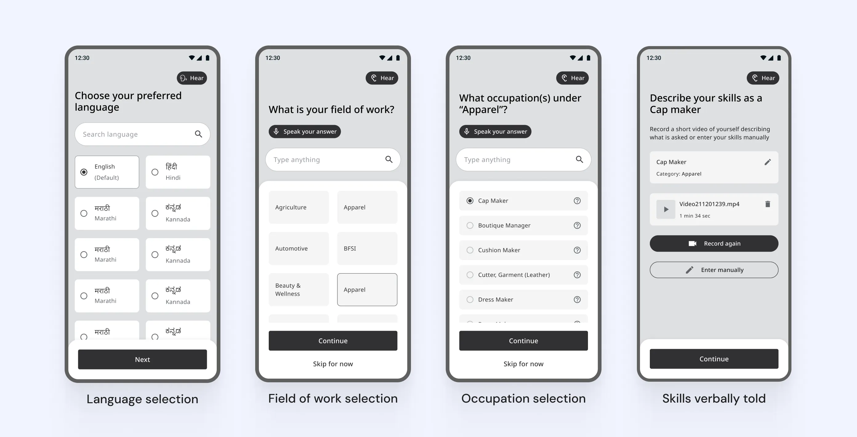
So I explored a completely different approach, which I called "Easy Mode". It would be on by default since it targets the majority of NCS's actual user base, and could be turned off in settings for users comfortable with technology. Language selection upfront. A persistent Hear button so users could listen instead of read. An assisted mode for profile setup. Occupations granular enough to actually reflect who was using the platform.
4.1.1
Reimagined jobseeker experience
Wireframes
It didn't move forward. Scope was set, time was limited, and a full rethink wasn't what had been agreed. The call was pragmatic. But the thinking carried over into the final design: the progressive complexity using features like the CV builder (shown in the coming sections)
2. The original proposal and why the visual direction changed
The concept I sent to MoLE had a distinct visual identity: deep navy, muted tones, a formal and restrained feel designed to signal credibility. Once the project began properly, the team felt the palette wasn't doing enough work. For a platform competing for attention against Naukri and LinkedIn, muted read as subdued rather than trustworthy. We shifted toward brighter, more confident colours.
The structure and information architecture of the original concept largely carried through. It was the visual language that evolved, not the underlying logic. The final designs are covered in detail further ahead.
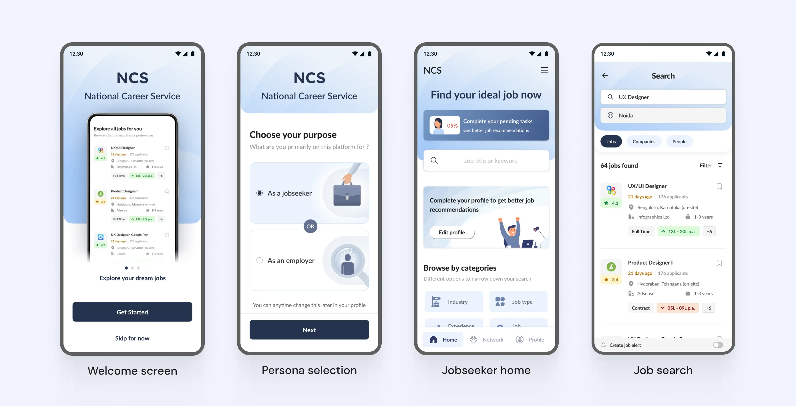
4.2.1
Redesigned app - Draft v1
Images
3. Employer flows designed for mobile app, pivoted to web
When I started designing the employer side, I designed it mobile-first. A full onboarding flow, EPFO verification integrated directly into employer registration, job posting screens, a jobseeker search and discovery flow, were all designed for a mobile app. The assumption was that recruiters would be on their phones.
Then I was told the scope for the employer side was web only. Some of what I had built translated directly, the information architecture and flow logic held up. Others were rebuilt from scratch for the larger canvas.
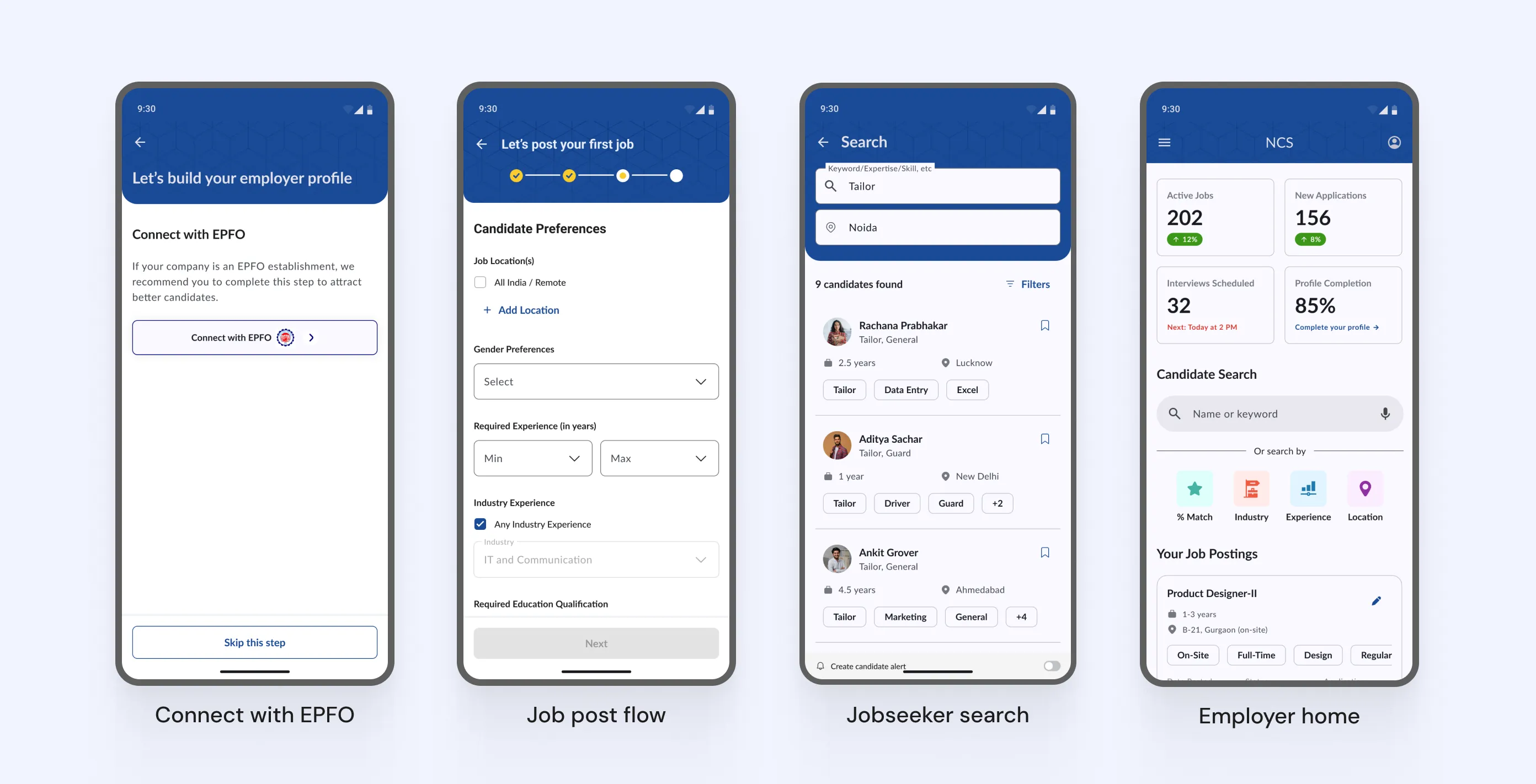
4.3.1
Draft employer app designs
Images
The EPFO integration specifically was one I believed in. Verifying an employer through their EPFO registration would have confirmed they were a real registered company with employees, creating a trust layer that no private platform could match. The API couldn't be arranged in time for launch so the integration was dropped entirely. A platform where employers are verified through EPFO and jobseekers are verified through DigiLocker would have been genuinely differentiated. That combination never shipped.
4. The recommendation engine that couldn't be built
Most of what exists on employer-side candidate discovery today is rule-based filtering. Does the candidate have the required education? Do they have enough years of experience? Is their location compatible? These are binary checks. They were achievable twenty years ago and they're what the platform currently does.
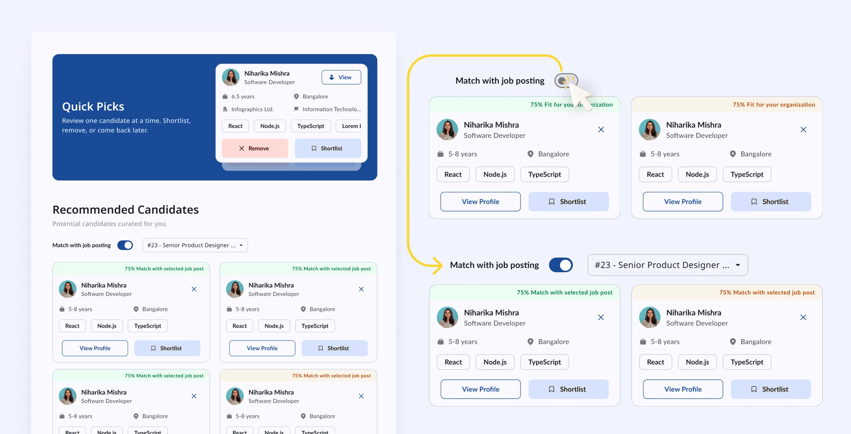
4.4.1
Relevant recommendations for Employer
Images
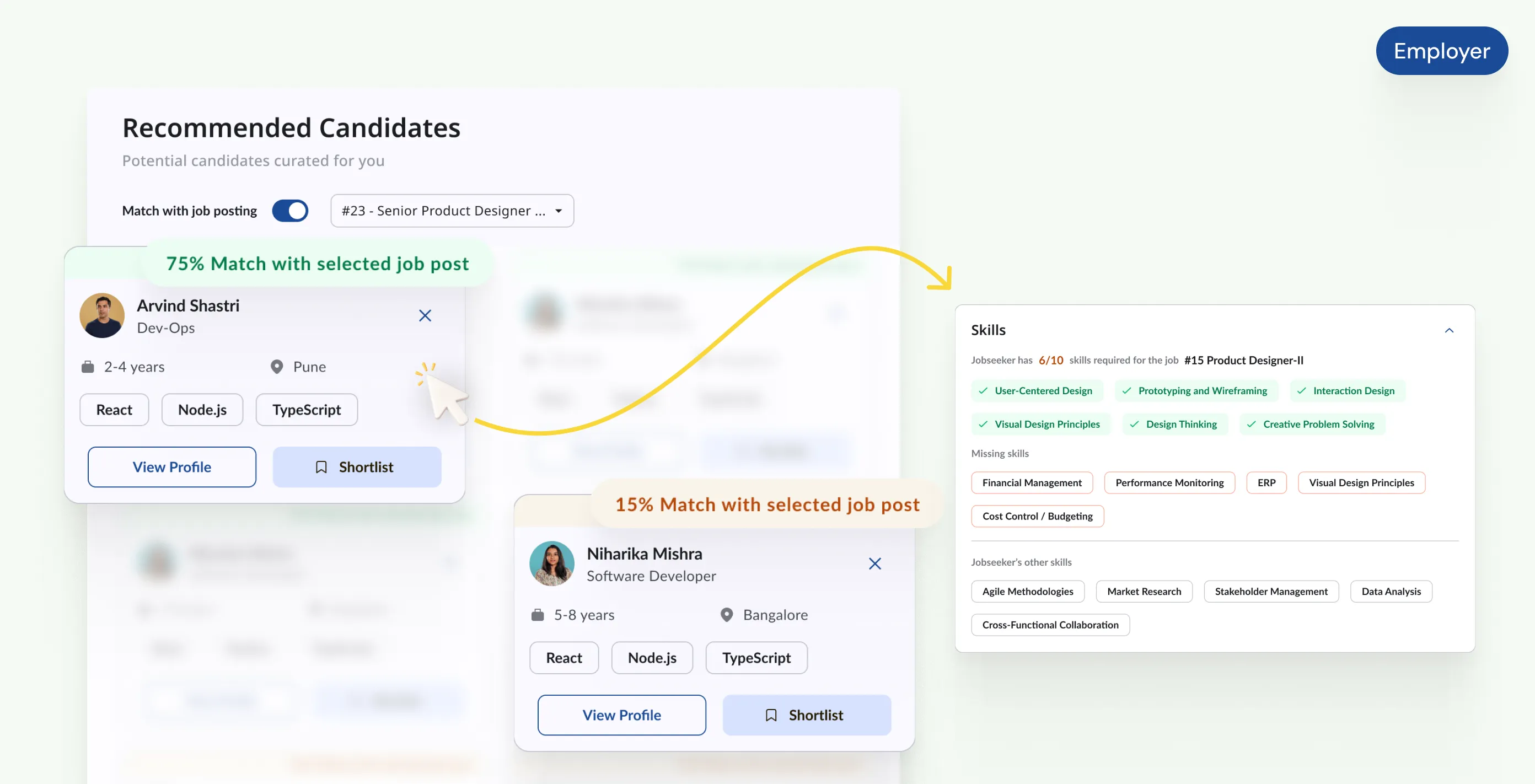
What I designed was a weighted matching engine that scored candidates across twelve criteria, with skill overlap weighted highest at 35%, followed by experience range, location, functional role alignment, education, and several softer signals. Every candidate gets a percentage match score. Profiles are ranked by relevance, not filtered by eligibility.
Quick Picks was one interaction built on top of this: surface one candidate at a time, shortlist or remove, move to the next. But that was just the most visible part. The engine was meant to power the entire employer-side experience, from candidate lists to search results to homepage recommendations.
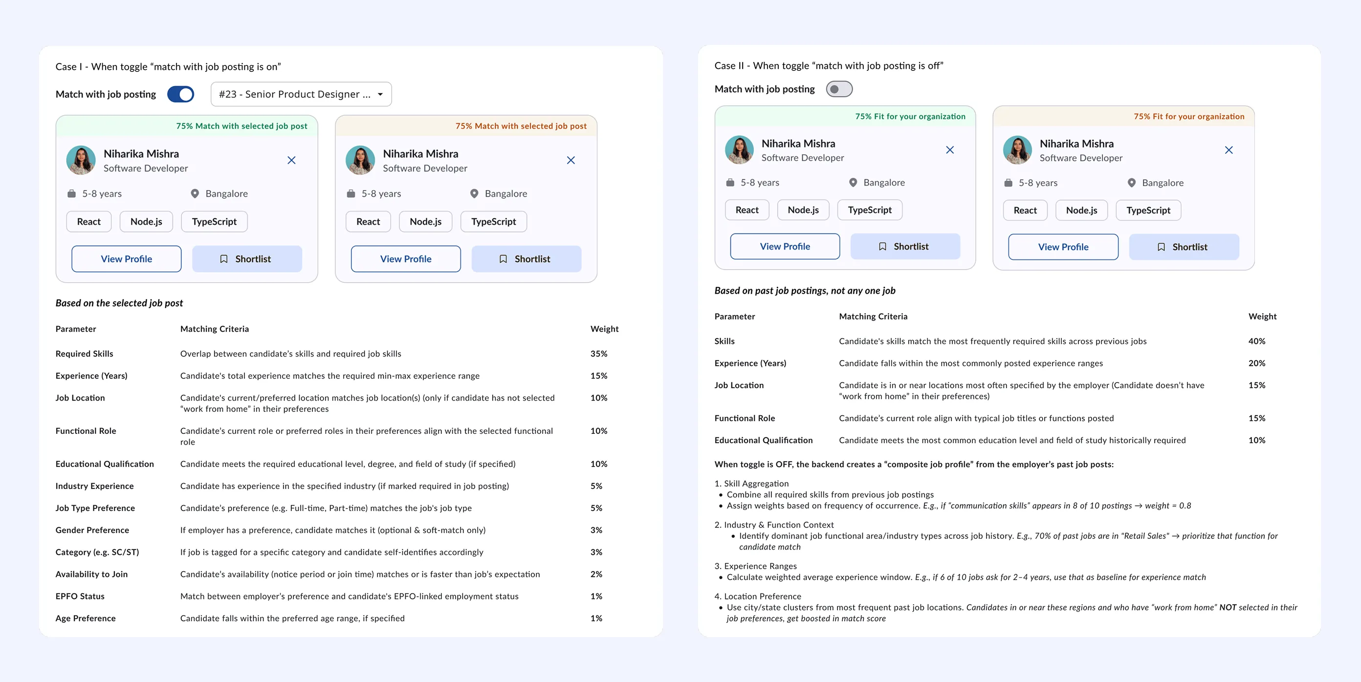
4.4.2
Jobseeker % match logic
Images
Neither shipped. The matching logic couldn't be built within the time and expertise available. What got delivered is simpler and functional, but it's the clearest example in this project of the gap between what was designed and what actually got built.
design process
A few decisions that shaped everything else.
A product this large involves hundreds of decisions. These are the ones that mattered most.
1. DigiLocker as the foundation for trust
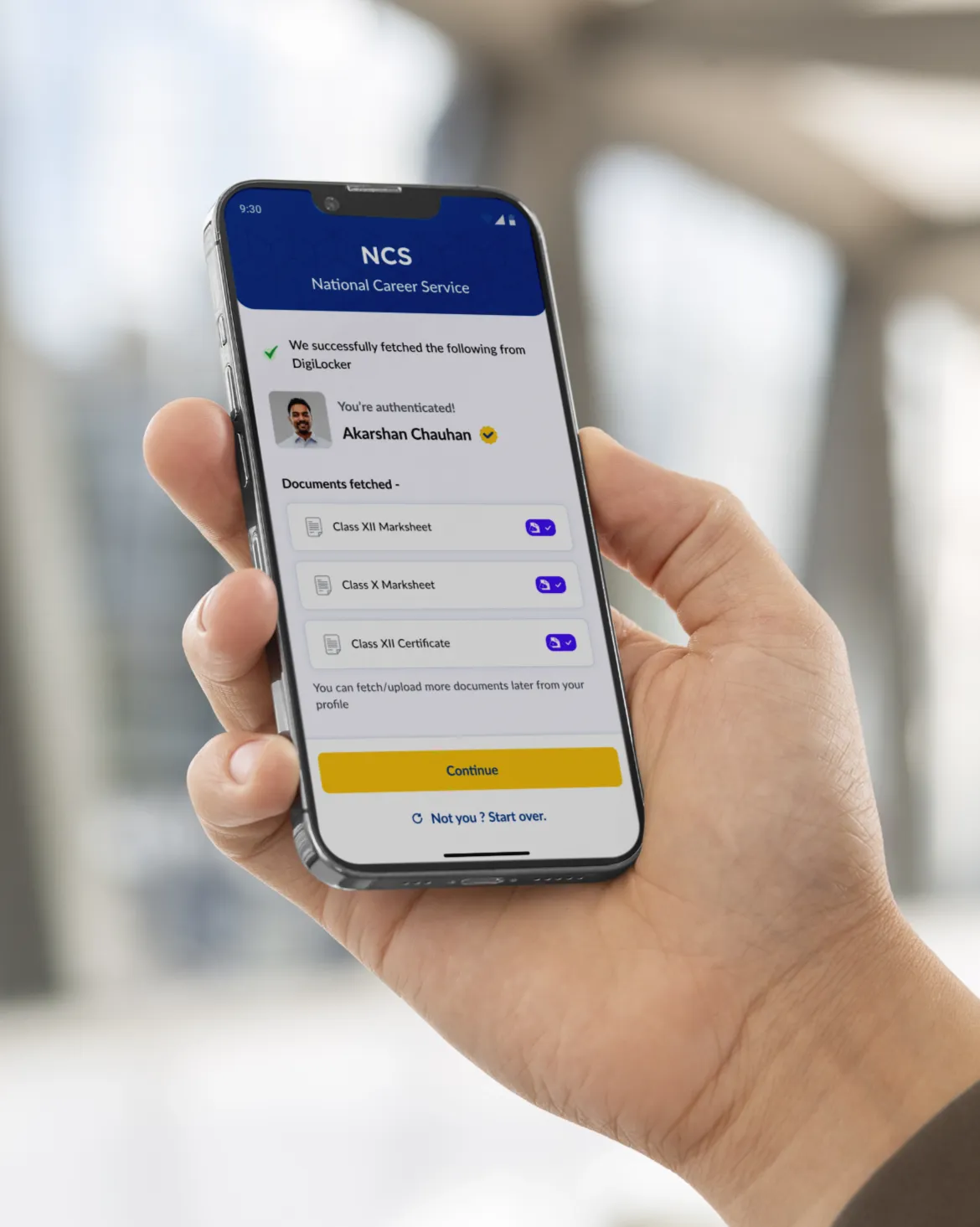
One of the core problems with NCS was credibility: bot accounts, unverified qualifications, employers who couldn't trust what they were reading on a profile. I made DigiLocker integration central rather than optional.
4.1.1
Registration using DigiLocker
Loop
4.1.2
Documents fetched via DigiLocker
Image
Logging in via DigiLocker means every account is tied to a verified identity from the start. It kills spam accounts and bots at the source. Beyond login, DigiLocker lets jobseekers pull their education certificates directly into their profile, meaning the qualifications shown are backed by real documents. For a government employment platform, that verified layer is genuinely differentiating from private alternatives.
2. Designing for low digital literacy without dumbing it down
The hardest design problem on this project was inclusivity. The platform needed to work for someone applying for their first job from a small town on a basic Android phone, and also for an experienced professional comparing multiple offers. Designing for the lowest common denominator usually produces something that frustrates everyone.
The answer was progressive complexity. Every core flow works in as few steps as possible with sensible defaults, minimal required fields, and clear plain-language labels. More advanced capabilities, like adding multiple CVs, setting visibility settings on profile sections, or writing a custom cover letter, exist and are discoverable, but are never in the way.
4.2.1
AI CV Builder - Via upload
Loop
4.2.2
AI CV Builder - Manual Filling
Loop
The AI-powered CV builder came directly from this thinking: a lot of NCS users have never written a CV before. Rather than leaving them with a blank form, the platform generates a complete, professional CV from their profile data using OpenAI, which they can then edit. That feature exists specifically because the user base includes people who genuinely need it.

4.2.3
AI-powered CV builder on desktop web
Image
3. Skill-based matching in both directions
Job search on the old NCS was a keyword search with basic filters. You typed something, got a list, scrolled through it. There was no intelligence to it and no connection between what a jobseeker had put in their profile and what they were being shown.
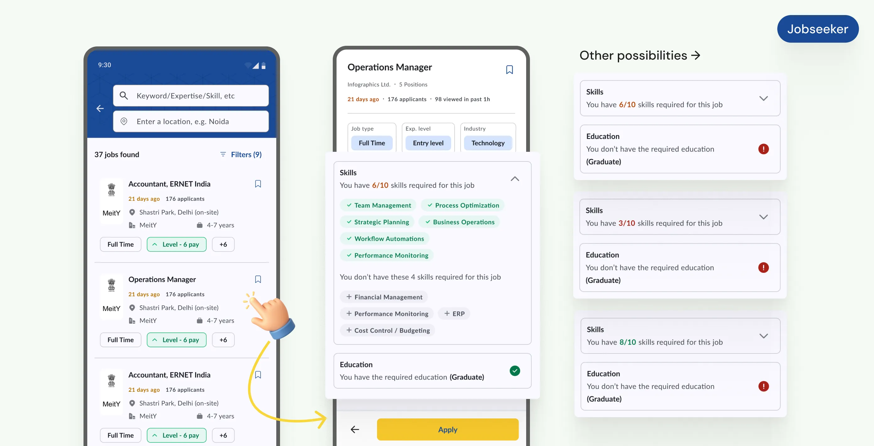
I introduced skill-based matching that works for both sides of the platform. Jobseekers see how their profile aligns with each job posting before they apply: which skills match, which are missing, how their experience compares to what's required.
4.3.1
Skill match indication for a jobseeker
Image
Employers get the reverse: when a job is posted, the system surfaces candidates whose skills and qualifications align with the role, ranked by match quality rather than just recency. The result is a platform where both sides spend less time filtering and more time on decisions that actually matter.
4.3.2
Jobseeker match % for employers
Image
4. Closing the quality-of-life gap with private platforms
A lot of users had tried NCS, found it lacking compared to Naukri or LinkedIn, and stopped using it. Not because the jobs weren't there, but because the experience around the jobs was so much worse. No bookmarking, no application status tracking, no employer invitations, no profile visibility controls, no multiple CV support.
I treated this systematically: I mapped every feature users mentioned when describing what they expected from a job platform and built a checklist of what NCS was missing.

4.4.1
Quality-of-life features for jobseekers
Images
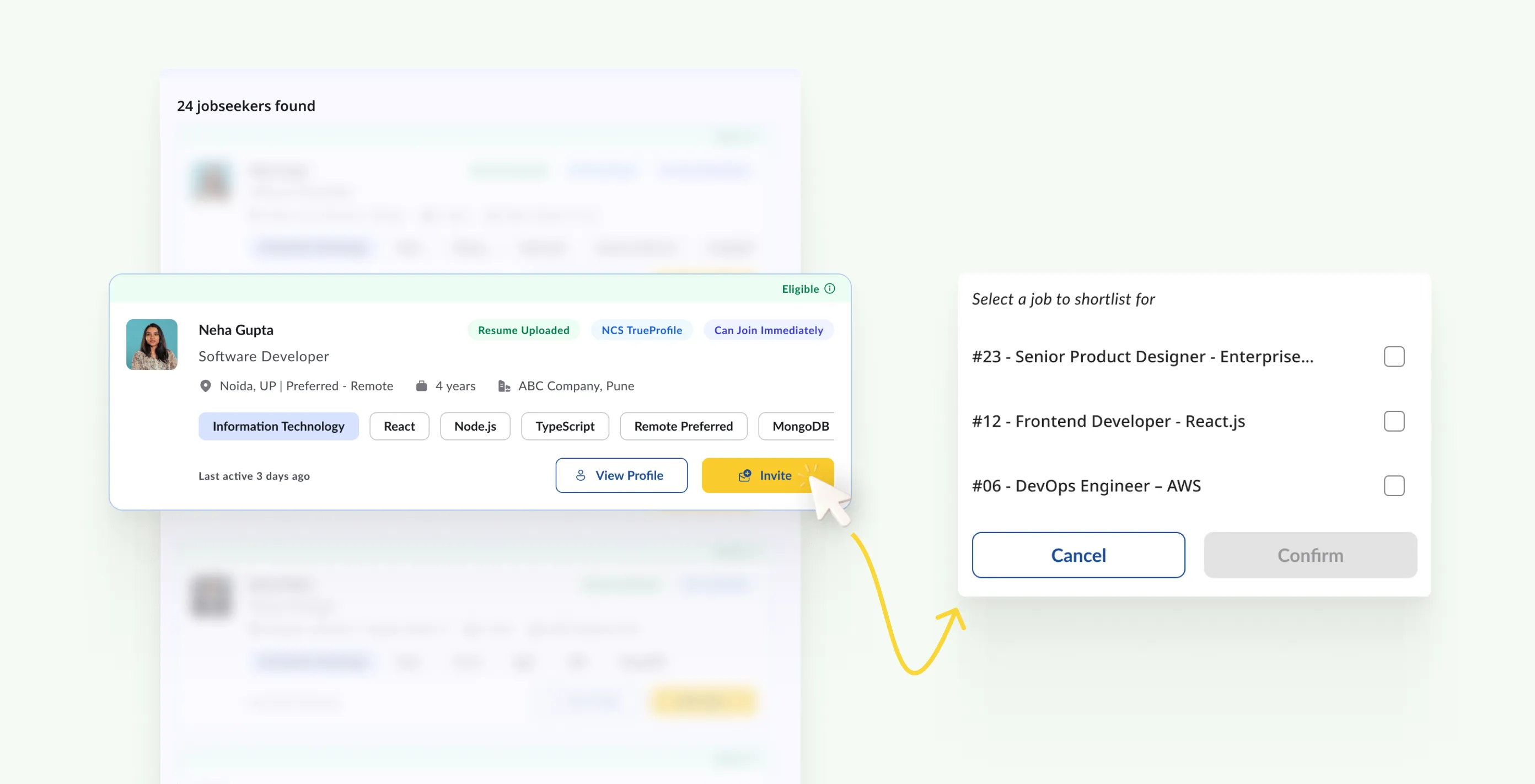
There were some features like employer invitations (where an employer can proactively reach out to a candidate, who then appears as shortlisted if they accept) required more thought about how they fit into the broader employer/jobseeker interaction model. The goal was that a user who had come from, say, Naukri should not feel like they had stepped backwards.
4.4.2
Invite jobseekers to apply on a job post - Employer
Images
final designs
Two personas, one connected platform.
The complete redesign covers 10+ major modules across the jobseeker and employer journeys. Here are the core ones.
1. Jobseeker: onboarding and profile
Registration via DigiLocker or mobile OTP, with document auto-fetch cutting profile setup time significantly. The profile covers skills, qualifications, work history, job preferences, and career timeline in one organised view. Multiple CVs supported, each shareable separately. Profile visibility settings let jobseekers control what different audiences can see. NCS-TrueProfile integration adds a verified identity layer that private platforms cannot offer.
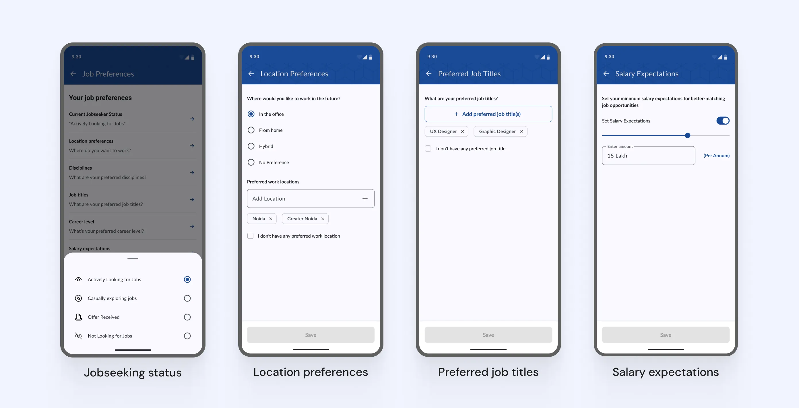
5.1.1
Some of the job preferences for a jobseeker
Images
Jobseeker's profile was improved considerably to introduce many familiar features like sharing their profile, adding a profile picture, job preferences, etc. To better understand the comparison with how the profile looked before, the slider below shows the desktop web version.
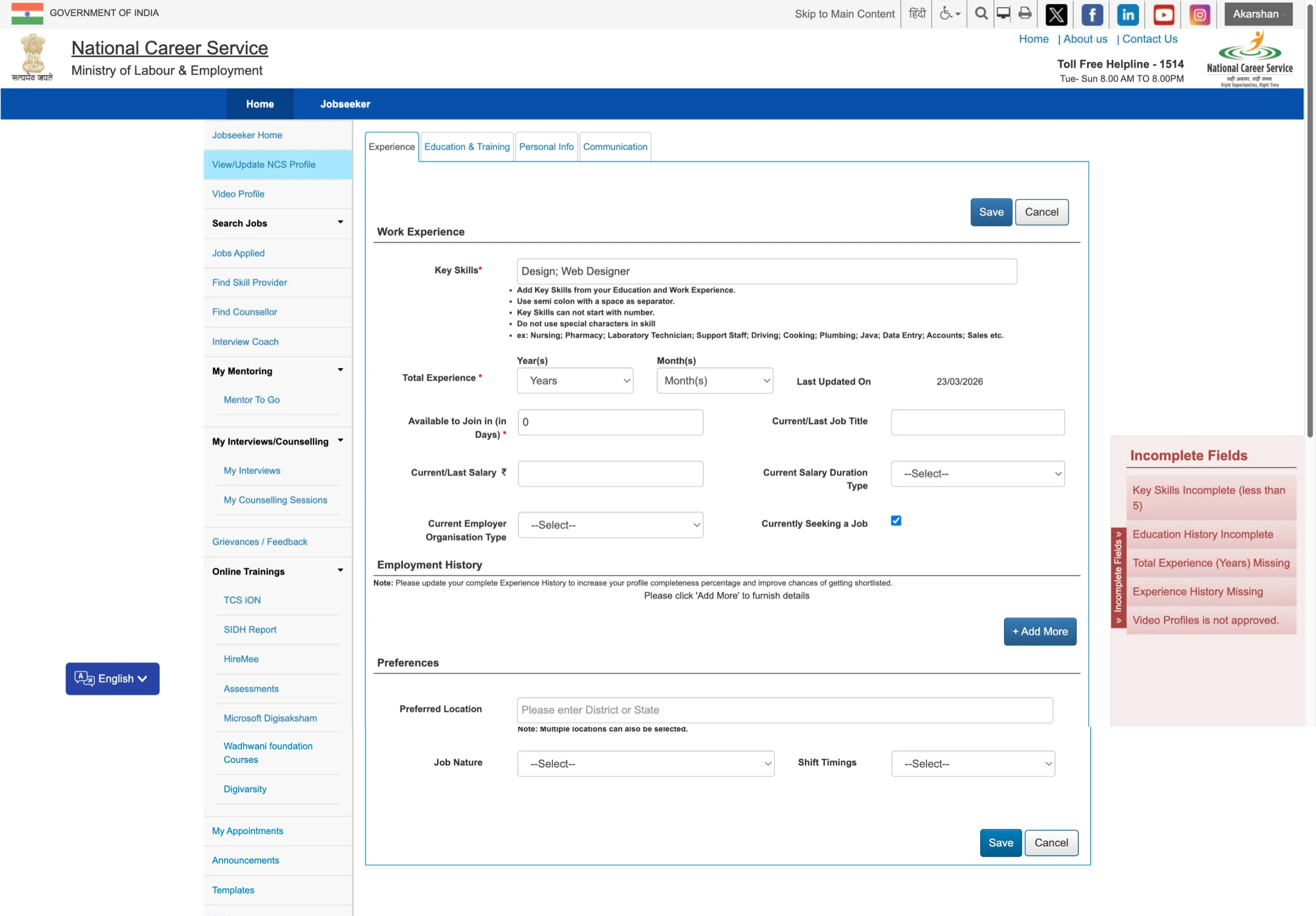
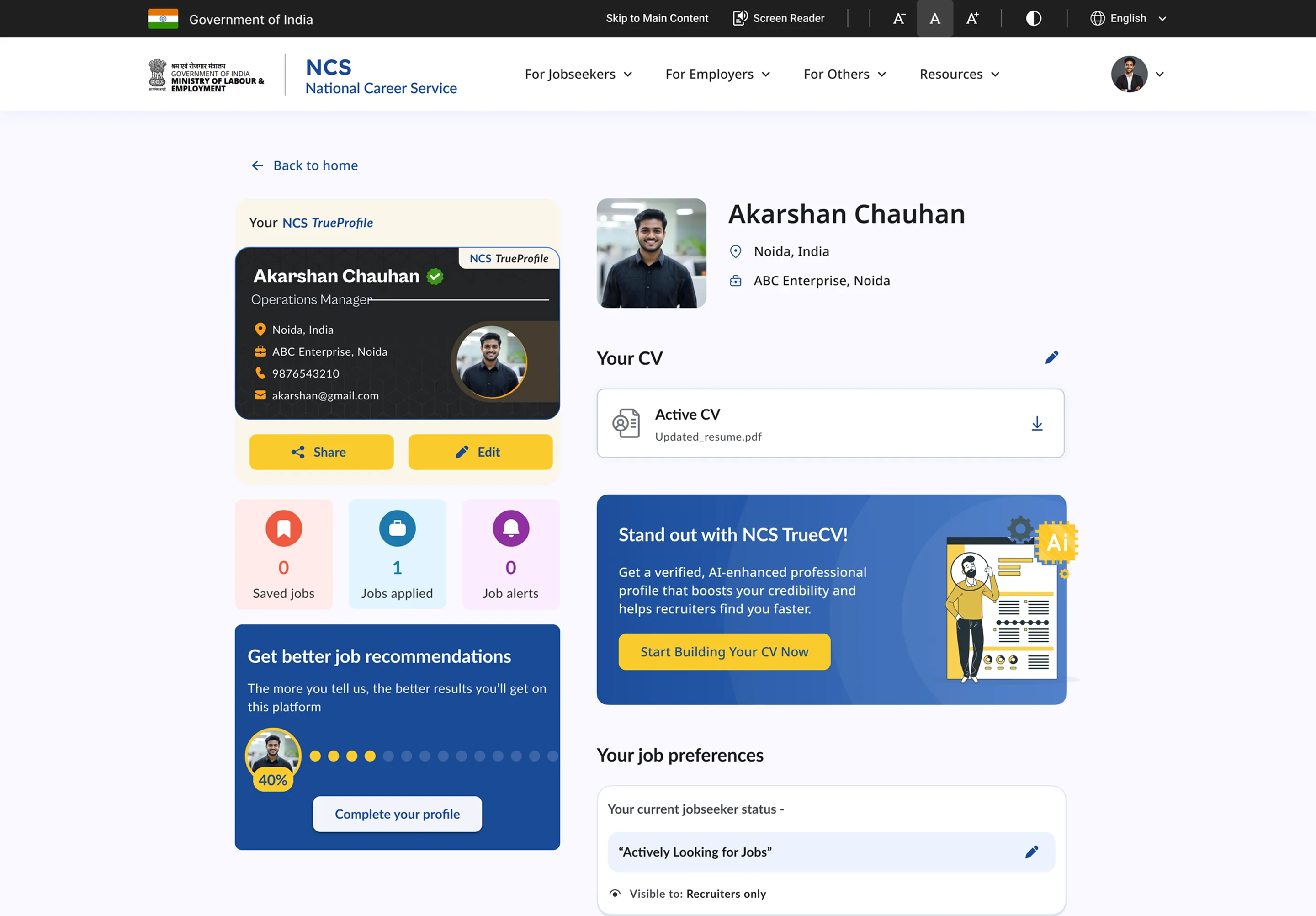
5.1.2
Jobseeker profile before & after (desktop web)
Slider
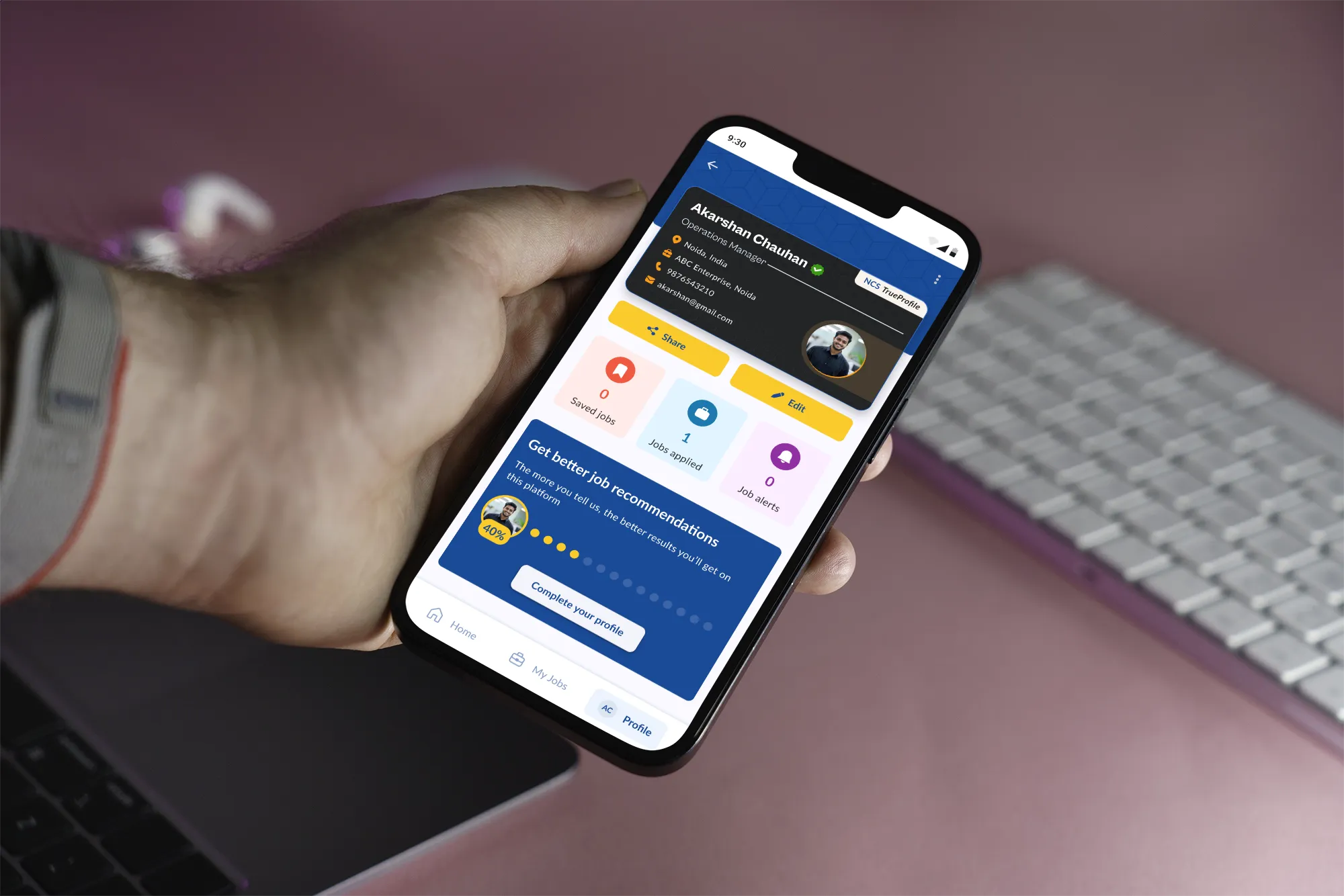
5.1.3
Reimagined Jobseeker profile (app)
Image
5.1.4
Jobseeker Profile - Full view
Loop
Career timeline is introduced to let jobseekers tell the story of how their career has panned out so far. For the current version, education and professional experiences are allowed to be entered but it is envisioned that milestones and achievements like competitions, hackathons, certifications could also be a part of this to better align with blue-collared jobseekers.
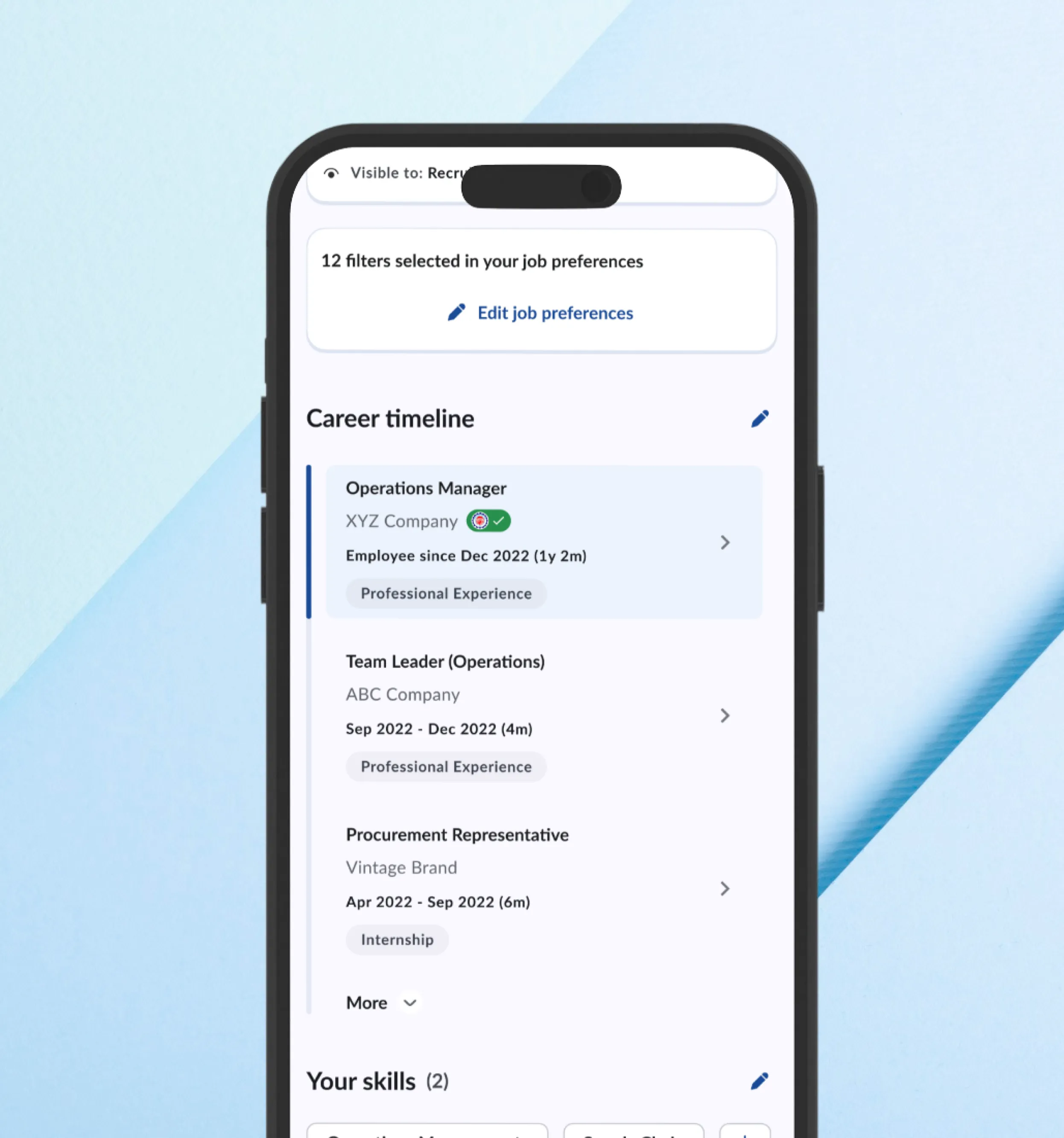
5.1.5
Career Timeline
Image
5.1.6
Career timeline - Edit flow
Loop
2. Jobseeker: finding and applying for jobs
A personalised home surface based on profile and preferences, with government job listings visually distinguished by the official Govt. of India emblem. Jobseekers can search jobs by industry, job type, experience level, etc. Quick filters are also given to browse jobs that match fix criteria like full-time, part-time, freelance, govt. jobs, etc.

5.2.1
Reimagined jobseeker's app
Loop
Improved search with relevant filters and keyword plus location inputs. Job bookmarking and alert setting for saved searches. We introduced "near me" feature to instantly let jobseekers search for opportunities near them, especially useful for blue-collar jobs when distance is more important than job profile.

5.2.2
Revamped job search experience for jobseekers
Image
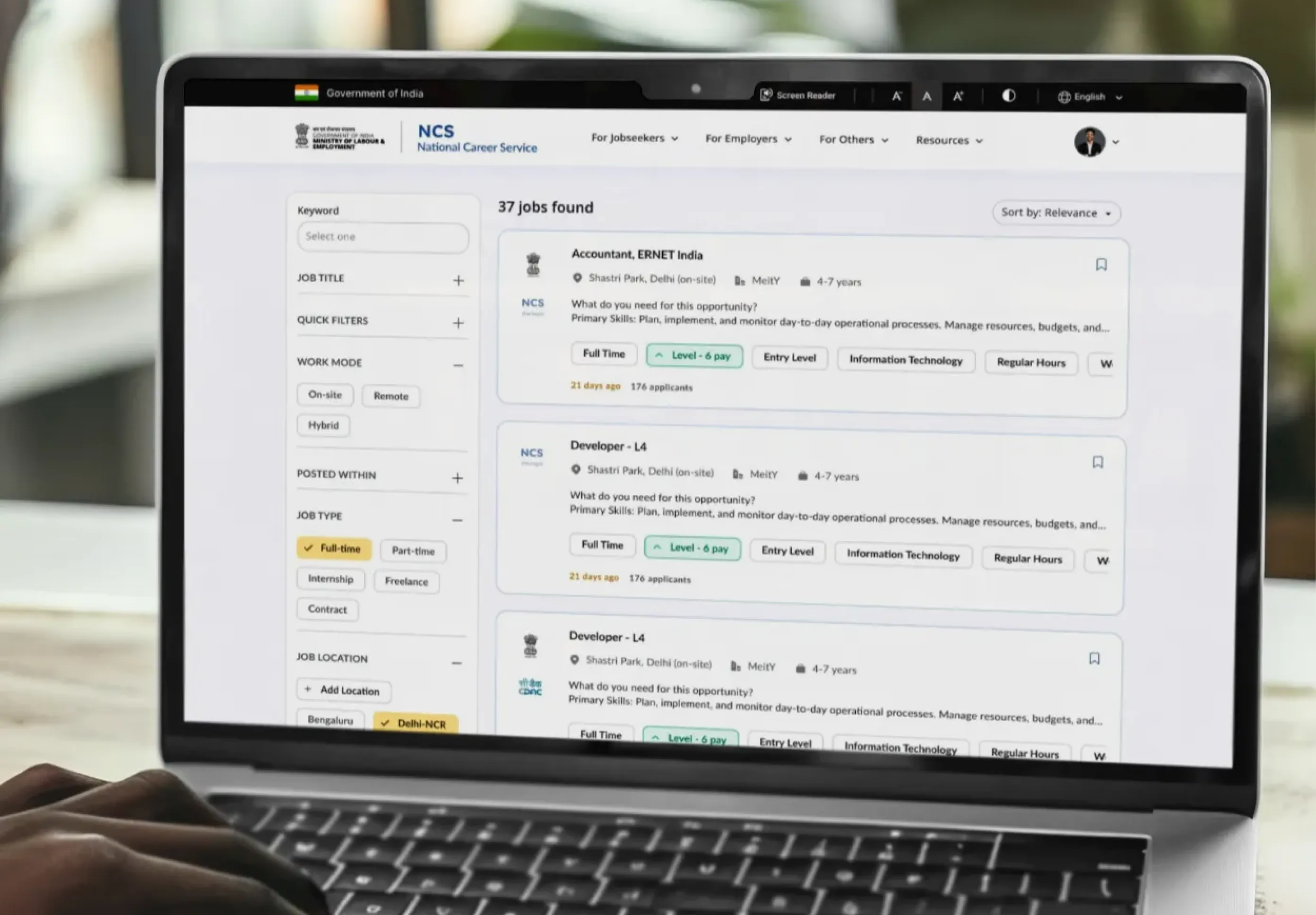
5.2.3
Job search experience on desktop (web)
Image
Each job listing shows a skills match score which is put together based on the skills and required education mentioned in the job post, so that jobseeker can make an informed decision whether they want to apply or not. The application flow becomes much smoother than earlier with an easy 2 step process - confirm contact details, upload or choose an existing CV and add an optional cover letter if one wishes to.

5.2.4
Easy Job application process
Loop
Unlike before, jobseekers could now stay aware of the current status of their job application at all times. This is something jobseekers from both ends of the spectrum, formal & informal sector want.
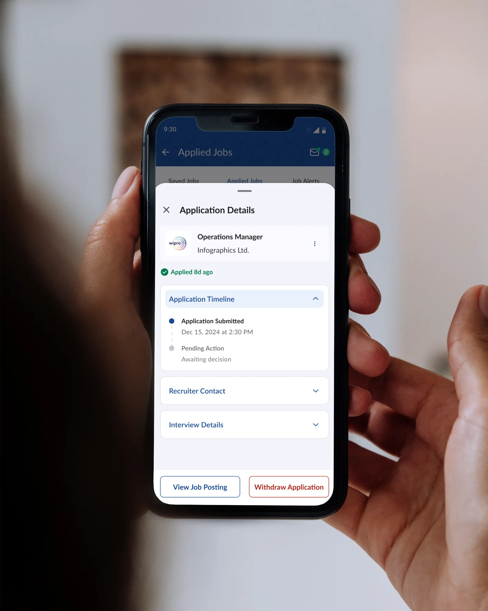
5.2.5
Job application status tracking
Loop
3. Employer: posting jobs and finding candidates
A guided job posting flow replacing the old single long form. Drafts and templates supported so frequent hirers don't start from scratch each time. AI assistance for writing and improving job descriptions.

5.3.1
Guided job post flow for new employers
Image
Candidate discovery surfaces profiles ranked by skill match rather than a flat list. Comprehensive filters are at an employer's disposal to filter out valid candidates: Industry, experience, functional role, functional area, min. education level, to name a few.
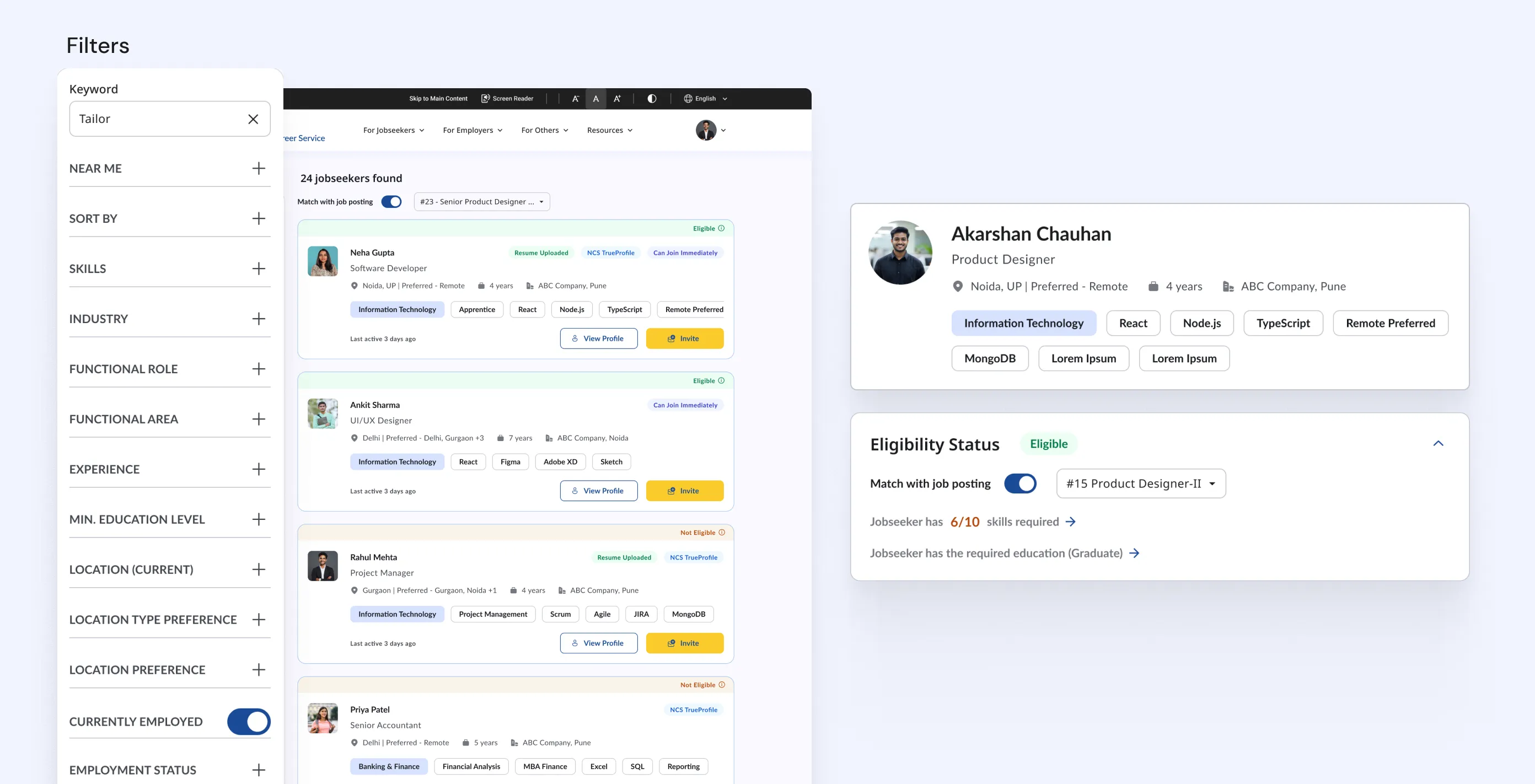
5.3.2
Jobseeker search and eligibility
Image
Just like the jobseeker, employers can keep track of their job postings via a dedicated job posting management module, with more intuitive options available for change status of any job posting easily.
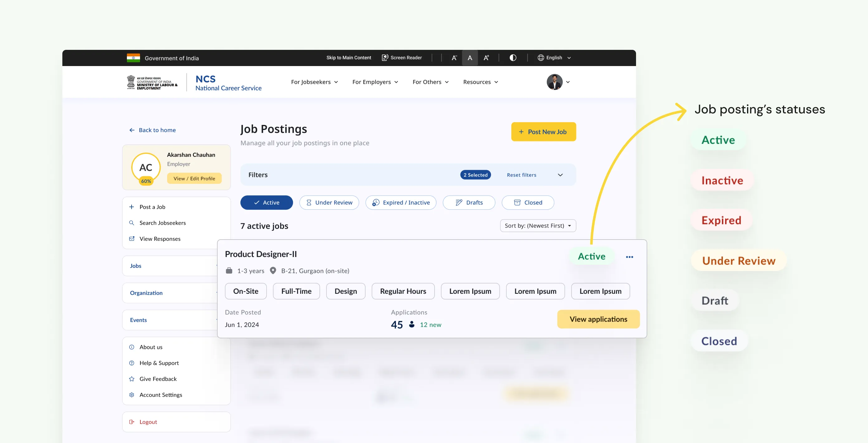
5.3.3
Job posting management
Image
Employers have dedicated section in their portal to manage candidates inside each of their job posting, easily changing the status across to keep everything organized.

5.3.4
Candidate management
Image
4. CV builder
Available to every jobseeker, it generates a complete professional CV from profile data using AI, which the user can then edit section by section. Supports both automatic generation and fully manual entry for users who prefer control. Designed specifically for users who have never written a CV before, which is a significant portion of NCS's user base. As part of the MVP, focus was on including only the core features.
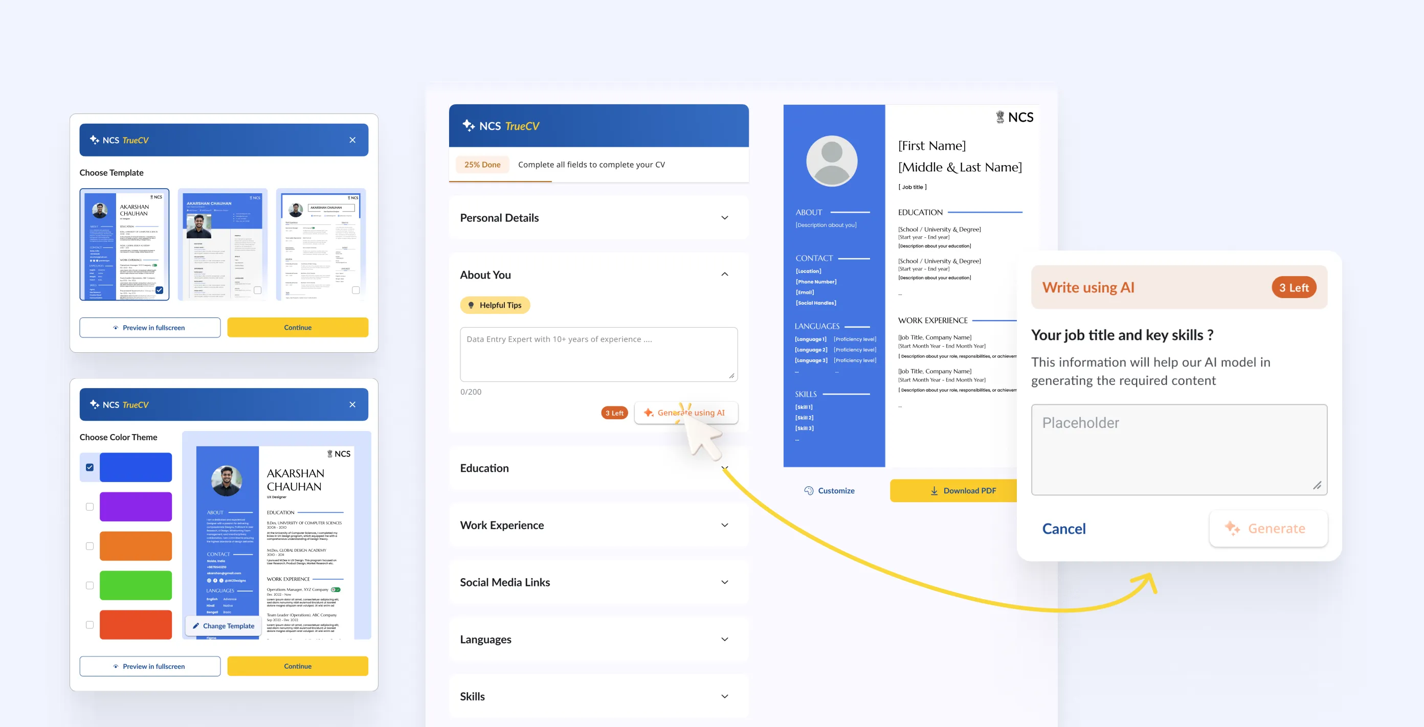
5.4.1
CV Builder on desktop web
Images
constraints & trade-offs
Not-so-small bumps along the way.
Designing for a demographic I am not part of
The user interviews helped, but I am not the target user for NCS. I have never looked for a job on a government portal, navigated a form in a language that is not my first, or applied for a role without a stable internet connection. Bridging that gap required constant pressure-testing of assumptions. Every time I thought a flow was simple enough, I had to ask: simple for whom?
Owning design and development simultaneously
Being product owner across both sides meant I was making decisions that affected the build directly, not just handing off to someone else to figure out. That is a different kind of responsibility. Scoping what goes into phase one versus phase two was as much a design decision as any visual or interaction choice. Several modules I designed are in Figma but not yet in development, held back by delivery scope rather than design readiness.
Working within government and policy constraints
NCS operates under MoLE. Some integrations were mandated, some workflows had to match existing policy processes, and anything touching user data cleared a different bar than a private product would. That's the expected part of government work.
One of the features I believed in strongly, the EPFO integration for employer verification was fully designed and ready. It didn't make it because the API couldn't be arranged with the team managing EPFO in time.
That's the reality of building on government infrastructure. You can do everything right and still lose a feature to a calendar on someone else's desk.
outcomes
Live, used, and still going.
At the time of writing, core features we revamped are live. The platform is continuing to evolve, with additional modules currently in design and scoped for the next development phase. I am not going to cite platform-level growth statistics here as the redesign is recent (at the time of writing) and isolating design impact from other variables would be misleading. What I can say is that a platform with a known reputation for being difficult to use now has a significantly different experience across every core flow, and that real users are moving through it.
Once there is enough data to say something meaningful, I will update this section with numbers.


REFLECTION
This project helped me grow as a designer.
Product Ownership
I came into this as a designer and ended up as a product owner. Those are not the same job. As a designer, my job is to understand the problem and create the best solution I can. As a product owner, my job is to make sure the right things get built in the right order by a team of people who are not in my head.
This project started because I made something nobody asked for.
The thing I keep coming back to is how this started. I put together a concept proposal on my own initiative and sent it cold to a government ministry. There was no brief, no client, no guarantee anything would come of it. Six or seven months later a follow-up arrived, and it eventually became a live product used by real people across the country.
I do not think that was luck. I think it was what happens when you care enough about a problem to do something about it before anyone gives you permission.